Quantitative methods in the context of STEM education research
MA STEM Education
1 Introduction to quantitative methods
Session 1: Introducing Quantitative methods in STEM education: Assumptions, purposes, and conceptualisations
This session will introduce you to the assumptions that underpin quantitative research. We will consider the potential value of quantitative research, and consider the process of quantising latent variables. Latent variables are variables that can only be inferred indirectly from data. For example, consider intelligence - there is no way to measure intelligence directly, we have to base our assumptions of intelligence on performance on some tasks.
1.1 Seminar tasks
1.1.1 Activity 1: The mismeasure of man?
’The Mismeasure of Man treats one particular form of quantified claim about the ranking of human groups: the argument that intelligence can be meaningfully abstracted as a single number capable of ranking all people on a linear scale of intrinsic and unalterable mental worth.
… this limited subject embodies the deepest (and most common) philosophical error, with the most fundamental and far-ranging social impact, for the entire troubling subject of nature and nurture, or the genetic contribution to human social organization.’ Gould (1996), p. ii
Discuss:
• To what extent do the variables commonly studied in educational research (for example, intelligence, exam scores, attitudes etc.) validly represent some underlying latent variable?
• What advantages does quantification of such variables bring, and what issues does it raise?
• Can you think of an example in your own practice where a variable has been created that doesn’t fully reflect the latent concept?
• What is the researcher’s role in making sure variables are validly represented?
1.1.2 Activity 2: An example of quantification
In the seminar we will consider this paper:
Pasha-Zaidi, N., & Afari, E. (2016). Gender in STEM education: An exploratory study of student perceptions of math and science instructors in the United Arab Emirates. International Journal of Science and Mathematics Education, 14(7), 1215-1231.
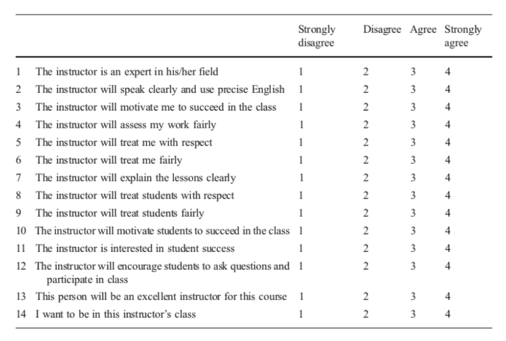
Pasha-Zaidi and Afari (2016)
Reflect on
- What potential issues arise from the authors’ construction of quantitative variables of ‘teacher professionalism’ and ‘teacher warmth’?
- To what extent does the authors’ survey validly probe the variables of ‘teacher professionalism’ and ‘teacher warmth’?
- What other critiques of the study can you propose?
1.1.3 Activity 3: A false dualism?
“‘Quantitative’ and ‘qualitative’ are frequently seen in opposition…. The contrast is drawn between the objective world (out there independently of our thinking about it) and the subjective worlds (in our heads, as it were, and individually constructed); between the public discourse and private meanings; between reality unconstructed by anyone and the ‘multiple realities’ constructed by each individual. The tendency to dichotomise in this way is understandable but misleading.” (Pring 2000, 248)
Discussion Questions
- What are the differing assumptions of qualitative and quantitative educational research?
- Are the two ‘paradigms’ completely distinct? Is the distinction helpful?
- How should a researcher choose what approach to use?
1.1.4 Task 4: Another critique of quantification
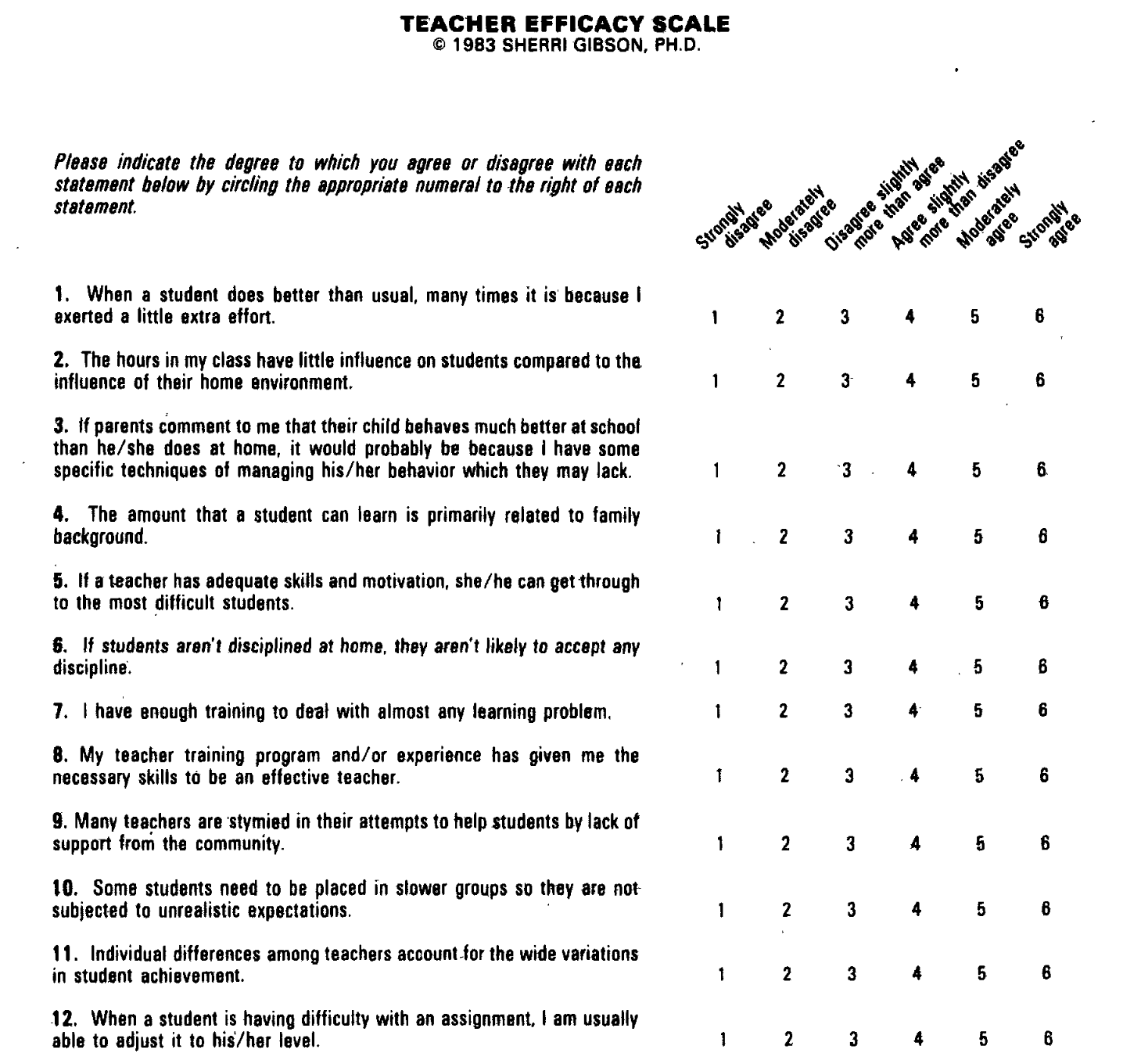
The second task considers this paper: Gibson and Dembo (1984)
For the purpose of discussion, teacher efficacy has been defined as “the extent to which the teacher believes he or she has the capacity to affect student performance” (Berman et al. 1977, 137)
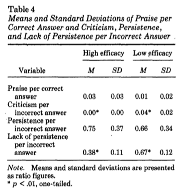
Tool
Findings
To discuss
- Does teacher efficacy measure a discrete aspect of teachers’ beliefs? Does that matter?
- Does the construct have validity? I.e., does the questionnaire measure what it claims to?
- What issues arises from quantifying teacher efficacy?
- What alternatives are there to quantitative measures of teacher efficacy? What are their advantages and limitations?
2 Introduction to R
2.1 Introduction
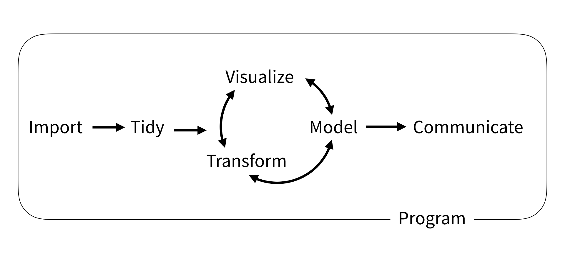
This short course aims to take you through the process of writing your first programs in the R statistical programming language to analyse national and international educational datasets. To do this we will be using the R Studio integrated development environment (IDE), a desktop application to support you in writing R scripts. R Studio supports your programming by flagging up errors in your code as you write it, and helping you manage your analysis environment by giving you quick access to tables, objects and graphs as you develop them. In addition, we will be looking at data analysis using the tidyverse code packages. The tidyverse is a standardised collection of supporting code that helps you read data, tidy it into a usable format, analyse it and present your findings.
The R programming language offers similar functionality to an application based statistical tool such as SPSS, with more of a focus on you writing code to solve your problems, rather than using prebuilt tools. R is open source, meaning that it is free to use and that lots of people have written code in R that they have shared with others. R statistical libraries are some of the most comprehensive in existence. R is popular1 in academia and industry, being used for everything from sales modelling to cancer detection.
# This example shows how R can pull data directly from the internet
# tidy it and start making graphs. All within 9 lines of code
library(tidyverse)

education <- read_csv(
  "https://barrolee.github.io/BarroLeeDataSet/BLData/BL_v3_MF.csv")

education %>%
  filter(agefrom == 15, ageto == 24,
         country %in% c("Germany","France","Italy","United Kingdom")) %>%
  ggplot(aes(x=year, y=yr_sch, colour=country)) +
  geom_point() +
  geom_line()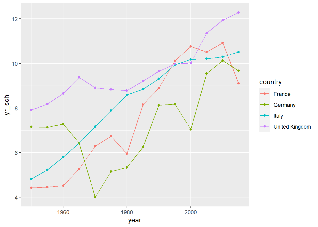
Whilst it is possible to use R through menu systems and drop down tools, the focus of this course is for you to write your own R scripts. These are text files that will tell the computer how to go through the process of loading, cleaning, analysing and presenting data. The sequential and modular nature of these files makes it very easy to develop and test each stage separately, reuse code in the future, and share with others.
This booklet is written with the following sections to support you:
[1] Code output appears like thisCourier font indicates keyboard presses, column names, column values and function names.
<folder> Courier font within brackets describe values that can be passed to functions and that you need to define yourself. I.e. copying and pasting these code chunks verbatim won’t work!
specifies things to note
gives warning messages
highlights issues that might break your code
gives suggestions on how to do things in a better way
2.2 Getting set up
2.2.1 Installation (on your own machine)
-
Install R (default settings should be fine)
Install RStudio, visit here and it should present you with the version suitable for your operating system.
(If the above doesn’t work follow the instructions here)
2.2.2 Setting up RStudio and the tidyverse
Open RStudio
-
On the bottom right-hand side, select Packages, then select Install, then type “tidyverse” into the Packages field of the new window:
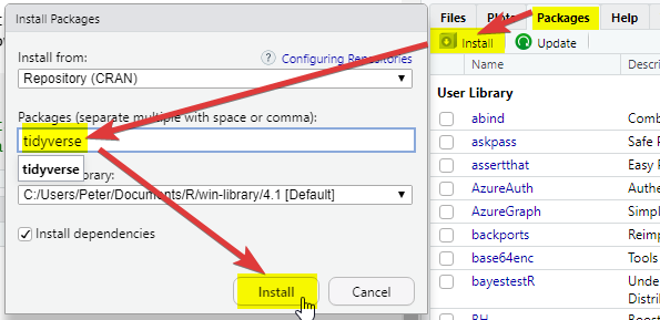
Click Install and you should see things happening in the console (bottom left). Wait for the console activity to finish (it’ll be downloading and checking packages). If it asks any questions, type
Nfor no and press enter.-
Add a new R Script using the
 button
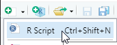
-
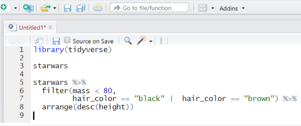
In the new R script, write the following:
-
Select all the lines and press
ControlorCommand ⌘andEnteron your keyboard at the same time. Alternatively, press the button
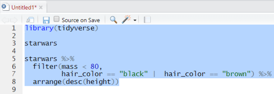
-
Check that you have the following in the console window (depending on your screen size you might have fewer columns):
Install the
arrowpackage, repeat step 2, above.Download the
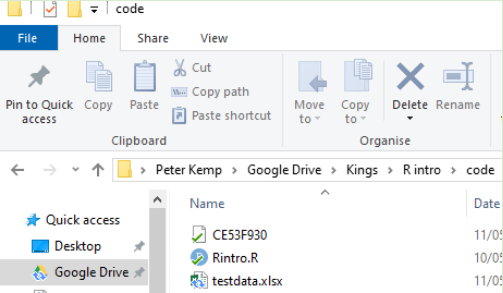
PISA_2018_student_subset.parquetdataset from here and download it on your computer, make a note of the full folder location where you have saved this!
If you need help with finding the full folder location of your file, often a hurdle for Mac users, go to Section 2.8.3
- Copy the following code and replace
<folder>with the full folder location of where your dataset was saved, make sure that you have.parqueton the end. And keep the(r"[ ]")!
examples of what this should look like for PC and Mac
# For Pete (PC) the address format was:
PISA_2018 <- read_parquet(r"[C:\Users\Peter\KCL\MASTEMR\PISA_2018_student_subset.parquet]")

# For Richard (Mac) the address format was:
PISA_2018 <- read_parquet(r"[/Users/k1765032/Documents/Teaching/STEM MA/Quantitative module/Data sets/PISA_2018_student_subset.parquet]")- Underneath the code you have already written, copy the code below (you don’t have to write it yourself), and run it. Try and figure out what each line does and what it’s telling you.
library(tidyverse)

PISA_2018 %>%
  mutate(maths_better = PV1MATH > PV1READ) %>%
  select(CNT, ST004D01T, maths_better, PV1MATH, PV1READ) %>%
  filter(!is.na(ST004D01T), !is.na(maths_better)) %>%
  group_by(ST004D01T) %>%
  mutate(students_n = n()) %>%
  group_by(ST004D01T, maths_better) %>%
  summarise(n = n(),
            per = n/unique(students_n))
That’s it, you should be set up!
Any issues, please drop a message on the Teams group, or mail peter.kemp@kcl.ac.uk and richard.brock@kcl.ac.uk
2.3 Starting to code
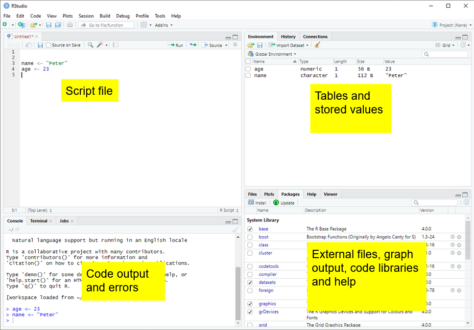
After adding a new R Script using the button ![]() , there are four parts to R Studio’s interface. For the moment we are most interested in the Script file section, top left.
, there are four parts to R Studio’s interface. For the moment we are most interested in the Script file section, top left.
2.4 Your first program
2.4.1 Objects and instructions
In programming languages we can attach data to a name, this is called assigning a value to an object (you might also call them variables). To do this in R we use the <- arrow command. For example, I want to put the word "Pete" into an object called myname (note that words and sentences such as "Pete" need speech marks):
We can also perform quick calculations and assign them to objects:
Type the two examples above into your RStudio script file and check that they work. Adapt them to say your full name and give the number of MinutesInADay
Remember to select code and press control or command and Enter to run it
Objects can form part of calculations, for example, the code below shows how we can use the number HoursInYear to (roughly!) calculate the number of HoursInWeek:
Notice from the above we can perform the main arithmetic commands using keyboard symbols: + (add); - (minus); * (multiply); / (divide); ^ (power)
Objects can change values when you run code. For example in the code below:
What’s going on here?
- line 1 sets
ato equal 2000 (note: don’t use commas in writing numbersa <- 2,000would bring up an error), - line 2 sets
bto equal 5, - line 4 overwrites the value of
awith the value stored inb, making objectanow equal to 5 - line six is now
5 * 5
2.4.1.1 Questions
what are the outputs of the following code snippets/what do they do? One of the examples might not output anything, why is that? Type the code into your script file to check your answers:
code example 1
code example 2
code example 3
2.4.2 Naming objects
Correctly naming objects is very important. You can give an object almost any name, but there are a few rules to follow:
- Name them something sensible
- R is case sensitive,
myNameis not equal to (!=)myname - Don’t use spaces in names
- Don’t start a name with a number
- Keep punctuation in object names to underscore (
_and full stop.) e.g.my_name,my.name. - Stick to a convention for all your objects, it’ll make your code easier to read, e.g.
-
myName,yourName,ourName(this is camelCase 2) -
my_name,your_name,our_name
-
The actual name of an object has no effect on what it does (other than invalid names breaking your program!). For example age <- "Barry" is perfectly valid to R, it’s just a real pain for a human to read.
2.4.2.1 Questions
Which of these are valid R object names:
my_Numbermy-NumbermyNumber!first nameFIRSTnamei3namesnames3
For more information on the R programming style guide, see this
2.5 Datatypes
We have already met two different datatypes, the character datatype for words and letters (e.g. "Peter") and the numeric datatype for numbers (e.g. 12). Datatypes tell R how to handle data in certain circumstances. Sometimes data will be of the wrong datatype and you will need to convert between datatypes.
weeks <- 4
days_in_week <- "7"

# we now attempt to multiply a number by a string
# but it doesn't work!
total_days <- weeks * days_in_week
Error in weeks * days_in_week: non-numeric argument to binary operatorWhilst R will understand what to do when we multiply numbers with numbers, it gets very confused and raises an error when we try to perform an arithmetic operation using words and numbers.
To perform the calculation we will need to convert the days_in_week from a string to a number, using the as.numeric(<text>) command:
There is a logical datatype for boolean values of TRUE and FALSE. This will become a lot more useful later.
legs_snake <- TRUE # you can specify logical values directly
dogs_legs <- 4
legs_dog <- dogs_legs > 0 # or as part of a calculation

# Do dog's have legs?
print(legs_dog)
[1] TRUEThere are actually three datatypes for numbers in R, numeric for most of your work, the rarer integer specifically for whole numbers and the even rarer complex for complex numbers. When you are looking at categorical data, factors are used on top of the underlying datatype to store the different values, for example you might have a field of character to store countries, factors would then list the different countries stored in this character field.
To change from one datatype to another we use the as.____ command: as.numeric(<text>), as.logical(<data>), as.character(<numeric>).
2.5.0.1 Questions
- Can you spot the error(s) in this code and fix them so it outputs: “July is month 7”?
- Can you spot the error(s) in this code and fix it?
- Can you spot the error(s) in this code and fix it?
If you want to find out the datatype of an object you can use the structure str command to give you more information about the object. In this instance chr means that month is of character datatype and num means it is of the numeric datatype.
2.5.1 Vectors
So far we have seen how R does simple calculations and prints out the results. Underlying all of this are vectors. Vectors are data structures that bring together one or data elements of the same datatype. E.g. we might have a numeric vector recording the grades of a class, or a character vector storing the gender of a set of students. To define a vector we use c(<item>, <item>, ...), where c stands for combine. Vectors are very important to R3, even declaring a single object, x <- 6, is creating a vector of size one. Larger vectors look like this:
You can quickly perform calculations across whole vectors:
[1] "f" "m" "m" "f" "m" "f" "m"[1] 6 5 5 2 8 6 9We can also perform calculations across vectors, in the example below we can find out which students got a better grade in Maths than in English.
# this compares each pair of values
# e.g. the first item in maths_grade (5) with
# the first item in english_grade (8)
# and so on
# This returns a logical vector of TRUE and FALSE
maths_grade > english_grade
[1] FALSE FALSE TRUE FALSE TRUE FALSE FALSE# To work out how many students got a better grade
# in maths than in English we can apply sum()
# to the logical vector.
# We know that TRUE == 1, FALSE == 0,
# so sum() will count all the TRUEs
sum(maths_grade > english_grade)[1] 2# if you want to find out the average grade for
# each student in maths and english
# add both vectors together and divide by 2
(maths_grade + english_grade) / 2[1] 6.5 4.5 3.5 1.5 5.0 5.5 8.5# we can use square brackets to pick a value from a vector
# vectors start couting from 1, so students[1] would pick Jo
students[1][1] "Joe"# we can pass a numeric vector to a another vector to create a
# subset, in the example below we find the 3rd and 5th item
students[c(3,5)][1] "Mo" "Olu"# we can also use a vector of TRUE and FALSE to pick items
# TRUE will pick an item, FALSE will ignore it
# for each maths_grade > english_grade that is TRUE
# the name in that position in the student vector will be shown
students[maths_grade > english_grade][1] "Mo" "Olu"You should be careful when trying to compare vectors of different lengths. When combining vectors of different lengths, the shorter vector will match the length of the longer vector by wrapping its values around. For example if we try to combine a vector of the numbers 1 ot 10 with a two item logical vector TRUE FALSE, the logical vector will repeat 5 times: c(TRUE, FALSE, TRUE, FALSE, TRUE, FALSE, TRUE, FALSE, TRUE, FALSE). We can use this vector as a mask to return the odd numbers, TRUE means keep, FALSE means ignore:
nums <- c(1,2,3,4,5,6,7,8,9,10)
mask <- c(TRUE, FALSE)

# you can see the repeat of mask by pasting them together
paste(nums, mask)
[1] "1 TRUE" "2 FALSE" "3 TRUE" "4 FALSE" "5 TRUE" "6 FALSE"
[7] "7 TRUE" "8 FALSE" "9 TRUE" "10 FALSE"[1] 1 3 5 7 9This might not seem very useful, but it comes in very handy when we want to perform a single calculation across a whole vector. For example, we want to find all the students who achieved grade 5 in English, the below code creates a vector of 5s the same size as english_grade:
# this can also be rewritten english_grade >= c(5)
# note, when we are doing a comparison, we need to use double ==
students[english_grade == 5]
[1] "Al"[1] "Al"When we are doing a comparison, we need to use double == equals sign. Using a single equals sign is the equivalent of an assignment = is the same as <-
There are several shortcuts that you can take when creating vectors. Instead of writing a whole sequence of numbers by hand, you can use the seq(<start>, <finish>, <step>) command. For example:
This allows for some pretty short ways of solving quite complex problems, for example if you wanted to know the sum of all the multiples of 3 and 5 below 1000, you could write it like this:
Another shortcut is writing T, F, or 1, 0 instead of the whole words TRUE, FALSE:
2.5.2 Questions
- Can you spot the four problems with this code:
answer
nums <- c(1,2,3,4,7,2,2)
#1 a vector is declared using c(), not v()
#2 3 should be numeric, so no need for speech marks
# (though technically R would do this conversion for you!)

sum(nums)
mean(nums)
# return a vector of all numbers greater than 2
nums[nums >= 2] #3 to pick items from another vector, use square brackets- Create a vector to store the number of glasses of water you have drunk for each day in the last 7 days. Work out:
- the average number of glasses for the week,
- the total number of glasses,
- the number of days where you drank less than 2 glasses (feel free to replace water with your own tipple: wine, coffee, tea, coke, etc.)
- Using the vectors below, create a program that will find out the average grade for females taking English:
2.5.3 Summary questions
Now you have covered the basics of R, it’s time for some questions to check your understanding. These questions will cover all the material you have read so far and don’t be worried if you need to go back and check something. Exemplar answers are provided, but don’t worry if your solution looks a little different, there are often multiple ways to achieve the same outcome.
- Describe three datatypes that you can use in your program?
- What are two reasons that you might use comments?
-
Which object names are valid?
my_nameyour nameour-nameTHYname
- Can you spot the four errors in this code:
- [Extension] Calculate the number of seconds since 1970.
2.6 Packages and libraries
R comes with some excellent statistical tools, but often you will need to supplement them with packages4 . Packages contain functionality that isn’t built into R by default, but you can choose to load or install them to meet the needs of your tasks. For example you have code packages to deal with SPSS data, and other packages to run machine learning algorithms. Nearly all R packages are free to use!
2.6.1 Installing and loading packages
To install a package you can use the package tab in the bottom right-hand panel of RStudio and follow the steps from Section 2.2.2. Alternatively you can install things by typing:
Note that the instruction is to install packages, you can pass a vector of package names to install multiple packages at the same time:
Once a package is installed it doesn’t mean that you can use it, yet. You will need to load the package. To do this you need to use the library(<package_name>) command, for example:
Some packages might use the same function names as other packages, for example select might do different things depending on which package you loaded last. As a rule of thumb, when you start RStudio afresh, make sure that you load the tidyverse package after you have loaded all your other packages. To read more about this problem see Section 16.1
2.7 The tidyverse
This course focuses on using the tidyverse; a free collection of programming packages that will allow you to write code that imports data, tidys it, transforms it into useful datasets, visualises findings, creates statistical models and communicates findings to others data using a standardised set of commands.
For many people the tidyverse is the main reason that they use R. The tidyverse is used widely in government, academia, NGOs and industry, notable examples include the Financial Times and the BBC. Code in the tidyverse can be (relatively) easily understood by others and you, when you come back to a project after several months.
# load the tidyverse packages
library(tidyverse)

# download Covid data from website
deaths <- read.csv("https://raw.githubusercontent.com/owid/covid-19-data/master/public/data/excess_mortality/excess_mortality.csv")

deaths <- deaths %>%
     filter(location %in%
              c("United States", "United Kingdom",
                "Sweden", "Germany")) %>%
  mutate(date = as.Date(date))

ggplot(data=deaths) +
  geom_line(aes(x = date,
                y = excess_per_million_proj_all_ages,
                colour=location)) +
  theme(legend.position="bottom")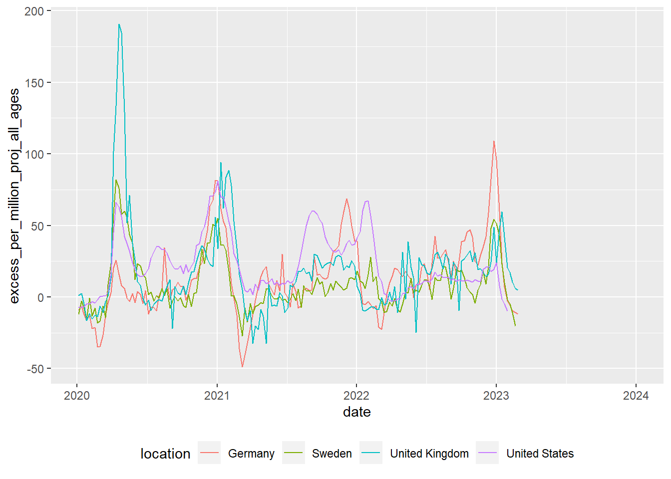
Try this out
The code above transforms data and converts it into a graph. It doesn’t have any comments, but you should hopefully be able to understand what a lot of the code does by just reading it. Can you guess what each line does? Try running the code by selecting parts of it and pressing control | command ⌘ and Enter
2.8 Loading data
We can’t do much with R without loading data from elsewhere. Data will come in many formats and R should be able to deal with all of them. Some of the datasets you access will be a few rows and columns; others, like the ones we are going to use on this course, might run into hundreds of thousands or even millions of rows and hundreds or thousands of columns. Depending on the format you are using, you might need to use specific packages. A few of the data file types you might meet are described below:
| File type | Description |
|---|---|
| Comma separated values [.csv] | As it says in the name, .csv files store data by separating data items with commas. They are a common way of transferring data and can be easily created and read by Excel, Google spreadsheets and text editors (in addition to R). CSVs aren’t compressed so will generally be larger than other file types. They don’t store information on the types of data stored in the file so you might find yourself having to specify that a date column is a date, rather than a string of text. You can read and write csv files without the need to load any packages, but if you do use readr you might find things go much faster. |
| Excel [.xls | .xlsx | .xlsxm] | Excel files store data in a compressed custom format. This means files will generally be smaller than CSVs and will also contain information on the types of data stored in different columns. R can read and write these files using the openxlsx package, but you can also use the tidyverse’s readxl for reading, and writexl for writing for excel formats. |
| R Data [.rds] | R has it’s own data format, .rds. Saving to this format means that you will make perfect copies of your R data, including data types and factors. When you load .rds files they will look exactly the same as when you saved them. Data can be highly compressed and it’s one of the fastest formats for getting data into R. You can read and write .rds files without the need to load any packages, but using the functions in readr might speed things up a bit. You won’t be able to look at .rds files in other programs such as Excel |
| Arrow [.parquet] | Apache Arrow .parquet is a relatively new format that allows for the transfer of files between different systems. Files are small and incredibly fast to load, whilst looking exactly the same as when you save them. The PISA dataset used here, that takes ~20 seconds to load in .rds format, will load in less than 2 seconds in .parquet format. Because of the way that data is stored you won’t be able to open these files in programs such as Excel. You will need the arrow package to read and write .parquet files. |
| SPSS [.sav] | SPSS is a common analysis tool in the world of social science. The native format for SPSS data is .sav. These files are compressed and include information on column labels and column datatypes. You will need either the haven or foreign packages to read data into R. Once you have loaded the .sav you will probably want to convert the data into a format that is more suitable for R, normally this will involve converting columns into factors. We cover factors in more detail below. |
| Stata [.dta] |
haven or foreign packages to read data into R |
| SAS [.sas] |
haven or foreign packages to read data into R |
| Structured Query Language [.sql] | a common format for data stored in large databases. Normally SQL code would be used to query these, you can use the tidyverse to help construct SQL this through the package dbplyr which will convert your tidyverse pipe code into SQL. R can be set up to communicate directly with databases using the DBI package. |
| JavaScript Object Notation [.json] |
.json is a popular format for sharing data on the web. You can use jsonlite and rjson to access this type of data |
For this course we will be looking at .csv, excel, .rds and parquet files.
2.8.1 Dataframes
Loading datasets into R will normally store them as dataframes (also known as tibbles when using the tidyverse). Dataframes are the equivalent of tables in a spreadsheet, with rows, columns and datatypes.
The table above has 4 columns, each column has a datatype, CNT is a character vector, PV1MATH is a double (numeric) vector, ESCS is a double (numeric) vector and ST211Q01HA is a factor. For more about datatypes, see Section 2.5
Core to the tidyverse is the idea of tidy data, a rule of thumb for creating datasets that can be easily manipulated, modeled and presented. Tidy data are datasets where each variable is a column and each observation a row.
This data isn’t tidy data as each row has contains multiple exam results (observations):
| ID | Exam 1 | Grade 1 | Exam 2 | Grade 2 |
|---|---|---|---|---|
| R2341 | English | 4 | Maths | 5 |
| R8842 | English | 5 |
This dataframe is tidy data as each student has one entry for each exam:
| ID | Exam | Grade |
|---|---|---|
| R2341 | English | 4 |
| R2341 | Maths | 5 |
| R8842 | English | 5 |
First we need to get some data into R so we can start analysing them. We can load large datatables into R by either providing the online web address, or by loading it from a local file directory on your hard drive. Both methods are covered below:
2.8.2 Loading data from the web
To download files from the web you’ll need to find the exact location of the file you are using. For example below we will need another package, openxlsx, which you need to install before you load it (see: Section 2.2.2, or use line 1 below). The code shown will download the files from an online Google drive directly into objects in R using read.xlsx(<file_web_address>, <sheet_name>):
To convert data on your google drive into a link that works in R, you can use the following website: https://sites.google.com/site/gdocs2direct/. Note that not all read/load commands in R will work with web addresses and some will require you have to copies of the datasets on your disk drive. Additionally, downloading large datasets from the web directly into R can be very slow, loading the dataset from your harddrive will nearly always be much faster.
2.8.3 Loading data from your computer
Downloading files directly from web addresses can be slow and you might want to prefer to use files saved to your computer’s hard drive. You can do this by following the steps below:
Download the PISA_2018_student_subset.parquet file from here and save it to your computer where your R code file is.
Copy the location of the file (see next step for help)
-
To find the location of a file in Windows do the following:
-
Navigate to the location of the file in Windows Explorer:
-
Click on the address bar

Copy the location
-
-
To find the location of a file in Mac OSX do the following:
Open Finder
Navigate to the folder where you saved the file
-
Right click on the name of the file, then press the option
⌥(orAlt) button and selectCopy <name of file> as Pathname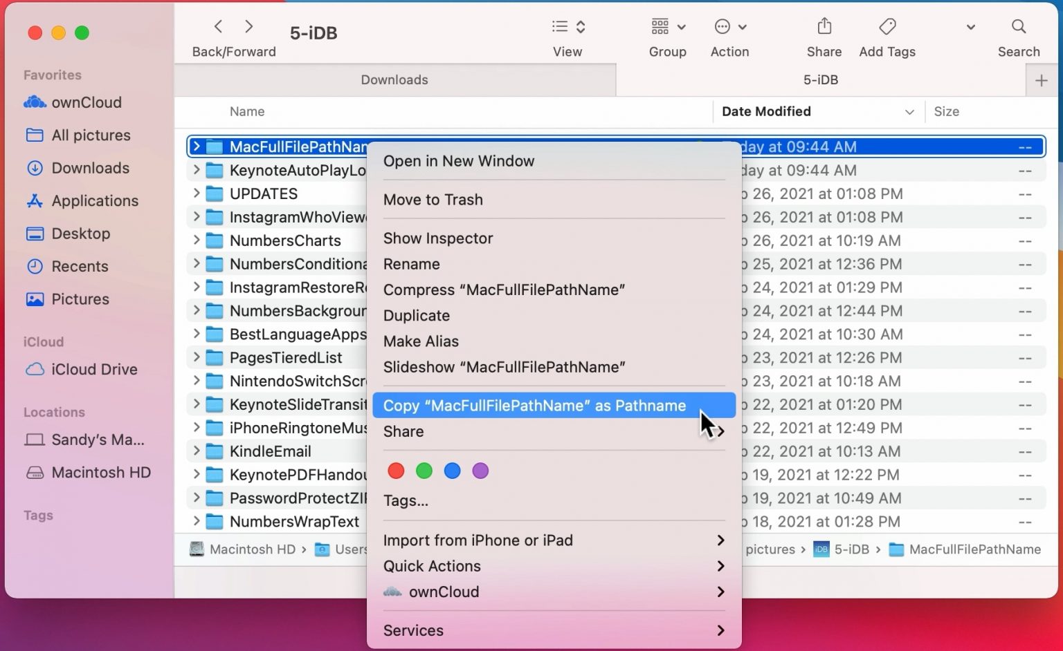
Alternatively, follow this
To load this particular data into R we need to use the read_parquet command from the arrow package, specifying the location and name of the file we are loading. See the following code:
2.8.4 Setting working directories
Using the setwd(<location>) you can specify where R will look by default for any datasets. In the example below, the dfe_data.xlsx will have been downloaded and stored in C:/Users/Peter/code. By running setwd("C:/Users/Peter/code") R will always look in that location when trying to load files, meaning that read_parquet(r"[C:/Users/Peter/code/PISA_2018_student_subset.parquet]") will be treated the same as read_parquet(r"[PISA_2018_student_subset.parquet]")
To work out what your current working directory is, you can use getwd().
2.8.5 Proper addresses
You might have found that you get an error if you don’t convert your backslashes \ into forwardslashes /. It’s common mistake and very annoying. In most programming languages a backslash signifies the start of a special command, for example \n signifies a newline.
With R there are three ways to get around the problem of backslashes in file locations, for the location:"C:\myfolder\" we could:
- replace them with forwardslashes (as shown above):
"C:/myfolder/" - replace them with double backslashes (the special character specified by two backslashes is one backslash!):
"C:\\myfolder\\" - use the inbuilt R command to deal with filenames:
r"[C:\myfolder\]"
2.8.6 .parquet files
For the majority of this workbook you will be using a cutdown version of the PISA_2018 student table. This dataset is huge and we have loaded it into R, selected fields we think are useful, converted column types to work with R and saved in the .parquet format. .parquet files are quick to load and small in size. To load an .parquet file you can use the read_parquet(<location>) command from the arrow package.
If you want to save out any of your findings, you can use write_parquet(<object>, <location>), where object is the table you are working on and location is where you want to save it.
2.8.7 .csv files
A very common way of distributing data is through .csv files. These files can be easily compressed and opened in common office spreadsheet tools such as Excel. To load a .csv we can use read_csv("<file_location>")
You might want to save your own work as a .csv for use later or for manipulation in another tool e.g. Excel. To do this we can use write_csv(<your_data>, "<your_folder><name>.csv"). NOTE: don’t forget to add .csv to the end of your “
2.9 Exploring data
Now that we have loaded the PISA_2018 dataset we can start to explore it.
You can check that the tables have loaded correctly by typing the object name and ‘running’ the line (control|command ⌘ and Enter)
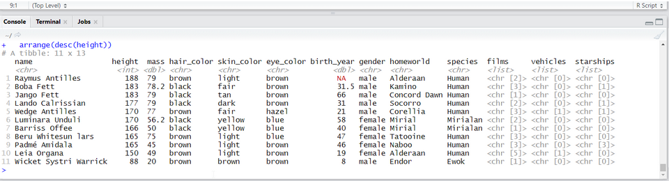
# A tibble: 612,004 × 205
   CNT     OECD  ISCEDL   ISCEDD ISCEDO PROGN WVARS…¹ COBN_F COBN_M COBN_S GRADE
 * <fct>   <fct> <fct>    <fct>  <fct>  <fct>   <dbl> <fct>  <fct>  <fct>  <fct>
 1 Albania No    ISCED l… C      Vocat… Alba…       3 Alban… Alban… Alban… 0
 2 Albania No    ISCED l… C      Vocat… Alba…       3 Alban… Alban… Alban… 0
 3 Albania No    ISCED l… C      Vocat… Alba…       3 Alban… Alban… Alban… 0
 4 Albania No    ISCED l… C      Vocat… Alba…       3 Alban… Alban… Alban… 0
 5 Albania No    ISCED l… C      Vocat… Alba…       3 Alban… Alban… Alban… 0
 6 Albania No    ISCED l… C      Vocat… Alba…       3 Alban… Alban… Alban… 0
 7 Albania No    ISCED l… C      Vocat… Alba…       3 Missi… Missi… Missi… 0
 8 Albania No    ISCED l… C      Vocat… Alba…       3 Alban… Alban… Alban… 0
 9 Albania No    ISCED l… C      Vocat… Alba…       3 Alban… Alban… Alban… 0
10 Albania No    ISCED l… C      Vocat… Alba…       3 Missi… Missi… Missi… 0
# … with 611,994 more rows, 194 more variables: SUBNATIO <fct>, STRATUM <fct>,
#   ESCS <dbl>, LANGN <fct>, LMINS <dbl>, OCOD1 <fct>, OCOD2 <fct>,
#   REPEAT <fct>, CNTRYID <fct>, CNTSCHID <dbl>, CNTSTUID <dbl>, NatCen <fct>,
#   ADMINMODE <fct>, LANGTEST_QQQ <fct>, LANGTEST_COG <fct>, BOOKID <fct>,
#   ST001D01T <fct>, ST003D02T <fct>, ST003D03T <fct>, ST004D01T <fct>,
#   ST005Q01TA <fct>, ST007Q01TA <fct>, ST011Q01TA <fct>, ST011Q02TA <fct>,
#   ST011Q03TA <fct>, ST011Q04TA <fct>, ST011Q05TA <fct>, ST011Q06TA <fct>, …
We can see from this that the tibble (another word for dataframe, basically a spreadsheet table) is 612004 rows, with 205 columns 5. This is data for all the students from around the world that took part in PISA 2018. The actual PISA dataset has many more columns than this, but for the examples here we have selected 205 of the more interesting data variables. The column names might seem rather confusing and you might want to refer to the PISA 2018 code book to find out what everything means.
The data shown in the console window is only the top few rows and first few columns. To see the whole table click on the Environment panel and the table icon ![]() to explore the table:
to explore the table:
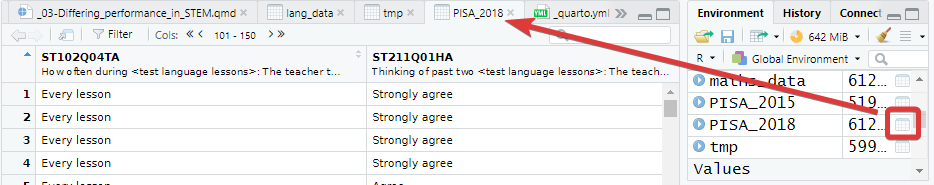
Alternatively, you can also hold down command ⌘|control and click on the table name in your R Script to view the table. You can also type View(<table_name>). Note: this has a capital “V”
In the table view mode you can read the label attached to each column, this will give you more detail about what the column stores. If you hover over columns it will display the label:
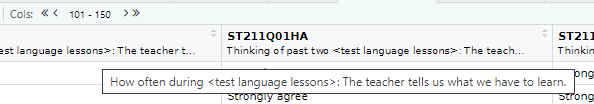
Alternatively, to read the full label of a column, the following code can be used:
[1] "How many books are there in your home?"Each view only shows you 50 columns, to see more use the navigation panel:
To learn more about loading data from in other formats, e.g. SPSS and STATA, look at the tidyverse documentation for haven.
The PISA_2018 dataframe is made up of multiple columns, with each column acting like a vector, which means each column stores values of only one datatype. If we look at the first four columns of the schools table, you can see the CNTSTUID, ESCS and PV1MATH columns are <dbl> (numeric) and the other three columns are of <fctr> (factor), a special datatype in R that helps store categorical and ordinal variables, see Section 2.11.2 for more information on how factors work.
# A tibble: 5 × 5
  CNTSTUID ST004D01T CNT       ESCS PV1MATH
     <dbl> <fct>     <fct>    <dbl>   <dbl>
1   800251 Male      Albania  0.675    490.
2   800402 Male      Albania -0.757    462.
3   801902 Female    Albania -2.51     407.
4   803546 Male      Albania -3.18     483.
5 804776 Male Albania -1.76 460.Vectors are data structures that bring together one or more data elements of the same datatype. E.g. we might have a numeric vector recording the grades of a class, or a character vector storing the gender of a set of students. To define a vector we use c(item, item, ...), where c stands for combine. Vectors are very important to R, even declaring a single object, x <- 6, is creating a vector of size one. To find out more about vectors see: Section 2.5.1
We can find out some general information about the table we have loaded. nrow and ncol tell you about the dimensions of the table
[1] 612004[1] 205If we want to know the names of the columns we can use the names() command that returns a vector. This can be a little confusing as it’ll return the names used in the dataframe, which can be hard to interpret, e.g. ST004D01T is PISA’s way of encoding gender. You might find the labels in the view of the table available through view(PISA_2018) and the Environment panel easier to navigate:
[1] "CNT" "OECD" "ISCEDL" "ISCEDD" "ISCEDO"
[6] "PROGN" "WVARSTRR" "COBN_F" "COBN_M" "COBN_S"
[11] "GRADE" "SUBNATIO" "STRATUM" "ESCS" "LANGN"
[16] "LMINS" "OCOD1" "OCOD2" "REPEAT" "CNTRYID"
[21] "CNTSCHID" "CNTSTUID" "NatCen" "ADMINMODE" "LANGTEST_QQQ"
[26] "LANGTEST_COG" "BOOKID" "ST001D01T" "ST003D02T" "ST003D03T"
[31] "ST004D01T" "ST005Q01TA" "ST007Q01TA" "ST011Q01TA" "ST011Q02TA"
[36] "ST011Q03TA" "ST011Q04TA" "ST011Q05TA" "ST011Q06TA" "ST011Q07TA"
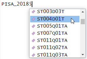
[ reached getOption("max.print") -- omitted 165 entries ]As mentioned, the columns in the tables are very much like a collection of vectors, to access these columns we can put a $ [dollar sign] after the name of a table. This allows us to see all the columns that table has, using the up and down arrows to select, press the Tab key to complete:
 [1] Male   Male   Female Male   Male   Female Female Male   Female Female
[11] Female Female Female Female Male   Female Male   Male   Male   Male
[21] Male   Male   Female Male   Male   Female Male   Female Male   Male
[31] Female Female Female Female Female Male   Male   Male   Male   Female
 [ reached getOption("max.print") -- omitted 611964 entries ]
attr(,"label")
[1] Student (Standardized) Gender
Levels: Female Male Valid Skip Not Applicable Invalid No Response
We can apply functions to the returned column/vector, for example: sum, mean, median, max, min, sd, round, unique, summary, length. To find all the different/unique values contained in a column we can write:
 [1] Albania                United Arab Emirates   Argentina
 [4] Australia              Austria                Belgium
 [7] Bulgaria               Bosnia and Herzegovina Belarus
[10] Brazil                 Brunei Darussalam      Canada
[13] Switzerland            Chile                  Colombia
[16] Costa Rica             Czech Republic         Germany
[19] Denmark                Dominican Republic     Spain
[22] Estonia                Finland                France
[25] United Kingdom         Georgia                Greece
[28] Hong Kong              Croatia                Hungary
[31] Indonesia              Ireland                Iceland
[34] Israel                 Italy                  Jordan
[37] Japan                  Kazakhstan             Korea
[40] Kosovo
 [ reached getOption("max.print") -- omitted 40 entries ]
82 Levels: Albania United Arab Emirates Argentina Australia Austria ... Vietnam
We can also combine commands, with length(<vector>) telling you how many items are in the unique(PISA_2018$CNT) command
You might meet errors when you try and run some of the commands because a field has missing data, recorded as NA. In the case below it doesn’t know what to do with the NA values in PV1MATH, so it gives up and returns NA:
You can see the NAs by just loking at this column:
 [1]  0.6747 -0.7566 -2.5112 -3.1843 -1.7557 -1.4855      NA -3.2481 -1.7174
[10]      NA -1.5617 -1.9952 -1.6790 -1.1337      NA      NA -1.0919 -1.2391
[19] -0.1641 -0.4510 -0.9622 -0.8303 -1.8772 -1.2963 -1.4784 -2.3759 -0.8440
[28] -1.2251      NA -2.4655 -1.2018 -0.4426 -1.4634 -2.1813 -1.9087 -1.7194
[37] -2.7486 -2.0457 -1.8321 -1.8647
 [ reached getOption("max.print") -- omitted 611964 entries ]
attr(,"label")
[1] "Index of economic, social and cultural status"
To get around this you can tell R to remove/ignore the NA values when performing maths calculations:
R’s inbuilt mode function doesn’t calculate the mathematical mode, instead it tells you what type of data you are dealing with. You can work out the mode of data by using the modeest package:
There is more discussion on how to use modes in R here
Calculations might also be upset when you try to perform maths on a column that is stored as another datatype. For example if you wanted to work out the mean common number of minutes spent learning the language that the PISA test was sat in, e.g. number of hours of weekly English lessons in England:
Looking at the structure of this column, we can see it is stored as a factor, not as a numeric
 num [1:612004] 90 180 90 90 400 150 NA NA 180 NA ...
 - attr(*, "label")= chr "Learning time (minutes per week) - <test language>"
So we need to change the type of the column to make it work with the mean command, changing it to as.numeric(<column>) for the calculation, for more details on datatypes, see Section 2.5.
# this isn't ideal for proper analysis as you will need to remove all the "No Response" data
mean(as.numeric(PISA_2018$LMINS), na.rm = TRUE)
[1] 223.747To get a good overview of what a table contains, you can use the str(<table_name>) and summary(<table_name>) commands.
2.9.1 Questions
Using the PISA_2018 dataset:
- use the Environment window to view the dataset, what is the name and the label of the 100th column?
answer
# the 100th column is ST102Q02TA
# the label is: "How often during <test language lessons>: The teacher asks questions to check whether we have understood what was taught"

# you could use View() instead of the environment window, note the capital V
View(PISA_2018)
# use could use the vector subset to fetch the 100th name
names(PISA_2018)[100]

# you could use the attr function to find the label
attr(PISA_2018$ST102Q02TA, "label")
# or using the dollar sign to load this field will also give the label
PISA_2018$ST102Q02TA- Use the dollar sign
$to return the columnST004D01T. What is stored in this column?
answer
# Student (Standardized) Gender
PISA_2018$ST004D01T

#  [1] Male   Male   Female Male   Male   Female Female Male   Female Female
# [11] Female Female Female Female Male   Female Male   Male   Male   Male
# [21] Male   Male   Female Male   Male   Female Male   Female Male   Male
# [31] Female Female Female Female Female Male   Male   Male   Male   Female
#  [ reached getOption("max.print") -- omitted 611964 entries ]
# attr(,"label")
# [1] Student (Standardized) Gender
# Levels: Female Male Valid Skip Not Applicable Invalid No Response- How many students results are in the whole table?
- What
uniquevalues does the dataset hold for Mother’s occupationOCOD1and Father’s occupationOCOD2? Which is larger?
- What are the
maximum,mean,medianandminumum science gradesPV1SCIEachieved by any student
- Explore the dataset and makes notes about the range of values of 2 other columns
2.10 Piping and dplyr
Piping allows us to break down complex tasks into manageable chunks that can be written and tested one after another. There are several powerful commands in the tidyverse as part of the dplyr package that can help us group, filter, select, mutate and summarise datasets. With this small set of commands we can use piping to convert massive datasets into simple and useful results.
Using the pipe %>% command, we can feed the results from one command into the next command making for reusable and easy to read code.

The pipe command we are using %>% is from the magrittr package which is installed alongside the tidyverse. Recently R introduced another pipe |> which offers very similar functionality and tutorials online might use either. The examples below use the %>% pipe.
Let’s look at an example of using the pipe on the PISA_2018 table to calculate the best performing OECD countries for maths PV1MATH by gender ST004D01T:
PISA_2018 %>%
  filter(OECD == "Yes") %>%
  group_by(CNT, ST004D01T) %>%
  summarise(mean_maths = mean(PV1MATH, na.rm=TRUE),
            sd_maths = sd(PV1MATH, na.rm=TRUE),
            students = n()) %>%
  filter(!is.na(ST004D01T)) %>%
  arrange(desc(mean_maths))
# A tibble: 74 × 5
# Groups: CNT [37]
CNT ST004D01T mean_maths sd_maths students
<fct> <fct> <dbl> <dbl> <int>
1 Japan Male 533. 90.5 2989
2 Korea Male 530. 102. 3459
3 Estonia Male 528. 85.0 2665
4 Japan Female 523. 82.2 3120
5 Korea Female 523. 96.0 3191
6 Switzerland Male 520. 92.7 3033
7 Estonia Female 519. 76.0 2651
8 Czech Republic Male 518. 98.0 3501
9 Belgium Male 518. 95.9 4204
10 Poland Male 517. 91.8 2768
# … with 64 more rows- line 1 passes the whole
PISA_2018dataset and pipes it into the next line%>% - line 2
filtersout any results that are from non-OECD countries by finding all the rows whereOECDequals==“Yes”, this is then piped to the next line - line 3 groups the data by country
CNTand by student genderST004D01T, this is then piped to the next line - line 4-6 the
summarisecommand performs a calculation on the country and gender groupings returning three new columns, each command on a new line and separated by a comma: the mean value for mathsmean_maths, the standard deviationsd_mathsand a column telling us how many students were in each grouping using then()which returns the number of rows in a group. These new columns and the grouping columns are then piped to the next line - line 7 filters out any gender
ST004D01Tthat isNA. First is finds all the students that haveNAas their gender by usingis.na(ST004D01T), then is NOTs/flips the result using the exclamation mark!, giving those students who don’t have their gender set toNA. The filtered data is then piped to the next line - line 8, finally we
arrange/ sort the results indescending order by themean_mathscolumn. The default for arrange is ascending order, leave out thedesc( )for the numbers to be ordered in the opposite way.
Males get a slightly better maths score than Females for this PV1MATH score, other scores are available, please read Section 15.1.4.1 to find out more about the limitations of using this value.
we met the assignment command earlier <-. Within the tidyverse commands we use the equals sign instead =.
The commands we have just used come from a package within the tidyverse called dplyr, let’s take a look at what they do:
| command | purpose | example |
|---|---|---|
| select | reduce the dataframe to the fields that you specify | select(<field>, <field>, <field>) |
| filter | get rid of rows that don’t meet one or more criteria | filter(<field> <comparison>) |
| group | group fields together to perform calculations | group_by(<field>, <field>)) |
| mutate | add new fields or change values in current fields | mutate(<new_field> = <field> / 2) |
| summarise | create summary data optionally using a grouping command | summarise(<new_field> = max(<field>)) |
| arrange | order the results by one or more fields | arrange(desc(<field>)) |
If you want to explore more of the functions of dplyr, take a look at the helpsheet
Adjust the code above to find out the lowest performing countries for reading PV1READ by gender that are not in the OECD
2.10.1 select
The PISA_2018 dataset has far too many fields, to reduce the number of fields to focus on just a few of them we can use select
# A tibble: 612,004 × 4
   CNT       ESCS ST004D01T ST003D02T
   <fct>    <dbl> <fct>     <fct>
 1 Albania  0.675 Male      February
 2 Albania -0.757 Male      July
 3 Albania -2.51  Female    April
 4 Albania -3.18  Male      April
 5 Albania -1.76  Male      March
 6 Albania -1.49  Female    February
 7 Albania NA     Female    July
 8 Albania -3.25  Male      August
 9 Albania -1.72  Female    March
10 Albania NA     Female    July
# … with 611,994 more rows
You might also be in the situation where you want to select everything but one or two fields, you can do this with the negative signal -:
# A tibble: 612,004 × 203
   ISCEDL ISCEDD ISCEDO PROGN WVARS…¹ COBN_F COBN_M COBN_S GRADE SUBNA…² STRATUM
   <fct>  <fct>  <fct>  <fct>   <dbl> <fct>  <fct>  <fct>  <fct> <fct>   <fct>
 1 ISCED… C      Vocat… Alba…       3 Alban… Alban… Alban… 0     Albania ALB - …
 2 ISCED… C      Vocat… Alba…       3 Alban… Alban… Alban… 0     Albania ALB - …
 3 ISCED… C      Vocat… Alba…       3 Alban… Alban… Alban… 0     Albania ALB - …
 4 ISCED… C      Vocat… Alba…       3 Alban… Alban… Alban… 0     Albania ALB - …
 5 ISCED… C      Vocat… Alba…       3 Alban… Alban… Alban… 0     Albania ALB - …
 6 ISCED… C      Vocat… Alba…       3 Alban… Alban… Alban… 0     Albania ALB - …
 7 ISCED… C      Vocat… Alba…       3 Missi… Missi… Missi… 0     Albania ALB - …
 8 ISCED… C      Vocat… Alba…       3 Alban… Alban… Alban… 0     Albania ALB - …
 9 ISCED… C      Vocat… Alba…       3 Alban… Alban… Alban… 0     Albania ALB - …
10 ISCED… C      Vocat… Alba…       3 Missi… Missi… Missi… 0     Albania ALB - …
# … with 611,994 more rows, 192 more variables: ESCS <dbl>, LANGN <fct>,
#   LMINS <dbl>, OCOD1 <fct>, OCOD2 <fct>, REPEAT <fct>, CNTRYID <fct>,
#   CNTSCHID <dbl>, CNTSTUID <dbl>, NatCen <fct>, ADMINMODE <fct>,
#   LANGTEST_QQQ <fct>, LANGTEST_COG <fct>, BOOKID <fct>, ST001D01T <fct>,
#   ST003D02T <fct>, ST003D03T <fct>, ST004D01T <fct>, ST005Q01TA <fct>,
#   ST007Q01TA <fct>, ST011Q01TA <fct>, ST011Q02TA <fct>, ST011Q03TA <fct>,
#   ST011Q04TA <fct>, ST011Q05TA <fct>, ST011Q06TA <fct>, ST011Q07TA <fct>, …
You might find that you have a vector of column names that you want to select, to do this, we can use the any_of command:
# A tibble: 612,004 × 3
   CNTSTUID CNTSCHID ST004D01T
      <dbl>    <dbl> <fct>
 1   800251   800002 Male
 2   800402   800002 Male
 3   801902   800002 Female
 4   803546   800002 Male
 5   804776   800002 Male
 6   804825   800002 Female
 7   804983   800002 Female
 8   805287   800002 Male
 9   805601   800002 Female
10   806295   800002 Female
# … with 611,994 more rows
With hundreds of fields, you might want to focus on fields whose names match a certain pattern, to do this you can use starts_with, ends_with, contains:
# A tibble: 612,004 × 19
ST011Q16NA ST012Q05NA ST012…¹ ST012…² ST125…³ ST060…⁴ ST061…⁵ IC009…⁶ IC009…⁷
<fct> <fct> <fct> <fct> <fct> <dbl> <fct> <fct> <fct>
1 Yes <NA> One One 6 year… 31 45 Yes, a… No
2 Yes Three or … One None 4 years 37 45 No Yes, b…
3 No One None None 4 years NA 45 Yes, a… Yes, a…
4 No <NA> None One 1 year… 31 45 Yes, a… No
5 No One One None 3 years 80 100 Yes, a… Yes, a…
6 No Three or … One None 6 year… 24 25 Yes, a… Yes, a…
7 <NA> <NA> <NA> <NA> <NA> NA <NA> <NA> <NA>
8 No None None None 1 year… NA 45 <NA> <NA>
9 Yes Three or … One One 4 years 36 45 Yes, a… Yes, a…
10 <NA> <NA> <NA> <NA> <NA> NA <NA> <NA> <NA>
# … with 611,994 more rows, 10 more variables: IC009Q07NA <fct>,
# IC009Q10NA <fct>, IC009Q11NA <fct>, IC008Q07NA <fct>, IC008Q13NA <fct>,
# IC010Q02NA <fct>, IC010Q05NA <fct>, IC010Q06NA <fct>, IC010Q09NA <fct>,
# IC010Q10NA <fct>, and abbreviated variable names ¹ST012Q06NA, ²ST012Q09NA,
# ³ST125Q01NA, ⁴ST060Q01NA, ⁵ST061Q01NA, ⁶IC009Q05NA, ⁷IC009Q06NAWhen you come to building your statistical models you often need to use numeric data, you can find the columns that have only numbers in them by the following. Be warned though, sometimes there are numeric fields which have a few words in them, so R treats them as characters. Use the PISA codebook to help work out where those numbers are.
 [1] "WVARSTRR"   "ESCS"       "LMINS"      "CNTSCHID"   "CNTSTUID"
 [6] "ST060Q01NA" "MMINS"      "SMINS"      "TMINS"      "CULTPOSS"
[11] "WEALTH"     "PV1MATH"    "PV1READ"    "PV1SCIE"    "ATTLNACT"
[16] "BELONG" "DISCLIMA" If you do want to change the type of a column to numeric you are going to neeed to:
-
filterout the offending rows, and -
mutatethe column to be numeric:col = as.numeric(col)
2.10.1.1 Questions
- Spot the three errors with the following
selectstatement
- Write a
selectstatement to display the monthST003D02Tand year of birthST003D03Tand the genderST004D01Tof each student.
- Write a
selectstatement to show all the fields that are to do with digital skills, e.g.IC150Q01HA
- [EXTENSION] Adjust the answer to Q3 so that you select the gender
ST004D01Tand the IDCNTSTUIDof each student in addition to theIC15____fields
2.10.2 filter
Not only does the PISA_2018 dataset have a huge number of columns, it has hundred of thousands of rows. We want to filter this down to the students that we are interested in, i.e. filter out data that isn’t useful for our analysis. If we only wanted the results that were Male, we could do the following:
# A tibble: 307,044 × 5
   CNT       ESCS ST004D01T ST003D02T PV1MATH
   <fct>    <dbl> <fct>     <fct>       <dbl>
 1 Albania  0.675 Male      February     490.
 2 Albania -0.757 Male      July         462.
 3 Albania -3.18  Male      April        483.
 4 Albania -1.76  Male      March        460.
 5 Albania -3.25  Male      August       441.
 6 Albania NA     Male      March        280.
 7 Albania -1.09  Male      March        523.
 8 Albania -1.24  Male      June         314.
 9 Albania -0.164 Male      August       428.
10 Albania -0.451 Male      December     369.
# … with 307,034 more rows
We can combine filter commands to look for Males born in September and where the PV1MATH figure is greater than 750. We can list multiple criteria in the filter by separating the criteria with commas, using commas mean that all of these criteria need to be TRUE for a row to be returned. A comma in a filter is the equivalent of an AND, :
PISA_2018 %>%
  select(CNT, ESCS, ST004D01T, ST003D02T, PV1MATH) %>%
  filter(ST004D01T == "Male",
         ST003D02T == "September",
         PV1MATH > 750)
# A tibble: 56 × 5
CNT ESCS ST004D01T ST003D02T PV1MATH
<fct> <dbl> <fct> <fct> <dbl>
1 United Arab Emirates 0.861 Male September 760.
2 Belgium 0.887 Male September 751.
3 Bulgaria -0.160 Male September 752.
4 Canada 1.38 Male September 751.
5 Canada 1.16 Male September 760.
6 Canada 0.760 Male September 770.
7 Switzerland 0.814 Male September 783.
8 Germany 0.740 Male September 762.
9 Spain 1.46 Male September 787.
10 Estonia 0.897 Male September 752.
# … with 46 more rowsYou can also write it as an ampersand &
Remember to include the == sign when looking to filter on equality; additionally, you can use != (not equals), >=, <=, >, <.
Remember matching is case sensitive, “june” != “June”
Rather than just looking at September born students, we want to find all the students born in the Autumn term. But if we add a couple more criteria on ST003D02T nothing is returned!
PISA_2018 %>%
  select(CNT, ESCS, ST004D01T, ST003D02T, PV1MATH) %>%
  filter(ST004D01T == "Male",
         ST003D02T == "September",
         ST003D02T == "October",
         ST003D02T == "November",
         ST003D02T == "December",
         PV1MATH > 750)
# A tibble: 0 × 5
# … with 5 variables: CNT <fct>, ESCS <dbl>, ST004D01T <fct>, ST003D02T <fct>,
# PV1MATH <dbl>The reason is R is looking for inidividual students born in September AND October AND November AND December. As a student can only have one birth month there are no students that meet this criteria. We need to use OR :
To create an OR in a filter we use the bar | character, the below looks for all students who are “Male” AND were born in “September” OR “October” OR “November” OR “December”, AND have a PV1MATH > 750.
PISA_2018 %>%
  select(CNT, ESCS, ST004D01T, ST003D02T, PV1MATH) %>%
  filter(ST004D01T == "Male",
         (ST003D02T == "September" | ST003D02T == "October" | ST003D02T == "November" | ST003D02T == "December"),
         PV1MATH > 750)
# A tibble: 175 × 5
CNT ESCS ST004D01T ST003D02T PV1MATH
<fct> <dbl> <fct> <fct> <dbl>
1 Albania 0.539 Male October 789.
2 United Arab Emirates 0.861 Male September 760.
3 United Arab Emirates 0.813 Male October 753.
4 United Arab Emirates 0.953 Male November 766.
5 United Arab Emirates 0.930 Male November 773.
6 United Arab Emirates 1.44 Male October 752.
7 Australia 1.73 Male December 756.
8 Australia -0.0537 Male October 827.
9 Australia 1.18 Male November 758.
10 Australia 1.13 Male October 757.
# … with 165 more rowsIt’s neater, maybe, to use the %in% command, which checks to see if the value in a column is present in a vector, this can mimic the OR/| command:
When building filters you need to know the range of values that a column can take, we can do this in several ways:
 [1] "0-10 books"          "11-25 books"         "26-100 books"
 [4] "101-200 books"       "201-500 books"       "More than 500 books"
 [7] "Valid Skip"          "Not Applicable"      "Invalid"
[10] "No Response"
# show the actual unique values in a field
# this might be a slightly smaller set of values
unique(PISA_2018$ST013Q01TA)[1] 0-10 books 11-25 books <NA>
[4] 26-100 books 101-200 books More than 500 books
[7] 201-500 books
10 Levels: 0-10 books 11-25 books 26-100 books 101-200 books ... No Response[1] "How many books are there in your home?"2.10.2.1 Questions
- Spot the three errors with the following
selectstatement
- Use
filterto find all the students withThree or morecars in their homeST012Q02TA. How does this compare to those with noNonecars?
- Adjust your code in Q2. to find the number of students with
Three or morecars in their homeST012Q02TAinItaly, how does this compare withSpain?
- Write a
filterto create a table for the number ofFemalestudents with readingPV1READscores lower than 400 in theUnited Kingdom, store the result asread_low_female, repeat but forMalestudents and store asread_low_male. Usenrow()to work out if there are more males or females with a low reading score in the UK
answer
read_low_female <- PISA_2018 %>%
  filter(CNT == "United Kingdom",
         PV1READ < 400,
         ST004D01T == "Female")

read_low_male <- PISA_2018 %>%
  filter(CNT == "United Kingdom",
         PV1READ < 400,
         ST004D01T == "Male")

nrow(read_low_female)
nrow(read_low_male)

# You could also pipe the whole dataframe into nrow()
PISA_2018 %>%
  filter(CNT == "United Kingdom",
         PV1READ < 400,
         ST004D01T == "Female") %>%
nrow()- How many students in the United Kingdom had no television
ST012Q01TAOR no connection to the internetST011Q06TA. HINT: uselevels(PISA_2018$ST012Q01TA)to look at the levels available for each column.
- Which countr[y|ies] had students with
NAfor Gender?
2.10.3 renaming columns
Very often when dealing with datasets such as PISA or TIMSS, the column names can be very confusing without a reference key, e.g. ST004D01T, BCBG10B and BCBG11. To rename columns in the tidyverse we use the rename(<new_name> = <old_name>) command. For example, if you wanted to rename the rather confusing student column for gender, also known as ST004D01T, and the column for having a dictionary at home, also known as ST011Q12TA, you could use:
PISA_2018 %>%
  rename(gender = ST004D01T,
         dictionary = ST011Q12TA) %>%
  select(CNT, gender, dictionary) %>%
  summary()
CNT gender dictionary
Spain : 35943 Female :304958 Yes :524311
Canada : 22653 Male :307044 No : 66730
Kazakhstan : 19507 Valid Skip : 0 Valid Skip : 0
United Arab Emirates: 19277 Not Applicable: 0 Not Applicable: 0
Australia : 14273 Invalid : 0 Invalid : 0
Qatar : 13828 No Response : 0 No Response : 0
(Other) :486523 NA's : 2 NA's : 20963 If you want to change the name of the column so that it stays when you need to perform another calculation, remember to assign the renamed dataframe back to the original dataframe. But be warned, you’ll need to reload the full dataset to restore the original names:
2.10.4 group_by and summarise
So far we have looked at ways to return rows that meet certain criteria. Using group_by and summarise we can start to analyse data for different groups of students. For example, let’s look at the number of students who don’t have internet connections at home ST011Q06TA:
# A tibble: 3 × 2
  ST011Q06TA student_n
  <fct>          <int>
1 Yes           543010
2 No             49703
3 <NA> 19291- Line 1 passes the full
PISA_2018to the pipe - Line 2 makes groups within
PISA_2018using the unique values ofST011Q06TA - Line 3, these groups are then passed to
summarise, which creates a new column calledstudent_nand stores the number of rows in eachST011Q06TAgroup using then()command.summariseonly returns the columns it creates, or are in thegroup_by, everything else is discarded.
What we might want to do is look at this data from a country by country perspective, by adding another field to the group_by() command, we then group by the unique combination of countries CNT and internet access ST011Q06TA, e.g. Albania+Yes; Albania+No; Albania+NA; Brazil+Yes; etc
int_by_cnt <- PISA_2018 %>%
  group_by(CNT, ST011Q06TA) %>%
  summarise(student_n = n())

print(int_by_cnt)
# A tibble: 240 × 3
# Groups: CNT [80]
CNT ST011Q06TA student_n
<fct> <fct> <int>
1 Albania Yes 5059
2 Albania No 1084
3 Albania <NA> 216
4 United Arab Emirates Yes 17616
5 United Arab Emirates No 949
6 United Arab Emirates <NA> 712
7 Argentina Yes 9871
8 Argentina No 1781
9 Argentina <NA> 323
10 Australia Yes 12547
# … with 230 more rowssummarise can also be used to work out statistics by grouping. For example, if you wanted to find out the max, mean and min science grade PV1SCIE by country CNT, you could do the following:
PISA_2018 %>%
  group_by(CNT) %>%
  summarise(sci_max  = max(PV1SCIE,  na.rm = TRUE),
            sci_mean = mean(PV1SCIE, na.rm = TRUE),
            sci_min  = min(PV1SCIE,  na.rm = TRUE))
# A tibble: 80 × 4
CNT sci_max sci_mean sci_min
<fct> <dbl> <dbl> <dbl>
1 Albania 674. 417. 166.
2 United Arab Emirates 778. 425. 86.3
3 Argentina 790. 418. 138.
4 Australia 879. 502. 153.
5 Austria 779. 493. 175.
6 Belgium 764. 502. 196.
7 Bulgaria 741. 426. 145.
8 Bosnia and Herzegovina 664. 398. 152.
9 Belarus 799. 474. 192.
10 Brazil 747. 407. 95.6
# … with 70 more rowsgroup_by() can have unintended consequences in your code if you are saving your pipes to new dataframes. To be safe your can clear any grouping by adding: my_data %>% ungroup()
2.10.4.1 Questions
- Spot the three errors with the following
summarisestatement
- Write a
group_byandsummarisestatement to work out themeanandmediancultural capital valueESCSfor each student by countryCNT
- Using
summarisework out,YesorNo, by countryCNTand genderST004D01T, whether students “reduce the energy I use at home […] to protect the environment.”ST222Q01HA. Filter out anyNAvalues onST222Q01HA:
2.10.5 mutate
Sometimes you will want to adjust the values stored in a field, e.g. converting a distance in miles into kilometres; or compute a new fields based on other fields, e.g. working out a total grade given the parts of a test. To do this we can use mutate. Unlike summarise, mutate retains all the other columns either adding a new column or changing an existing one
mutate(<field> = <field_calculation>)
The PISA_2018 dataset has results for maths PV1MATH, science PV1SCIE and reading PV1READ. We could combine these to create an overall PISA_grade, and PISA_mean:
PISA_2018 %>%
  mutate(PV1_total = PV1MATH + PV1SCIE + PV1READ,
         PV1_mean = PV1_total/3) %>%
  select(CNT, ESCS, PV1_total, PV1_mean)
# A tibble: 612,004 × 4
CNT ESCS PV1_total PV1_mean
<fct> <dbl> <dbl> <dbl>
1 Albania 0.675 1311. 437.
2 Albania -0.757 1319. 440.
3 Albania -2.51 1158. 386.
4 Albania -3.18 1424. 475.
5 Albania -1.76 1094. 365.
6 Albania -1.49 1004. 335.
7 Albania NA 1311. 437.
8 Albania -3.25 1104. 368.
9 Albania -1.72 1268. 423.
10 Albania NA 1213. 404.
# … with 611,994 more rows- line 2
mutatecreates a new field calledPV1_totalmade up by adding together the columns for maths, science and reading. Each column acts like a vector and adding them together is the equivalent of adding each students individual grades together, row by row. See Section 2.5.1 for more details on vector addition. - line 3 inside the same
mutatestatement, we take thePV1_totalcalculated on line 2 and divide it by 3, to give us a mean value, this is then assigned to a new column,PV1_mean. - line 4 this line
selects only the fields that we are interested in, dropping the others
We can use mutate to create subsets of data in fields. For example, if we wanted to see how many students in each country were high performing readers, specified by getting a reading grade of greater than 550, we could do the following:
PISA_2018 %>%
  mutate(PV1READ_high = PV1READ > 550) %>%
  group_by(CNT, PV1READ_high) %>%
  summarise(n = n())
# A tibble: 159 × 3
# Groups: CNT [80]
CNT PV1READ_high n
<fct> <lgl> <int>
1 Albania FALSE 6083
2 Albania TRUE 276
3 United Arab Emirates FALSE 16567
4 United Arab Emirates TRUE 2710
5 Argentina FALSE 11003
6 Argentina TRUE 972
7 Australia FALSE 9311
8 Australia TRUE 4962
9 Austria FALSE 4900
10 Austria TRUE 1902
# … with 149 more rowsComparisons can also be made between different columns, if we wanted to find out the percentage of Males and Females that got a better grade in their maths test PV1MATH than in their reading test PV1READ:
PISA_2018 %>%
  mutate(maths_better = PV1MATH > PV1READ) %>%
  select(CNT, ST004D01T, maths_better, PV1MATH, PV1READ) %>%
  filter(!is.na(ST004D01T), !is.na(maths_better)) %>%
  group_by(ST004D01T) %>%
  mutate(students_n = n()) %>%
  group_by(ST004D01T, maths_better) %>%
  summarise(n = n(),
            per = n/unique(students_n))
# A tibble: 4 × 4
# Groups: ST004D01T [2]
ST004D01T maths_better n per
<fct> <lgl> <int> <dbl>
1 Female FALSE 176021 0.583
2 Female TRUE 126157 0.417
3 Male FALSE 110269 0.362
4 Male TRUE 194178 0.638- line 2
mutatecreates a new field calledmaths_bettermade up by comparing thePV1MATHgrade withPV1READand creating a boolean/logical vector for the column. - line 3
selects a subset of the columns - line 4
filters out any students that don’t have gender dataST004D01T, or where the calculation on line 2 failed, i.e.PV1MATHorPV1READwasNA - line 5
groupon the gender of the student - line 6 using the
groupon line 5, usemutateto calculate the total number of Males and Females by looking for the number of rows in each groupn(), store this asstudents_n - line 7 re-
groupthe data on genderST004D01Tand whether the student is better at maths than readingmaths_better - line 8 count the number of students,
nin each group, as specified by line 7. - line 9 create a percentage figure for the number of students in each grouping given by line 7. Use the
nvalue from line 8 and thestudents_nvalue from line 6. NOTE: we need to useunique(students_n)to return just one value for each grouping rather than a value for every row of the line 7 grouping
For more information on how to mutate fields using ifelse, see Section 2.11.1
2.10.6 arrange
The results returned by pipes can be huge, so it’s a good idea to store them in objects and explore them in the Environment window where you can sort and search within the output. There might also be times when you want to order/arrange the outputs in a particular way. We can do this quite easily in the tidyverse by using the arrange(<column_name>, <column_name>) function.
# A tibble: 612,004 × 3
   CNT             ST004D01T PV1MATH
   <fct>           <fct>       <dbl>
 1 Philippines     Female       24.7
 2 Jordan          Male         51.0
 3 Jordan          Female       61.6
 4 Mexico          Female       64.3
 5 Kazakhstan      Male         70.4
 6 Jordan          Male         70.7
 7 Bulgaria        Male         73.4
 8 Kosovo          Male         76.0
 9 North Macedonia Female       78.3
10 North Macedonia Male         81.2
# … with 611,994 more rows
If we’re interested in the highest achieving students we can add the desc() function to arrange:
# A tibble: 612,004 × 4
   CNT                  LANGN                  ST004D01T PV1MATH
   <fct>                <fct>                  <fct>       <dbl>
 1 Canada               Another language (CAN) Male         888.
 2 Canada               Another language (CAN) Male         874.
 3 United Arab Emirates English                Male         865.
 4 B-S-J-Z (China)      Mandarin               Female       864.
 5 Australia            English                Male         863.
 6 B-S-J-Z (China)      Mandarin               Male         861.
 7 Serbia               Serbian                Male         860.
 8 Singapore            Invalid                Female       849.
 9 Australia            Cantonese              Male         845.
10 Canada               French                 Female       842.
# … with 611,994 more rows
2.10.7 Bring everyting together
We know that the evidence strongly indicates that repeating a year is not good for student progress, but how do countries around the world differ in terms of the percentage of their students who repeat a year?
data_repeat <- PISA_2018 %>%
  filter(!is.na(REPEAT)) %>%
  group_by(CNT) %>%
  mutate(total = n()) %>%
  select(CNT, REPEAT, total) %>%
  group_by(CNT, REPEAT) %>%
  summarise(student_n = n(),
            total = unique(total),
            per = student_n / unique(total)) %>%
  filter(REPEAT == "Repeated a  grade") %>%
  arrange(desc(per))

print(data_repeat)

write_csv(data_repeat, "<folder_location>/repeat_a_year.csv")
# A tibble: 77 × 5
# Groups: CNT [77]
CNT REPEAT student_n total per
<fct> <fct> <int> <int> <dbl>
1 Morocco Repeated a grade 3333 6666 0.5
2 Colombia Repeated a grade 2746 7185 0.382
3 Lebanon Repeated a grade 1580 4756 0.332
4 Uruguay Repeated a grade 1657 5049 0.328
5 Luxembourg Repeated a grade 1655 5168 0.320
6 Dominican Republic Repeated a grade 1694 5474 0.309
7 Brazil Repeated a grade 3227 10438 0.309
8 Macao Repeated a grade 1135 3773 0.301
9 Belgium Repeated a grade 2351 8089 0.291
10 Costa Rica Repeated a grade 1904 6571 0.290
# … with 67 more rows- Line 2,
filterout anyNAvalues in theREPEATfield - Line 3, group on the country of student
CNT - Line 4, create a new column
totalfor total number of rowsn()in each countryCNTgrouping - Line 5, select on the
CNT,REPEATandtotalcolumns - Line 6, regroup the data on country
CNTand whether a student has repeated a yearREPEAT, i.e. Albania+Did not repeat a grade; Albania+Repeated a grade; etc. - Line 7, using the above grouping, count the number of rows in each group
n()and assign this tostudent_n - Line 8, for each grouping keep the
totalnumber of students in each country, as calculated on line 4. Note:unique(total)is needed here to return a single value oftotal, rather than a value for each student in each country - Line 9, using
student_nfrom line 7 and the number of students per countrytotal, from line 4, create a percentageperfor each grouping - Line 10, as we have percentages for both
Repeated a gradeandDid not repeat a grade, we only need to display one of these. Note: that there is an extra space in this - Line 11, finally, we sort the data on the per/percentage column, to show the countries with the highest level of repeating a grade. This data is self-recorded by students, so might not be totally reliable!
- Line 15, save the data to your own folder as a csv
2.11 Advanced topics
2.11.1 Recoding data (ifelse)
Often we want to plot values in groupings that don’t yet exist, for example might want to give all schools over a certain size a different colour from others schools, or flag up students who have a different home language to the language that is being taught in school. To do this we need to look at how we can recode values. A common way to recode values is through an ifelse statement:
ifelse(<statement(s)>, <value_if_true>, <value_if_false>)
ifelse allows us to recode the data. In the example below, we are going to add a new column to the PISA_2018 dataset (using mutate) noting whether a student got a higher grade in their Maths PV1MATH or Reading PV1READ tests. if PV1MATH is bigger then PV1READ, the maths_better is TRUE, else maths_better is FALSE, or in dplyr format:
maths_data <- PISA_2018 %>%
  mutate(maths_better =
           ifelse(PV1MATH > PV1READ,
                  TRUE,
                  FALSE)) %>%
  select(CNT, ST004D01T, maths_better, PV1MATH, PV1READ)

print(maths_data)
# A tibble: 612,004 × 5
CNT ST004D01T maths_better PV1MATH PV1READ
<fct> <fct> <lgl> <dbl> <dbl>
1 Albania Male TRUE 490. 376.
2 Albania Male TRUE 462. 434.
3 Albania Female TRUE 407. 359.
4 Albania Male TRUE 483. 425.
5 Albania Male TRUE 460. 306.
6 Albania Female TRUE 367. 352.
7 Albania Female FALSE 411. 413.
8 Albania Male TRUE 441. 271.
9 Albania Female TRUE 506. 373.
10 Albania Female FALSE 412. 412.
# … with 611,994 more rowsWe now take this new dataset maths_data and look at whether the difference between relative performance in maths and reading is the same for girls and boys:
maths_data %>%
  filter(!is.na(ST004D01T), !is.na(maths_better)) %>%
  group_by(ST004D01T, maths_better) %>%
  summarise(n = n())
# A tibble: 4 × 3
# Groups: ST004D01T [2]
ST004D01T maths_better n
<fct> <lgl> <int>
1 Female FALSE 176021
2 Female TRUE 126157
3 Male FALSE 110269
4 Male TRUE 194178Adjust the code above to work out the percentages of Males and Females ST004D01T in each group. Check to see if the pattern also exists between science PV1SCIE and reading PV1READ:
adding percentage column
PISA_2018 %>%
  mutate(maths_better =
           ifelse(PV1MATH > PV1READ,
                  TRUE,
                  FALSE)) %>%
  select(CNT, ST004D01T, maths_better, PV1MATH, PV1READ) %>%
  filter(!is.na(ST004D01T), !is.na(maths_better)) %>%
  group_by(ST004D01T) %>%
  mutate(students_n = n()) %>%
  group_by(ST004D01T, maths_better) %>%
  summarise(n = n(),
            per = n/unique(students_n))
comparing science and reading
PISA_2018 %>%
  mutate(sci_better =
           ifelse(PV1SCIE > PV1READ,
                  TRUE,
                  FALSE)) %>%
  select(CNT, ST004D01T, sci_better, PV1SCIE, PV1READ) %>%
  filter(!is.na(ST004D01T), !is.na(sci_better)) %>%
  group_by(ST004D01T) %>%
  mutate(students_n = n()) %>%
  group_by(ST004D01T, sci_better) %>%
  summarise(n = n(),
            per = n/unique(students_n))
comparing science and maths
PISA_2018 %>%
  mutate(sci_better =
           ifelse(PV1SCIE > PV1MATH,
                  TRUE,
                  FALSE)) %>%
  select(CNT, ST004D01T, sci_better, PV1SCIE, PV1MATH) %>%
  filter(!is.na(ST004D01T), !is.na(sci_better)) %>%
  group_by(ST004D01T) %>%
  mutate(students_n = n()) %>%
  group_by(ST004D01T, sci_better) %>%
  summarise(n = n(),
            per = n/unique(students_n))
ifelse statements can get a little complicated when using factors (see: Section 2.11.2). Take this example. Let’s flag students who have a different home language LANGN to the language that is being used in the PISA assessment tool LANGTEST_QQQ. We make an assumption here that the assessment tool will be the language used at school, so these students will be learning in a different language to their mother tongue. if LANGN equals LANGTEST_QQQ, the lang_diff is FALSE, else lang_diff is TRUE, this raises an error:
lang_data <- PISA_2018 %>%
  mutate(lang_diff =
           ifelse(LANGN == LANGTEST_QQQ,
                  FALSE,
                  TRUE)) %>%
  select(CNT, lang_diff, LANGTEST_QQQ, LANGN)
Error in `mutate()`:
! Problem while computing `lang_diff = ifelse(LANGN == LANGTEST_QQQ,
FALSE, TRUE)`.
Caused by error in `Ops.factor()`:
! level sets of factors are differentThe levels in each field are different, i.e. the range of home languages is larger than the range of test languages. To fix this, all we need to do is cast the factors LANGN and LANGTEST_QQQ as characters using as.character(<field>). This will then allow the comparison of the text stored in each row:
lang_data <- PISA_2018 %>%
  mutate(lang_diff =
           ifelse(as.character(LANGN) == as.character(LANGTEST_QQQ),
                  FALSE,
                  TRUE)) %>%
  select(CNT, lang_diff, LANGTEST_QQQ, LANGN)

print(lang_data)
# A tibble: 612,004 × 4
CNT lang_diff LANGTEST_QQQ LANGN
<fct> <lgl> <fct> <fct>
1 Albania TRUE Albanian Another language (ALB)
2 Albania FALSE Albanian Albanian
3 Albania FALSE Albanian Albanian
4 Albania FALSE Albanian Albanian
5 Albania FALSE Albanian Albanian
6 Albania FALSE Albanian Albanian
7 Albania NA <NA> Missing
8 Albania FALSE Albanian Albanian
9 Albania FALSE Albanian Albanian
10 Albania NA <NA> Missing
# … with 611,994 more rowsWe can now look at this dataset to get an idea of which countries have the largest percentage of students learning in a language other than their mother tongue:
lang_data_diff <- lang_data %>%
  group_by(CNT) %>%
  mutate(student_n = n()) %>%
  group_by(CNT, lang_diff) %>%
  summarise(n = n(),
            percentage = 100*(n / max(student_n))) %>%
    filter(!is.na(lang_diff),
         lang_diff == TRUE)

print(lang_data_diff)
# A tibble: 80 × 4
# Groups: CNT [80]
CNT lang_diff n percentage
<fct> <lgl> <int> <dbl>
1 Albania TRUE 284 4.47
2 United Arab Emirates TRUE 8195 42.5
3 Argentina TRUE 651 5.44
4 Australia TRUE 2238 15.7
5 Austria TRUE 1329 19.5
6 Belgium TRUE 2458 29.0
7 Bulgaria TRUE 747 14.1
8 Bosnia and Herzegovina TRUE 526 8.12
9 Belarus TRUE 248 4.27
10 Brazil TRUE 297 2.78
# … with 70 more rowsThis looks like a promising dataset, but there are some strange results:
# A tibble: 9 × 4
# Groups:   CNT [9]
  CNT             lang_diff     n percentage
  <fct>           <lgl>     <int>      <dbl>
1 Hong Kong       TRUE       5880       97.4
2 Lebanon         TRUE       5339       95.1
3 Macao           TRUE       3683       97.6
4 Montenegro      TRUE       6411       96.2
5 Norway          TRUE       5813      100
6 Philippines     TRUE       6823       94.3
7 B-S-J-Z (China) TRUE      12049       99.9
8 Singapore       TRUE       6666       99.9
9 Ukraine         TRUE       5597       93.3
Exploring data for Ukraine, we can see that a different spelling has been used in each field, Ukrainian and Ukranain.
# A tibble: 5,998 × 4
   CNT     lang_diff LANGTEST_QQQ LANGN
   <fct>   <lgl>     <fct>        <fct>
 1 Ukraine TRUE      Ukranian     Ukrainian
 2 Ukraine TRUE      Ukranian     Ukrainian
 3 Ukraine TRUE      Ukranian     Ukrainian
 4 Ukraine TRUE      Ukranian     Russian
 5 Ukraine TRUE      Ukranian     Ukrainian
 6 Ukraine TRUE      Ukranian     Russian
 7 Ukraine TRUE      Ukranian     Ukrainian
 8 Ukraine TRUE      Ukranian     Ukrainian
 9 Ukraine TRUE      Ukranian     Russian
10 Ukraine TRUE      Ukranian     Ukrainian
# … with 5,988 more rows
ifelse can help here too. If we pick the spelling we want to stick to, we can recode fields to match:
lang_data %>%
  mutate(LANGTEST_QQQ =
           ifelse(as.character(LANGTEST_QQQ) == "Ukranian",
                 "Ukrainian",
                 as.character(LANGTEST_QQQ))) %>%
  filter(CNT == "Ukraine")
# A tibble: 5,998 × 4
CNT lang_diff LANGTEST_QQQ LANGN
<fct> <lgl> <chr> <fct>
1 Ukraine TRUE Ukrainian Ukrainian
2 Ukraine TRUE Ukrainian Ukrainian
3 Ukraine TRUE Ukrainian Ukrainian
4 Ukraine TRUE Ukrainian Russian
5 Ukraine TRUE Ukrainian Ukrainian
6 Ukraine TRUE Ukrainian Russian
7 Ukraine TRUE Ukrainian Ukrainian
8 Ukraine TRUE Ukrainian Ukrainian
9 Ukraine TRUE Ukrainian Russian
10 Ukraine TRUE Ukrainian Ukrainian
# … with 5,988 more rowsUnfortunately, if you explore this dataset a little further, the language fields are don’t conform well with each other and a lot more work with ifelse will be needed before you could put together any full analysis around students who speak different langages at home and at school.
It’s possible to nest our ifelse statements, by writing another ifelse where you would have the <value_if_false>, for example we might want to give describe the type of school in England:
2.11.2 Factors and statistical data types
The types of variable will heavily influence what statistical analysis you can perform. R is there to help by assigning datatypes to each field. We have different sorts of data that can be stored:
-
Categorical - data that can be divided into groups or categories
- Nominal - categorical data where the order isn’t important, e.g. gender, or colours
- Ordinal - categorical data that may have order or ranking, e.g. exam grades (A, B, C, D) or lickert scales (strongly agree, agree, disgaree, strongly disagree)
-
Numeric - data that consists of numbers
- Continuous - numeric data that can take any value within a given range, e.g. height (178cm, 134.54cm)
- Discrete - numeric data that can take only certain values within a range, e.g. number of children in a family (0,1,2,3,4,5)
But here we are going to look at how R handles factors. Factors have two parts, levels and codes. levels are what you see when you view a table column, codes are an underlying order to the data. Factors allow you to store data that has a known set of values taht you might want to display in an order other than alphabetical. For example, if we look at the month field ST003D02T using the levels(<field>) command:
 [1] "January"        "February"       "March"          "April"
 [5] "May"            "June"           "July"           "August"
 [9] "September"      "October"        "November"       "December"
[13] "Valid Skip"     "Not Applicable" "Invalid"        "No Response"
We can see that the months of the year are there along with other possible levels. With this particular dataset, we have set all other levels as NA.
Codes are the underlying numbers/order for each level, in this case 1 = January, 2 = February, etc.
 [1]  2  7  4  4  3  2  7  8  3  7 12  1 12  6  3 12  3  6  8 12  7  8  8  9 10
[26] 11  6  4  9  4  1  2  9  5 12  5  1  2 10  9
 [ reached getOption("max.print") -- omitted 611964 entries ]
How can this be useful? A good example is how plots are made, they will use the codes to give an order to the display of columns, in the plot below, February (2) comes before March (3), even though there were more students born in March:
grph_data <- PISA_2018 %>%
         group_by(ST003D02T) %>%
         summarise(n=n())

ggplot(data=grph_data, aes(x=ST003D02T, y=n)) +
  geom_bar(stat = "identity")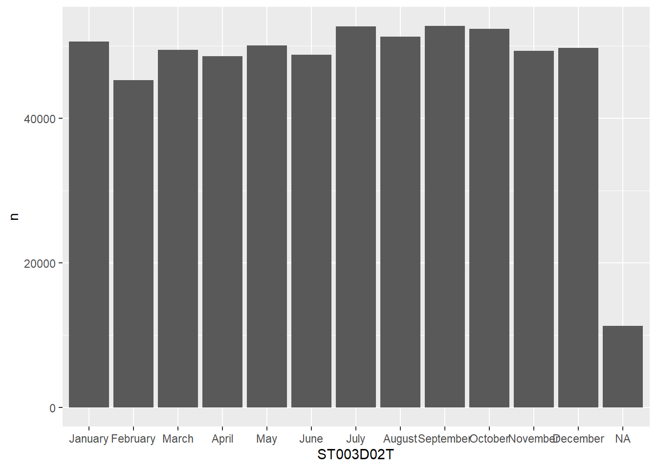
To re-order the columns to match the number of students, we can either try to do this manually, which is rather cumbersome:
my_levels <- c("July", "September", "January", "March", "February","April", "May", "June", "August", "October", "November", "December", "Valid Skip", "Not Applicable", "Invalid", "No Response")

grph_data$ST003D02T <- factor(grph_data$ST003D02T, levels=my_levels)

ggplot(data=grph_data, aes(x=ST003D02T, y=n)) +
  geom_bar(stat = "identity")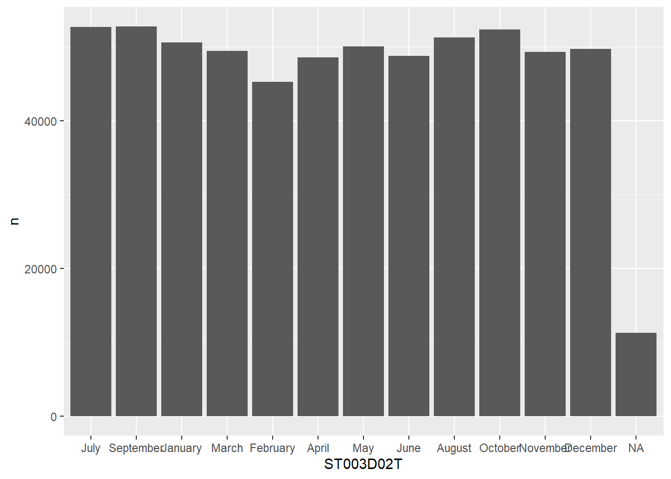
Or get R to do this for us:
# get the levels in order and pull/create a vector of them
my_levels <- grph_data %>% arrange(desc(n)) %>% pull(ST003D02T)

# reassign the re-ordered levels to the dataframe column
grph_data$ST003D02T <- factor(grph_data$ST003D02T, levels=my_levels)

ggplot(data=grph_data, aes(x=ST003D02T, y=n)) +
  geom_bar(stat = "identity")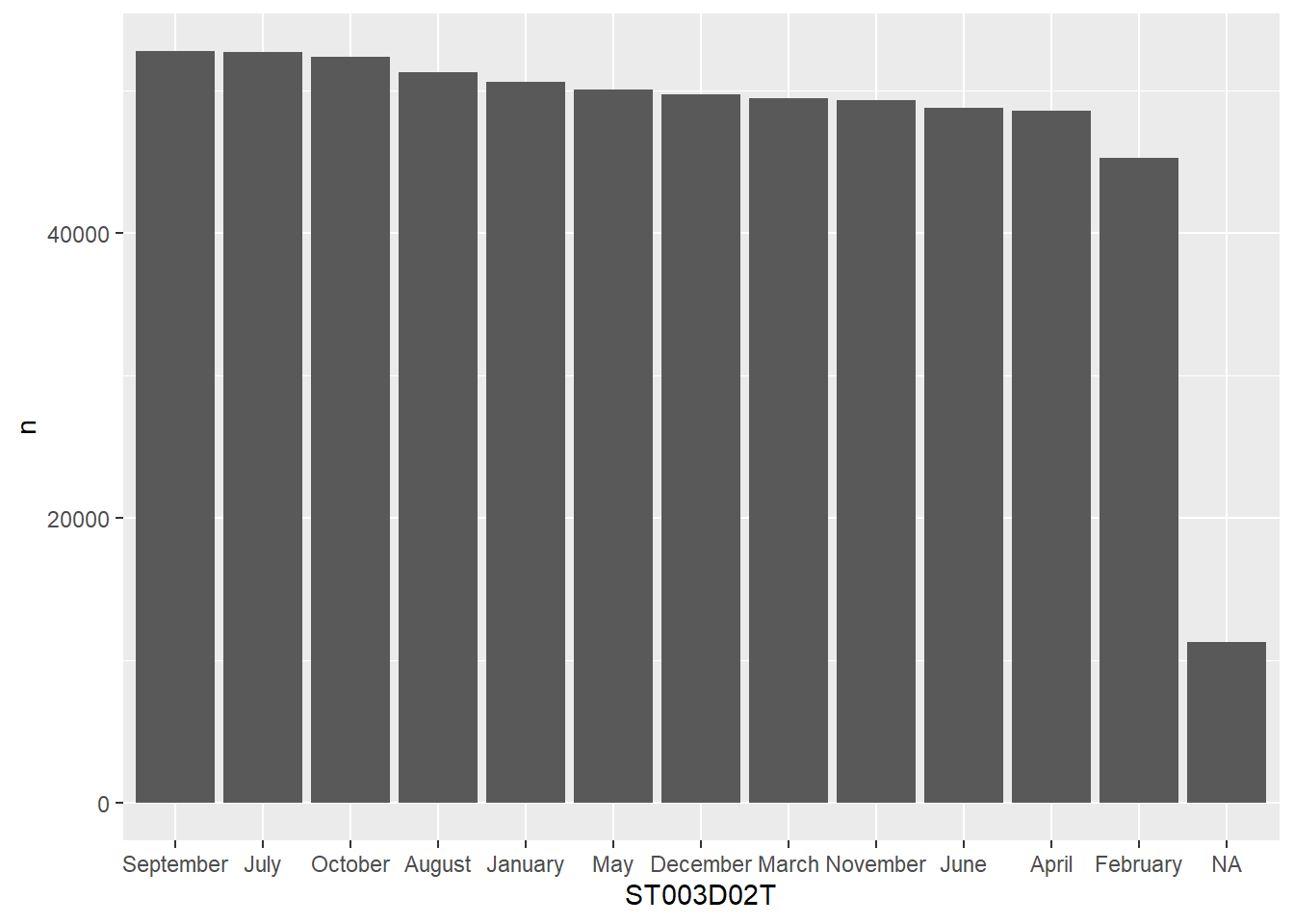
To learn a lot more about factors, see Hadley’s chapter
2.12 Seminar tasks
2.12.1 Student dataset
- How many unique values are there in the
OCOD3field for student intended future occupation? How does the most desired career vary by gender?
- write code to work out the
meanandmediannumber of hours of learning MathsMMINSfor each countryCNT.
- what is the fourth most popular language at home
LANGNspoken by students in schools in theUnited Kingdom, how does this compare toFrance?
- Spot the five errors with the following code. Can you make it work? What does it do?
# Work out when more time spent in language lessons than maths lessons
PISA_2018_lang < PISA_2018 %>%
  rename(gender = ST004D01T) %>%
  mutate(language importance = LMINS - MMINS) %>%
  filter(is.na(language_importance)) %>%
  group_by(CNT gender) %>%
  summarise(students = n,
            lang_win = sum(language_importance >= 0),
            per_lang_win = 100*(lang_win/students))
answer
# Work out when more time spent in language lessons than maths lessons
PISA_2018_lang <- PISA_2018 %>%  #1 make sure you have the assignment arrow <-
  rename(gender = ST004D01T) %>%
  mutate(language_importance = LMINS - MMINS) %>% #2 _ not space in name of field
  filter(!is.na(language_importance)) %>%  #3 this needs to be !is.na, otherwise it'll return nothing
  group_by(CNT, gender) %>% #4 missing comma
  summarise(students = n(),   #5 missing brackets on the n() command
            lang_win = sum(language_importance >= 0),
per_lang_win = 100*(lang_win/students))- By gender work out the average attitudes to learning activities
ATTLNACT
2.12.2 Teacher dataset
To further check your understanding of this section you will be attempting to analyse the 2018 teacher dataset. This dataset includes records for 107367 teachers from 19 countries, including 351 columns, covering attitudinal, demographic and workplace data. You can find the dataset here in the .parquet format.
- Work out how many teachers are in the dataset for the
United Kingdom
- For each country
CNTby genderTC001Q01NA, what is themeantime that a teacher has been in the teaching professionTC007Q02NA? Include the number of teachers in each group. Order this to show the country with the longest serving workforce:
- For each country
CNTfind out which teachers provide the most opportunities for students to improve their critical thinking skillsTC207Q06HA:
- Explore the data on use of technology in the classroom
TC169____
Save the results of one of the above questions using
write_csv().[EXTENSION] explore the dataset and find out some more interesting facts to share with your group
3 Introduction to graphs
3.1 Introduction to graphing in R
The tidyverse includes the incredibly powerful ggplot2 package. This package is pretty much the industry standard for making graphs for publication. ggplot2 is built on the grammar of graphics where you build graphs by specifying underlying attributes and layering geometric objects on top of each other. In the diagram below you can see how a graph is built from geometric objects (the things that are plotted such as points and bars) a scale, and plot annotations (e.g. a key, title etc). You can then apply faceting to the graph to automatically split one graph into multiple plots, allowing you to easily compare different groupings. Publications, such as the Financial Times, make daily use of ggplot2.

The basic structure of ggplot code is to combine different graphing elements through the use of the + operator. To demonstrate this, let’s look at the relationship between a poverty indicator ESCS and the performance in Maths PV1MATH, by gender ST004D01T and country CNT:
library(tidyverse)
# wrangle our data
graph_data <- PISA_2018 %>%
  filter(CNT %in% c("France", "United Kingdom"))

# display a graph of the results
ggplot(data = graph_data,
       aes(x = ESCS, y = PV1MATH, colour = ST004D01T)) +
  geom_point() +
  geom_smooth(method = 'lm') +
  facet_wrap(. ~ CNT) +
  ggtitle("Comparison of poverty indicator and Maths result, by gender and country") +
  theme(legend.position = "bottom")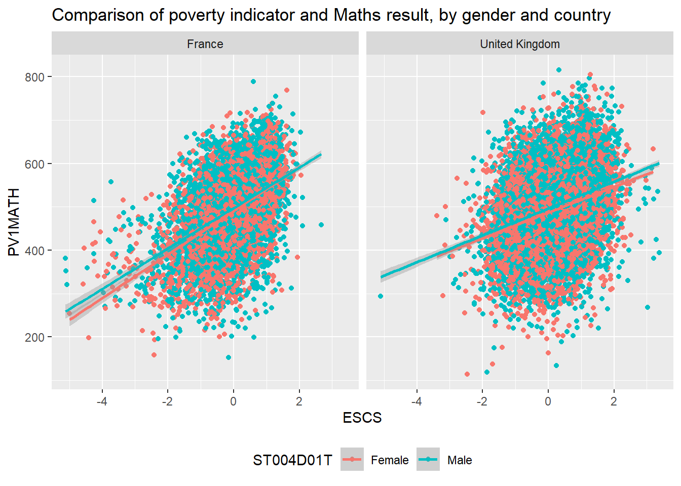
Hopefully you can work out what lines 1-3 do from the previous chapter, let’s focus on the ggplot commands:
- 6-7 these lines set up the
ggplotgiving it the table objectgraph_dataas its data input and setting up the aesthetics for the rest of the graph elements using columns fromgraph_data. Theaes(<attribute>, <attribute>, ...)command allows us to specify aesthetic elements of the graph that will change dependent on the dataset we use. In the PISA_2018 data set, the variableESCSrefers to an index of economic status, andPV1Math, is the plausible value of the mathematics score. We set the x and y variablesx=ESCSandy=PV1MATH, definingaes()insideggplot()means we will pass down these values to subsequent geometric objects so we don’t have to define thesexandyaxis items again and again. - 8 using the data and
aesvalues defined on lines 6-7,geom_pointuses thexandyvalues defined on line 19 to draw a point for each school in our dataset. There are lots of different parameters we could givegeom_pointe.g. specifying size and shape, but here we are content with using the defaults. - 9 we add another geometric object on top of the points, this time we add a line of best fit
geom_smooth, again this geometric object uses the values specified on lines 6-7, and we define themethodaslm, to calculate a linear model line of best fit. - 10 next we use
facet_wrap(. ~ CNT)to create a graph for each group ofCNTin the dataset, i.e. a graph for each country defined on line 3. - 11 finally we customise the title of the graph,
ggtitle, ready for display.
Switching between the pipes and ggplot can get rather confusing. A very common mistake in using ggplot is to try and link together the geom_ elements with a pipe command %>% rather than the +.
3.2 Geoms
There are about 40 different geometric objects in ggplot, allowing you to create almost any sort of graph. We will be exploring a few of them in detail, but if you want to explore others, please follow some of the links below:
- geom_bar for creating bar charts and histograms
- geom_point for plotting single points
- geom_line for connecting points together and showing trends
- geom_text for adding text labels to data points
- geom_boxplot for representing the range of data
- geom_hex for creating heat maps
- geom_map for adding geographic maps
- geom_smooth for adding lines of best fit
- geom_hline for adding static horizontal lines to a graph
- geom_vline for adding static vertical lines to a graph
3.2.1 geom_point
Rather unsurprisingly, geom_point allows us to plot a layer of points using x and y coordinates. The below example shows how we can specify within the ggplot function data=school_plot_data. We then define the aesthetic attributes of the graph, passing the x x=NumberOfBoys and y y=NumberOfGirls values. Once these have been declared in the ggplot(...) function, their values are passed down to any subsequent geom_, in this case geom_point will use the data and x and y values that have been specified in ggplot(...)
# create a new dataframe of maths and reading scores by country and OECD status
country_plot_data <- PISA_2018 %>%
  group_by(OECD, CNT) %>%
  summarise(mean_maths = mean(PV1MATH),
            mean_read = mean(PV1READ),
            sz = n())

# using this new dataframe, show the relationship between maths and reading score
# using geom_points
ggplot(data=country_plot_data,
       aes(x=mean_maths, y=mean_read)) +
  geom_point(aes(size=sz, colour=OECD), alpha = 0.6)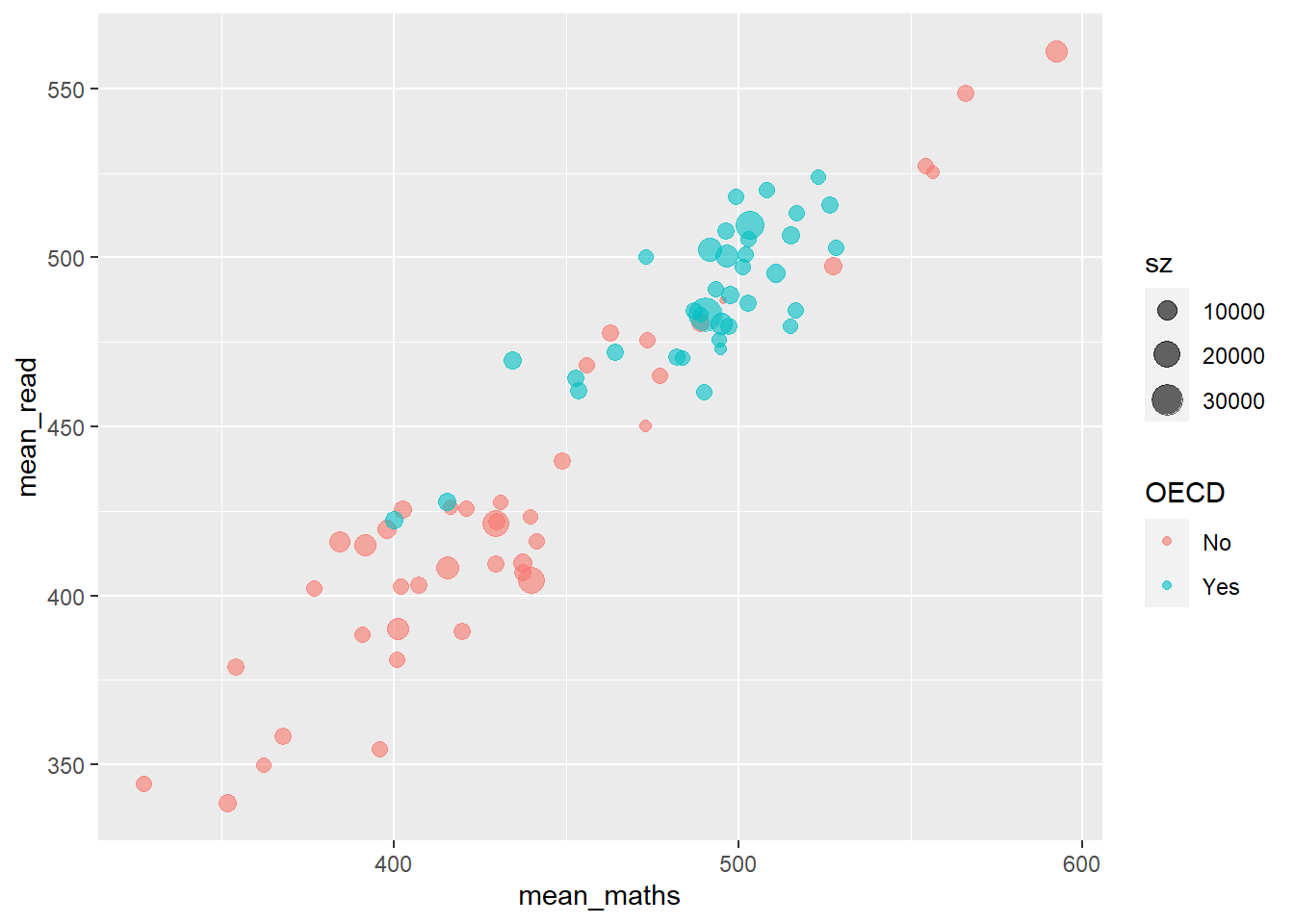
- In line 2 above we pipe the large data.frame
PISA_2018to apply a number of functions. - Line 3 groups by
OECD(a Yes or No indicating membership) andCNT(the name of the country). - Lines 4-5 calculate the
meanmathematics and reading score, and create new variables (mean_maths, andmean_read) for their values. - In addition, in line 6, the variables
szis created which counts the number of responses per country through then()command. - This whole pipe is then saved to the
country_plot_dataobject, using the<-on line 2
This new dataframe is then passed to ggplot.
- In line 10, we specify the data that should be plotted - the new dataframe
country_plot_datawe have created. - Line 11, then we pass the
xandyvariables,mean_maths, andmean_read, inside theaesthetic function. These values will be passed to any subsequentgeom_ - In line 12, we make a number of tweaks to the points: first setting the
aesthetics - thesizeof the points is linked to theszvariable we created, the number of responses per country, and thecolouris linked toOECDmembership. Finally (and note this is outside theaesbrackets, we set analphavalue which makes the point slightly transparent, which is more visually appealing where points overlap.
Defining things inside aes mean that they will change with the dataset you use, if you define them outside aes then they will be constant values. For example
# plotting number of boys as x, number of girls as y and % disadvantged as size,
# all inside aes, so each point is a table row
ggplot(data=PISA_2018_school) +
  geom_point(aes(x = SC002Q01TA,
                 y = SC002Q02TA,
                 size=SC048Q03NA))
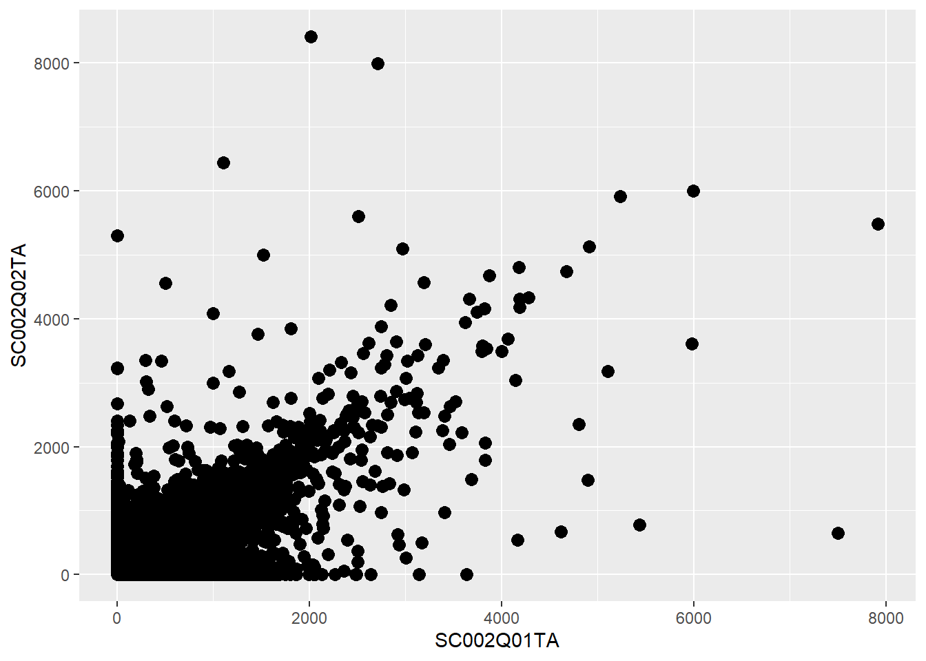
3.2.2 Questions
- Spot the three errors in this graph code
- Using the
PISA_2018dataset, plot a graph for students fromNorwayto look at the relationship between wealthWEALTHand reading gradePV1READ. Colour each point with the genderST004D01Tof the student. Give the graph sensiblexandylabels (e.g.xlab("label")).
- Using the
PISA_2018dataset for each countryCNT, create a graph to explore how themedianof the sense of school belongingBELONGrelates to themedianof the disciplinary climate in the schoolDISCLIMA, adjust the colour of each point to reflect themeanwealth of students in each countryESCS.
HINT: You’ll need create a new dataframe with summarised variables for median_belong, median_discipline and mean_wealth.
HINT: To make your colours stand out more, add + scale_color_gradientn(colours = rainbow(3)) to the end of your plot.
3.2.3 geom_bar
The geom_bar function is versatile, allowing the creation of bar, multiple bar, stacked bar charts and histograms. This first example shows how we can use bar charts to represent the number of cars in a household ST012Q02TA:
plot_cars <- PISA_2018 %>% filter(!is.na(ST012Q02TA))

ggplot(data = plot_cars,
       aes(x=ST012Q02TA)) +
  geom_bar()
- 2 gets the
PISA_2018dataset and removes all rows whereST012Q02TAisNA, storing this new dataset asplot_cars - 4 passes the
plot_carstoggplot, as the dataset we are going to plot - 5 specifies the
xvalues to be the values stored inST012Q02TA, i.e. we will have a bar for each response given inST012Q02TA: None, One, Two, Three or more. - 6
geom_bartell ggplot to make bars, it uses theaesthetic from line 5, to plot thexaxis, note we haven’t given it ayvalue, this is auto-calculated from the number of students in eachxgroup.
We can choose to let ggplot split the results into different groups for us by setting a fill option, in this case on the OECD status of the country, i.e. do students in OECD countries have more cars than those not in OECD countries, to do this, we add fill=OECD to the aes on line 2 below:
The bars are now coloured with a key, but, annoyingly, the bars are on top of each other not easily allowing us to make direct comparisons. To compare different groups we need the bars to not be stacked, we want them next to each other, or in ggplot language, we want the bars to dodge each other, to do this we add the position=position_dodge() command to line 3 below:

3.2.3.1 Raising the bars yourself
ggplot can do a lot of the hard work when putting together bar charts, e.g. counting the number of students in each group, but there might also be times when you want to use pipes to calculate summary values that you then want plot. That is, you want to specify the heights of the bars yourself. To do this we will specify the y axis in the aes and use stat="indentity" to tell ggplot that’s what we’re doing. Take the example where you want to find the overall percentage of students for a range of countries getting over 500 in PV1SCIE:
plot_data <- PISA_2018 %>%
group_by(OECD, CNT) %>%
summarise(all_students = n(),
upper_sci_per = sum(PV1SCIE > 500) / n())
ggplot(data=plot_data,
aes(x=CNT, y=upper_sci_per)) +
geom_bar(aes(fill=OECD),
position=position_dodge(),
stat="identity") +
theme(axis.text.x = element_text(angle = 90, vjust = 0.5, hjust=1))
- 1 to 4 creates a dataframe
plot_datathat calculates the percentage of students in each countryCNT, that have a science gradePV1SCIEover500 - 7 as we are setting the heights of the bars ourselves, we need to give the ggplot
aescommand ayvalue, in this casey=upper_sci_per - 8 the
geom_baris given afillvalue ofOECD, this will allow us to see how countries in and out of the OECD compare - 9 we use
position=position_dodge()as we want the percentage grades of each country to be next to each other so we can look for differences in heights - 10
stat="identity"tellsgeom_barthat you have defined your own bar heights in theyattribute and not to count the number of rows. - 11 this
themecommand helps rotate the x-axis labels 90 degrees, so they don’t overlap.
Alternatively, you can use the geom_col() function that can handle you setting the y values and not specifying stat="identity"
3.2.4 Questions
- Can you spot the 4 errors in this code.
- Create a bar chart showing the total number of students for each grouping of “Think about your school, how true: Students seem to value competition”
ST205Q01HA. Adjust this graph to see if there is a difference for this amongst females and malesST004D01T:
- Plot bars for the number of Females and Males
ST004D01Twho answer each grouping for: “Use digital devices outside of school: Browsing the Internet for fun (such as watching videos, e.g.)” IC008Q08TA. Make sure that the barsposition_dodge()each other so we can compare the heights.
- For France and the United Kingdom, plot the total number of students who gave each answer for
IC010Q09NA“Use digital devices outside of school: Doing homework on a computer”. Filter out all theNAvalues first!is.na(...)
- Using the
PISA_2018_schooldataset (available here] create a table that stores for each countryCNT
- the total number of schools,
- the total number of teachers working full-time
SC018Q01TA01, - the total number of teachers working part-time
SC018Q01TA02, - and the overall total number of teachers
Add an additional column working out the % of teachers working part-time in each country, call this per_part
Using this dataframe plot a bar graph for each country of the per_part, use the number of schools as a fill:
- [Extension] Explore other patterns in the school and student pisa datasets.
3.2.5 geom_text
Our bar charts look great, but finding the actual value of each bar can be a little clumsly if we have to get a ruler out and read off the y-axis. Better would be for us to have numbers listed at the top of each bar by adding a geom_text element:
plot_cars <- PISA_2018 %>% filter(!is.na(ST012Q02TA))
ggplot(data = plot_cars,
       aes(x=ST012Q02TA, fill=OECD)) +
geom_bar(position=position_dodge()) +
geom_text(stat='count',
aes(label=..count..),
position = position_dodge(width=0.9),
vjust=-0.5)
- line 6 starts the
geom_textcommand, telling the geom to use thecountstatistic from ggplot, this means it will be able to fetch the number of rows in each grouping. - line 7 as we want the label to change for each bar element, we put
label=..count..insideaes. Thexlocation of the labels is inherited from line 4 and theylocation will be calculated from the height of each bar - line 8 we want the labels to align to the bars, so we tell the
geom_textto alsoposition_dodge, passing awidth=0.9to the dodge function, so the labels line up above the columns, - finally, on line 9, we vertically adjust the labels
vjust, so they sit on top of the columns.
Rather than adding the count, you might want to add the percentage that each bar represents, we can do this by changing the value given to label on line 5, below:
ggplot(data = plot_cars,
       aes(x=ST012Q02TA, fill=OECD)) +
  geom_bar(position=position_dodge()) +
  geom_text(stat='count',
            aes(label=100*(..count../sum(..count..)) %>% round(3),
            group = OECD),
            position = position_dodge(width=0.9),
            vjust=-0.5)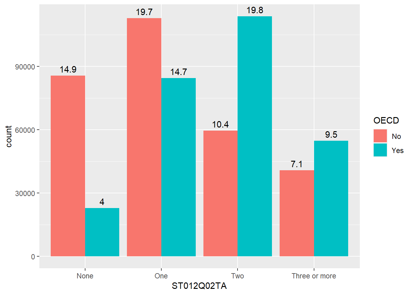
Additionally, when we make graphs we often want to label the dataset, for example if we were to plot all the countries and their PV1MATH and PV1READ scores, we would get:
plot_data <- PISA_2018 %>%
  group_by(OECD, CNT) %>%
  summarise(m_read  = mean(PV1READ, na.rm="TRUE"),
            m_maths = mean(PV1MATH, na.rm="TRUE"))

ggplot(data=plot_data,
       aes(x=m_read, y=m_maths, colour=OECD)) +
geom_point() 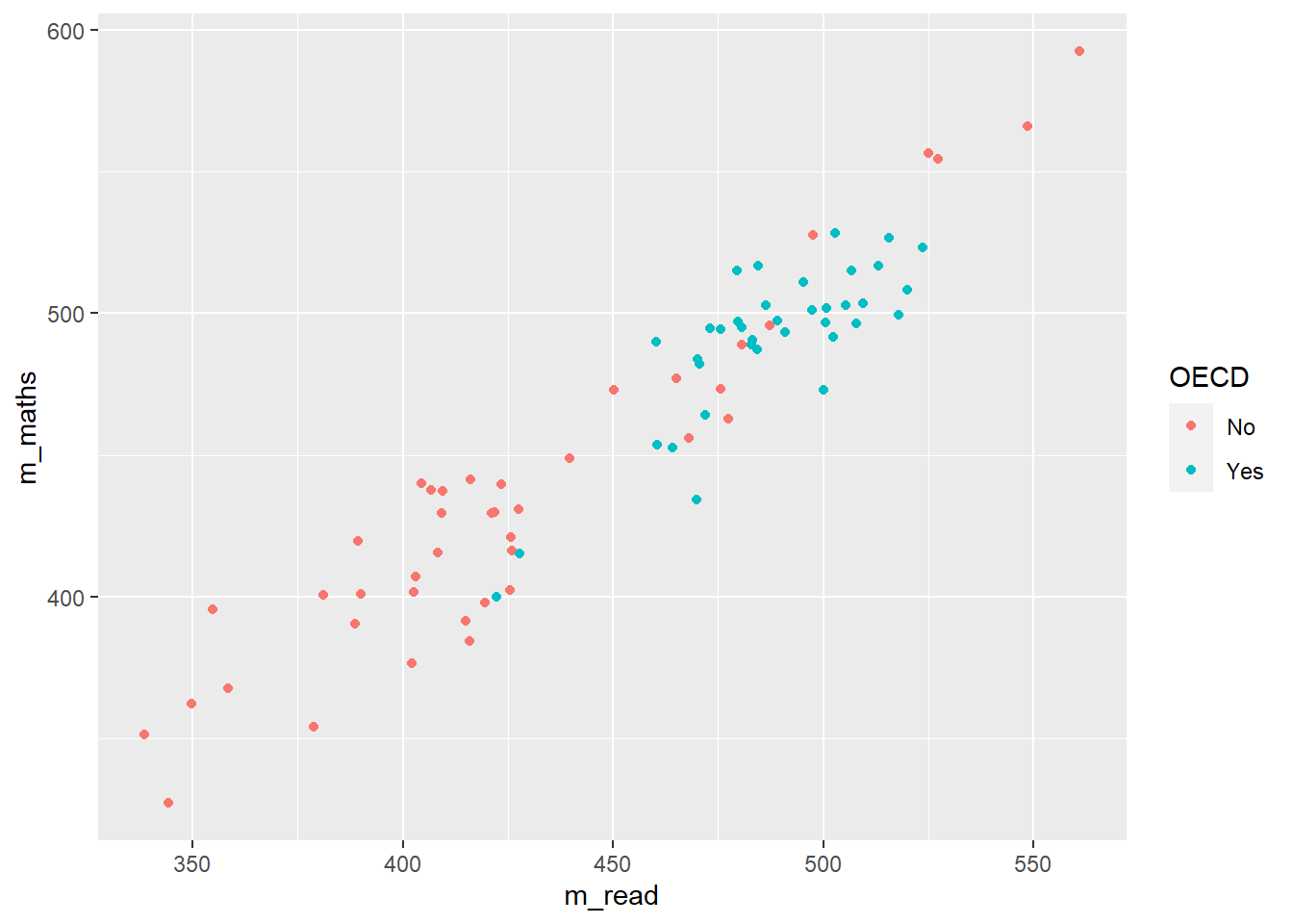
This looks great, but we don’t actually know which countries are which. To get this data we need to add text to the graph, using geom_text.
ggplot(data=plot_data,
       aes(x=m_read, y=m_maths, colour=OECD)) +
  geom_point() +
  geom_text(aes(label=CNT),
            colour="black",
            check_overlap = TRUE)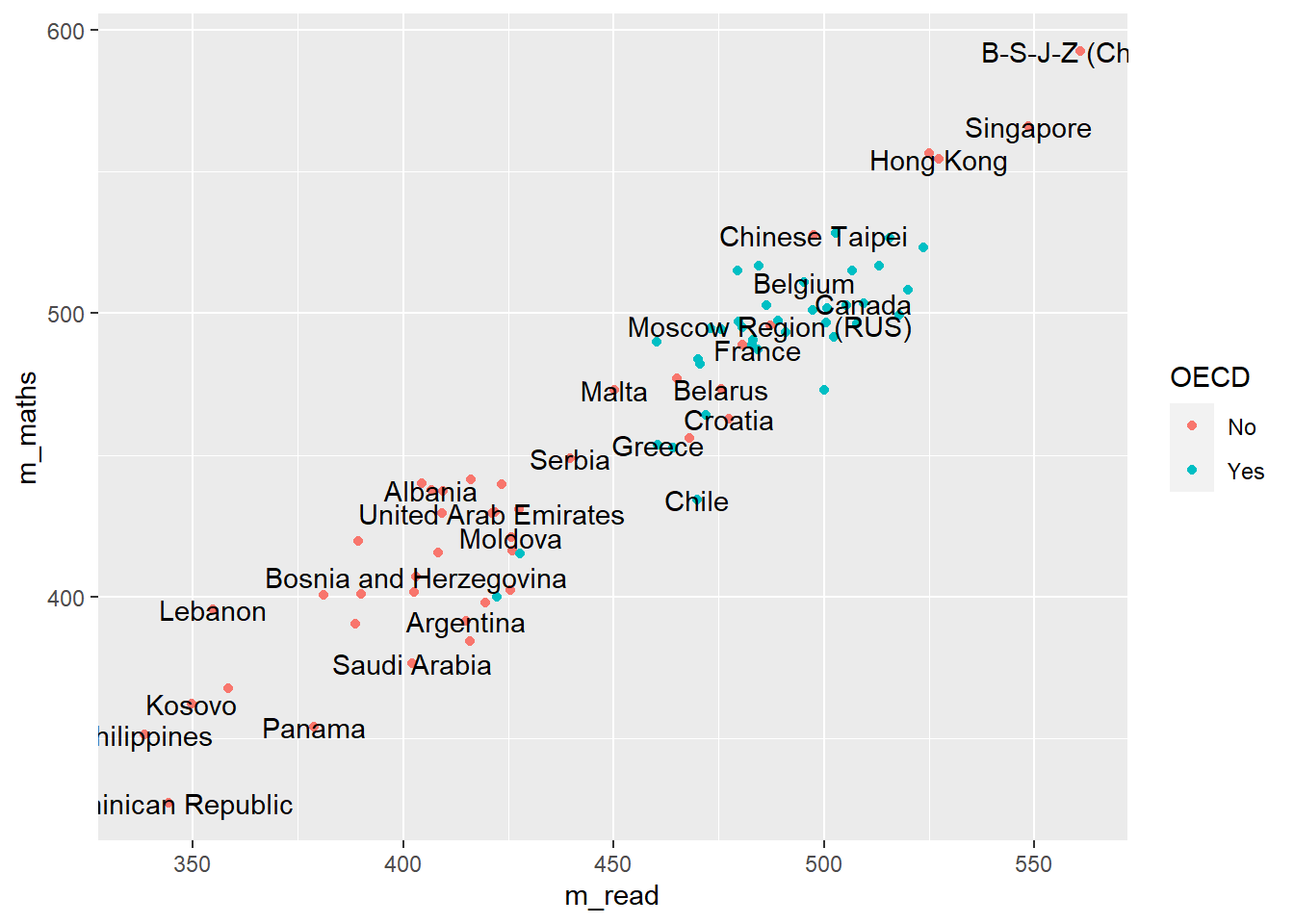
Here we have used colour="black" outside the aes to define the colour for all the labels, and check_overlap = TRUE which removes any labels that are on top of each other. It’s still a little bit hard to understand, and maybe we want to focus on just a few of the labels for countries we are interested in. For example
# make a vector of countries you want to have labels for
focus_cnt <- c("United Kingdom", "France", "Argentina")

# add a new column to the plot_data where these countries are
plot_data <- plot_data %>% mutate(focus = CNT %in% focus_cnt)

plot_data
# A tibble: 80 × 5
# Groups: OECD [2]
OECD CNT m_read m_maths focus
<fct> <fct> <dbl> <dbl> <lgl>
1 No Albania 407. 438. FALSE
2 No United Arab Emirates 421. 430. FALSE
3 No Argentina 415. 392. TRUE
4 No Bulgaria 423. 440. FALSE
5 No Bosnia and Herzegovina 403. 407. FALSE
6 No Belarus 476. 473. FALSE
7 No Brazil 416. 384. FALSE
8 No Brunei Darussalam 409. 429. FALSE
9 No Costa Rica 426. 403. FALSE
10 No Dominican Republic 344. 327. FALSE
# … with 70 more rowsNow we can adjust out geom_text to only show those countries that we want to focus on:
ggplot(data=plot_data,
aes(x=m_read, y=m_maths, colour=OECD)) +
geom_point() +
geom_text(data=plot_data %>% filter(focus == TRUE),
aes(label=CNT),
colour="black",
check_overlap = TRUE)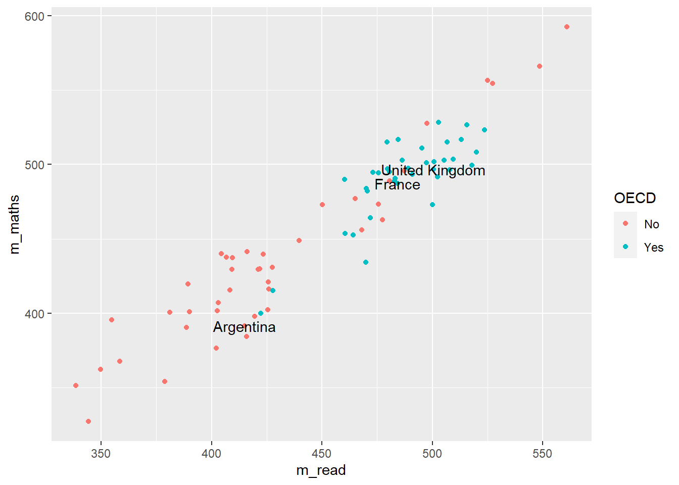
- line 5 changes the data that is being passed to the
geom_text, it no longer uses the data defined in line 2, but has a new dataset, that is filtered onfocus == TRUE, i.e. only containing the countries that we want. - Note that the
xandymappings from line 3 are inherited by line 6, it’s only the data that we have redefined
geom_text is great, but you might find that ggrepel package useful as it’ll add lines connecting the text the data points. Using the plot_data from above:
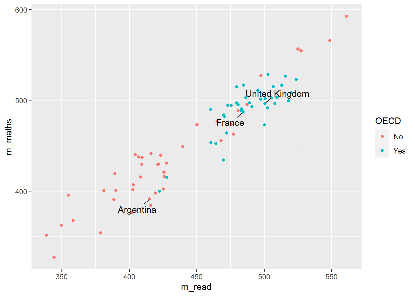
3.3 Faceting
Faceting allows you to easily create multiple graphs from one dataset and one ggplot definition by splitting the data on different factors, by defining:
facet_grid(<column_to_split> ~ .)
or
facet_grid(. ~ <column_to_split>)
Looking at the PISA_2018 dataset, we can plot the WEALTH and reading test outcome PV1READ variables against each other:
# create a subset of the data for plotting
plot_data <- PISA_2018 %>%
select(OECD, CNT, WEALTH, PV1READ) %>%
filter(CNT %in% c("Germany", "Russian Federation",
"United Kingdom"))
ggplot(data=plot_data, aes(x=WEALTH, y=PV1READ)) +
geom_point() +
geom_smooth() +
theme(legend.position = "bottom")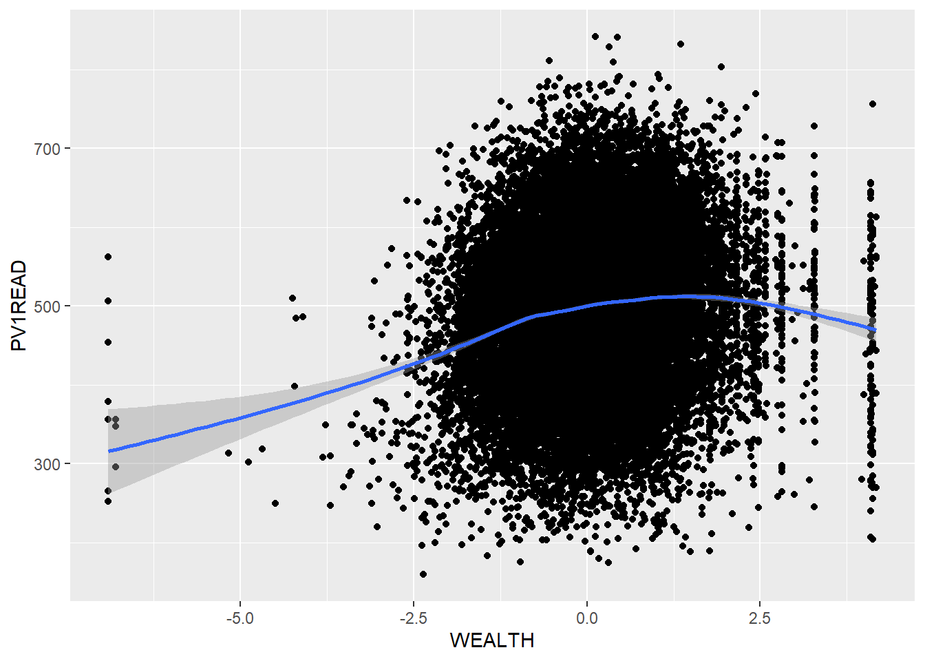
But it isn’t clear how this graph varies between countries. We could try plotting separate graphs for each country, but there is a faster way. Using:
+ facet_grid(CNT ~ .)
ggplot will automatically create graphs for subsets of plot_data, split on each different country in CNT
ggplot(data=plot_data, aes(x=WEALTH, y=PV1READ)) +
geom_point() +
geom_smooth() +
theme(legend.position = "bottom") +
facet_grid(CNT ~ .)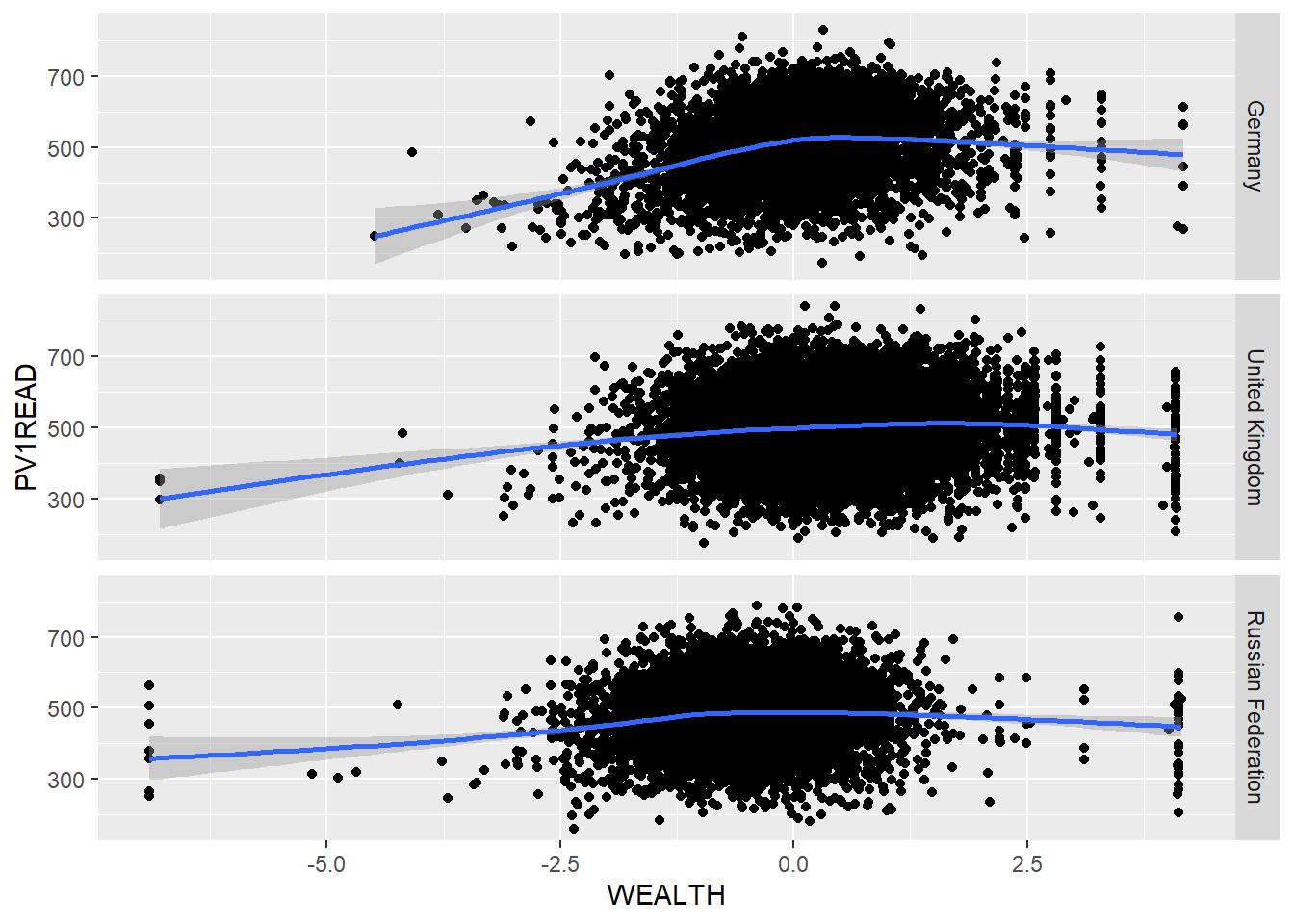
If the column you want to split on it on the left hand side of facet_grid(CNT ~ .), then the graphs will be piled on top of each other, if it’s on the right hand side facet_grid(. ~ CNT), then they’ll be side by side.
Take a subset of the overall dataset, by filtering on a few countries, take another one of your plots and use facet_grid(CNT ~ .) to explore the graphs for different countries.
3.4 Exporting plots
ggplot can export data in a variety of formats suitable for printing, publication and the web. Once you have created a graph and stored it in an object my_graph <- ggplot(..., the command to save the graph to your hard drive is:
ggsave(<file_location_name_and_extension>, <object_name>, width = 5, height = 4, device=<file_ext>)
If you want to change the output format, just change the extension of the file you are saving:
- “poverty_size.pdf” perfect for publication and printing, large size
- “poverty_size.svg” the same as pdf, also suitable for putting on webpages
- “poverty_size.png” smaller file size, suitable for websites and presentations
- “poverty_size.jpg” same as the png
3.5 Additional support on graphing
3.6 Using R to do descriptive statistics and plot graphs
You can find the code used in the video below:
Show the code
# Introduction to plotting graphs
#
# Download data from /Users/k1765032/Library/CloudStorage/GoogleDrive-richardandrewbrock@gmail.com/.shortcut-targets-by-id/1c3CkaEBOICzepArDfjQUP34W2BYhFjM4/PISR/Data/PISA/subset/Students_2018_RBDP_none_levels.rds
# You want the file: Students_2018_RBDP_none_levels.rds
# and place in your own file system
# change loc to load the data directly. Loading into R might take a few minutes
library(tidyverse)
loc <- "/Users/k1765032/Library/CloudStorage/GoogleDrive-richardandrewbrock@gmail.com/.shortcut-targets-by-id/1c3CkaEBOICzepArDfjQUP34W2BYhFjM4/PISR/Data/PISA/subset/Students_2018_RBDP_none_levels.rds"
PISA_2018 <- read_rds(loc)
# Calculating means of groups
# The PISA_2018 dataframe is piped to a new dataframe MeanPISA
# The data are grouped by the country variable (CNT)
# The countries of interest are chosen (UK, France, Germany and the US)
# The summarise function is used to output the mean and standard deviation score for each country
# on the Science Plausible Value (PV1SCIE) and NAs are ignored na.rm=TRUE
MeanPISA <- PISA_2018 %>%
group_by(CNT) %>%
filter(CNT=="United Kingdom" | CNT== "France" | CNT== "Germany" | CNT=="United States") %>%
summarise(mean_sci = mean(PV1SCIE, na.rm=TRUE), sd_sci= sd(PV1SCIE, na.rm=TRUE))
print(MeanPISA)
# To plot data we can use the ggplot function.
# We will start by plotting a column graph use geom_col
# We specify the data set for ggplot to use (MeanPisa) and then
# define the x and y variables:
# ggplot(MeanPISA,
# aes(x=CNT, y=mean_sci))
# geom_col() (Note the plus is on the line before) plots the graph and the fill colour is set to red
# The next three lines set the formatting of the axis text and add x and y axis labels
ggplot(MeanPISA,
aes(x=CNT, y=mean_sci))+
geom_col(fill="red") +
theme(axis.text.x = element_text(angle = 90, hjust=0.95, vjust=0.2, size=10)) +
xlab("Country") +
ylab("Science Score")
# For plotting a scatter plot or PISA reading scores against science scores
#, first we make a managable data set
# I will filter the data set to include only the UK data
# and remove any NAs
UKData <- PISA_2018 %>%
filter(CNT=="United Kingdom") %>%
drop_na(PV1SCIE)
# This time I will use ggplot to plot a scatter graph
# I feed UKDATA to ggplot, specify the x (PISA Reading score)
# And y (PISA science score). This time, I have linked the colour
# to a variable (ST004D01T) which is the gender value, giving
# plot points of different colours for boys and girls
# To produce a scatter plot, I use geom_point to plot points,
# Giving the size of point and the transparency (alpha=0.5) -
# some transparency of points is helpful when plots become dense
# The x and y lables are added
# Finally, a line is plotted - geom_smooth(method='lm')
# sets the line to a linear ('lm') line
ggplot(UKData,
aes(x=PV1READ, y=PV1SCIE, colour=ST004D01T)) +
geom_point(size=0.1, alpha=0.5) +
ylab("Science Score") +
xlab("Reading Score") +
geom_smooth(method='lm')
# Where R becomes very powerful is being able to produce multiple charts rapidly
# In the code below, I plot reading against science scores as above, but this time
# Use the entire data set - for the whole world!
# All the steps are the same, except, I use the facet_wrap, a way to create multiple
# graph panels - the instruction creates a set of graphs for each country
WorldData <- PISA_2018 %>%
drop_na(PV1SCIE)
ggplot(WorldData,
aes(x=PV1READ, y=PV1SCIE, colour=ST004D01T)) +
geom_point(size=0.1, alpha=0.5) +
ylab("Science Score") +
xlab("Reading Score") +
geom_smooth(method='lm') +
facet_wrap(CNT~.)4 Group performance in STEM
4.1 Seminar activities
4.1.1 Discussion activity
Based on Davis (2013) Link to chapter
Consider how and why we think of things as being ‘normal’ (or not). Some suggested questions are:
- What were your immediate thoughts on reading this paper?
- In what ways have you yourself been aware of being compared to norms or ideals?
- How do you feel about that? As an education professional, have you made comparisons between individual students and expected norms or averages? Between groups of students?
- When and how was this useful?
- When and how was this problematic?
4.1.2 Tasks
Getting set up
Using the following .csv data set and the read.csv command: DfE_SEN_School_Level to load data on Special Educational Needs (SEN) students in UK schools.
You may find these explanation of acronyms used in the spreadsheet useful:
LA stands for local authority and is an administrative region, for example, Camden and Greenwich.
FSM refers to students who receive free school meals - this funding is available for students whose parents or carers receive certain government benefits, typically due to relatively low income. It is taken, by some policy makers and researchers, as a marker of socioeconomic disadvantage
SEN support indicates a school has made a judgement that a student needs further support in school because of special educational needs or disabilities, for example dyslexia or speech and communication needs. If students need a higher level of support, they can be assessed by a specialist and are then placed on an education, health and care (EHC) plan. Students on EHC plans receive a higher level of support than those on SEN support.
A Pupil Referral Unit (PRU) is a type of school for children who are not able to attend a mainstream school due to illness or behavioural issues that have led to being excluded.
A special school is a school that provides support for students with special educational needs, for example, autism or physical disabilities, like deafness.
EHC_primary_need_spld = specific learning difficulties, for example, dyslexia and dyspraxia
EHC_primary_need_mld = moderate learning difficulties, indicating a delay in development
EHC_primary_need_sld = severe learning difficulties, indicating significant learning needs
EHC_primary_need_pmld = profound and multiple learning difficulties - students with multiple and complex needs
4.1.2.1 Descriptive statistics
We will now learn how to calculate means of subgroups of schools using the filter and summarise functions. We can use filter to focus on only a subset of our data.frame. For example, below, we choose to focus on schools in Camden.
In line 3 below, we focus on schools in Camden. Note that, in filter we use ==. Then we use summarise to calculate the totals of the variables we are interested in, students getting SEN support (SEN.support), students on an EHC plan (EHC.plan) and the total (Total.Pupils).
# Selecting only schools in one LA and finding the mean of various variables
DfE_SEN_data %>%
filter(la_name == "Camden") %>% # Filter to only include schools in Camden (note the ==)
summarise(SEN_total=sum(SEN.support),
EHCplan=sum(EHC.plan),
Total=sum(Total.pupils)) SEN_total EHCplan Total
1 4389 1107 31622If you want to filter by a different vector (that is, a different column in the table), don’t forget to change the name of the vector in the filter command, for example, to filter by the gender of pupils at the school. Don’t forget to use the %>% and the == in filter!
4.1.2.2 Task 1
- Find the total number of students with SEN support, on EHC plans, and the total number of students (using
Total.pupils) in Greenwich
Make sure you have spelled the name of the variables SEN.support, etc. correctly. They are case sensitive. You can use the function colnames(DfE_SEN_data) to get a list of names and copy and paste them
4.1.2.3 Task 2
- Select a single local authority (LA) or region.
- Calculate the total number of pupils in the LA, the total number listed as receiving SEN support, and the total number with an EHC plan.
- Calculate the totals for all of London (note, you will need to change the name of the column you are filtering by).
4.1.2.4 Calculating Percentages
Next, we will use the totals of SEN supported and EHC plan students to calculate percentages. We simply do an additional summarise with the equation to find the percentage of EHCplan students =(EHCplan/Total)*100.
When using summarise, be careful to add a comma after each function, and check you have closed as many brackets as you open!
# Descriptive Statistics using the DfE SEN School Level Data
# Calculating Percentages of students on EHC plans
Percenttable <- DfE_SEN_data %>%
group_by(district_administrative_name) %>%
summarise(SEN_support = sum(SEN.support),
EHCplan = sum(EHC.plan),
Total = sum(Total.pupils),
percentageEHCplan = (EHCplan/Total)*100)
print(Percenttable)# A tibble: 310 × 5
district_administrative_name SEN_support EHCplan Total percentageEHCplan
<chr> <int> <int> <int> <dbl>
1 Adur 1427 350 9315 3.76
2 Allerdale 1701 523 14994 3.49
3 Amber Valley 2409 823 18819 4.37
4 Arun 2621 556 18742 2.97
5 Ashfield 2485 420 20140 2.09
6 Ashford 2357 1280 22832 5.61
7 Babergh 1910 675 15097 4.47
8 Barking and Dagenham 5286 1570 45153 3.48
9 Barnet 7269 2505 68481 3.66
10 Barnsley 3849 1579 35271 4.48
# … with 300 more rowsThis gives a table as an output, with the percentage of students on an EHC plan in each local authority.
You can use the signif function to display a given number of decimal places. Here, I have used signif( ,2) to limit the percentage calculation to two significant figures
# Calculating Percentages of students on EHC plans
Percenttable <- DfE_SEN_data %>%
group_by(district_administrative_name) %>%
summarise(SEN_support = sum(SEN.support),
EHCplan = sum(EHC.plan),
Total = sum(Total.pupils),
percentageEHCplan = signif((EHCplan/Total)*100,2))
print(Percenttable)# A tibble: 310 × 5
district_administrative_name SEN_support EHCplan Total percentageEHCplan
<chr> <int> <int> <int> <dbl>
1 Adur 1427 350 9315 3.8
2 Allerdale 1701 523 14994 3.5
3 Amber Valley 2409 823 18819 4.4
4 Arun 2621 556 18742 3
5 Ashfield 2485 420 20140 2.1
6 Ashford 2357 1280 22832 5.6
7 Babergh 1910 675 15097 4.5
8 Barking and Dagenham 5286 1570 45153 3.5
9 Barnet 7269 2505 68481 3.7
10 Barnsley 3849 1579 35271 4.5
# … with 300 more rows4.1.2.5 Task 3
Don’t forget to use the pipe operator %>% between each function
For each administrative district (local authority), calculate the percentages of pupils with SEN support.
Answer
# Descriptive Statistics using the DfE SEN School Level Data
# Calculating Percentages of students with SEN support in each administrative district (local authority)
Percenttable <- DfE_SEN_data %>%
group_by(district_administrative_name) %>%
summarise(SEN_support = sum(SEN.support),
EHCplan = sum(EHC.plan),
Total = sum(Total.pupils),
percentagesupport = (SEN_support/Total)*100)
print(Percenttable)4.1.2.6 Finding the mean, median, maximum, and minimum
- Example, Find the
mean,median,maximum andminimum percentages of students with SEN support in each administrative district.
To find the mean, we can use summarise to find the mean (summarise(Mean_support=mean(SEN.support))). Similarly, we can use the max, min and median function to find the respective values (modes are little more complicated).
library(tidyverse)
# We do the steps above to create our percentage table for SEN support
Descrip <- DfE_SEN_data %>%
group_by(district_administrative_name) %>%
summarise(SEN_support = sum(SEN.support),
Total = sum(Total.pupils),
percentagesupport = (SEN_support/Total)*100,
Max_support = max(SEN.support),
Mean_support = mean(SEN.support),
Min_support=min(SEN.support),
Median_support=median(SEN.support))
# describe is a function from the psych package (remember to load tidyverse after it) which gives summary data for max, min, mean etc for the whole country.
print(Descrip) # A tibble: 310 × 8
district_administrati…¹ SEN_s…² Total perce…³ Max_s…⁴ Mean_…⁵ Min_s…⁶ Media…⁷
<chr> <int> <int> <dbl> <int> <dbl> <int> <dbl>
1 Adur 1427 9315 15.3 251 71.4 0 54.5
2 Allerdale 1701 14994 11.3 157 24.3 0 13
3 Amber Valley 2409 18819 12.8 182 33 0 23
4 Arun 2621 18742 14.0 213 57.0 0 32
5 Ashfield 2485 20140 12.3 309 50.7 0 35
6 Ashford 2357 22832 10.3 266 39.3 0 26
7 Babergh 1910 15097 12.7 333 34.1 0 14
8 Barking and Dagenham 5286 45153 11.7 288 81.3 0 68
9 Barnet 7269 68481 10.6 472 43.5 0 30
10 Barnsley 3849 35271 10.9 247 41.4 0 30
# … with 300 more rows, and abbreviated variable names
# ¹district_administrative_name, ²SEN_support, ³percentagesupport,
# ⁴Max_support, ⁵Mean_support, ⁶Min_support, ⁷Median_support# An alternative way to do this is to turn the table into the longer format
# This converts each entry in the table into an individual row in a list
# which can then be used to calculate descriptive statistics
#
# new_table <- DfE_SEN_data %>%
# group_by(district_administrative_name) %>%
# summarise(SEN_support = sum(SEN.support),
# EHCplan = sum(EHC.plan),
# Total = sum(Total.pupils))
#
# new_table %>%
# pivot_longer(!district_administrative_name,
# names_to = "variable",
# values_to = "value") %>%
# group_by(variable) %>%
# summarise(mean_value = mean(value),
# max_value = max(value),
# median_value = median(value))Surprisingly, there is no function to calculate the mode in tidyverse. However, you can get one by loading the modeest package and using the most frequent value (nfv) function.
4.1.2.7 Task 4
- Find the
mean,median,maximum andminimum percentages of students with EHC plans in each local authority for the whole country.
Answer
library(tidyverse)
# We do the steps above to create our percentage table for EHC plans
# after grouping by districts (LAs)
EHCDescrip <- DfE_SEN_data %>%
group_by(district_administrative_name) %>%
summarise(EHC_support = sum(EHC.plan),
Total = sum(Total.pupils),
percentagesupport = (EHC_support/Total)*100,
Max_support = max(EHC.plan),
Mean_support = mean(EHC.plan),
Min_support=min(EHC.plan),
Median_support=median(EHC.plan))
print(EHCDescrip)- Find the
mean,median,maximum andminimum percentages of students with EHC plans in the UK as a whole, and for London. What differences can you see?
Answer
# To get the descriptive statistics for EHC plans in all of the UK:
EHCDescripTotal <- DfE_SEN_data %>%
summarise(EHC_support = sum(EHC.plan),
Total = sum(Total.pupils),
percentageEHC = (EHC_support/Total)*100,
Max_EHC = max(EHC.plan),
Mean_EHC = mean(EHC.plan),
Min_EHC=min(EHC.plan),
Median_EHC=median(EHC.plan))
print(EHCDescripTotal)
# To get the descriptive statistics for EHC plans in London, we add a filter first
EHCDescripLon <- DfE_SEN_data %>%
filter(region_name=="London") %>%
summarise(EHC_support = sum(EHC.plan),
Total = sum(Total.pupils),
percentageEHC = (EHC_support/Total)*100,
Max_EHC = max(EHC.plan),
Mean_EHC = mean(EHC.plan),
Min_EHC=min(EHC.plan),
Median_EHC=median(EHC.plan))
print(EHCDescripLon)4.1.3 Graphing
Using the same data set ( DfE_SEN_School_Level) we are going to now plot some graphs
For more details on graphing with the PISA_2018 dataset, see Section 3.1
4.1.4 Column graphs
Imagine we want to plot a graph of the the percentage of students on EHC plans by gender of school
When plotting graphs, it makes things easier to have a data.frame of the data you will pass to ggplot - a bit like the final table of data you will actually plot when drawing a graph in real life.
To complete our take we are going to create a new data.frame we will use in the plot. I have called that data.frame genderplot (the data about percentage of students on EHC plans by gender, that I will plot). Then, I take the main data.frame and group_by sex_of_school_description, to get the schools grouped by whether they are single of mixed sex. Next I use the mutate function to create percentage columns, as we did before.
The new element here is using ggplot, R’s graphing function (more details on how to use geom_bar are in the section above: Geom_bar).
To plot a graph, you call ggplot and specify the data you want to use for the graph (in our case, the new data.frame we have created, genderplot).
The next layer of ggplot is the aesthetics (aes), i.e., what our graph will look like. First, we tell ggplot what we want our x (sex_of_school_description) and y (percentageEHCplan) variables to be. Finally, we use geom_col() to plot a column graph.
# Presenting % on EHC by gender of school
genderplot <- DfE_SEN_data %>%
group_by(sex_of_school_description) %>%
summarise(SEN_support=sum(SEN.support),
EHCplan=sum(EHC.plan),
Total=sum(Total.pupils),
percentageEHCplan = (EHCplan/Total)*100,
percentagesupport = (SEN_support/Total)*100)
# using the genderplot data create a graph
ggplot(data=genderplot,
aes(x=sex_of_school_description,
y=percentageEHCplan)) +
geom_col()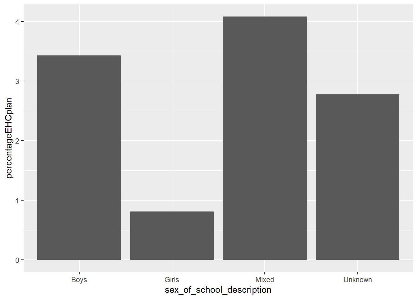
4.1.4.1 Task 5
Plot a column graph of the % of students of EHC.plans by the type of school (the type_of_establishment variable)
Answer
# Calculate percentage on plan and support by type of school
estabdata <- DfE_SEN_data %>%
group_by(type_of_establishment) %>%
summarise(EHCplan=sum(EHC.plan),
Total=sum(Total.pupils),
percentageEHCplan = (EHCplan/Total)*100)
# Plot the type of school data
ggplot(data=estabdata,
aes(x=type_of_establishment,
y=percentageEHCplan)) +
geom_col(fill="red")+ # I have filled the columns in red here
theme(axis.text.x = element_text(angle = 90, vjust = 0.5, hjust=1))
# The final line rotates the text and spaces it nicely4.1.5 Scatter Graphs
To plot a scatter graph we use the geom_point (see also: Geom_Point section), which works in a similar way to geom_col.
Example
Imagine I want to plot a graph of total number of students (on the x-axis) against those with EHC plans (y-axis) for all schools in London.
A above, I first want to create a data.frame to plot - in this case I have called it plotdata. I filter to select only London schools from the DfE dataset.
Then I pass ggplot plotdata. As with geom_col, I use ggplot and first specify the data I want to plot (ggplot(data=plotdata,). Next, I set the aesthetic variables, to keep things simple,only the x and y variables. Then I call geom_point to plot the points as a scatter graph.
# Filter to create a dataframe of only London schools
plotdata<-DfE_SEN_data %>%
filter(region_name=="London")
# Plot the type of school data
ggplot(data=plotdata,
aes(x=Total.pupils,y=EHC.plan)) +
geom_point()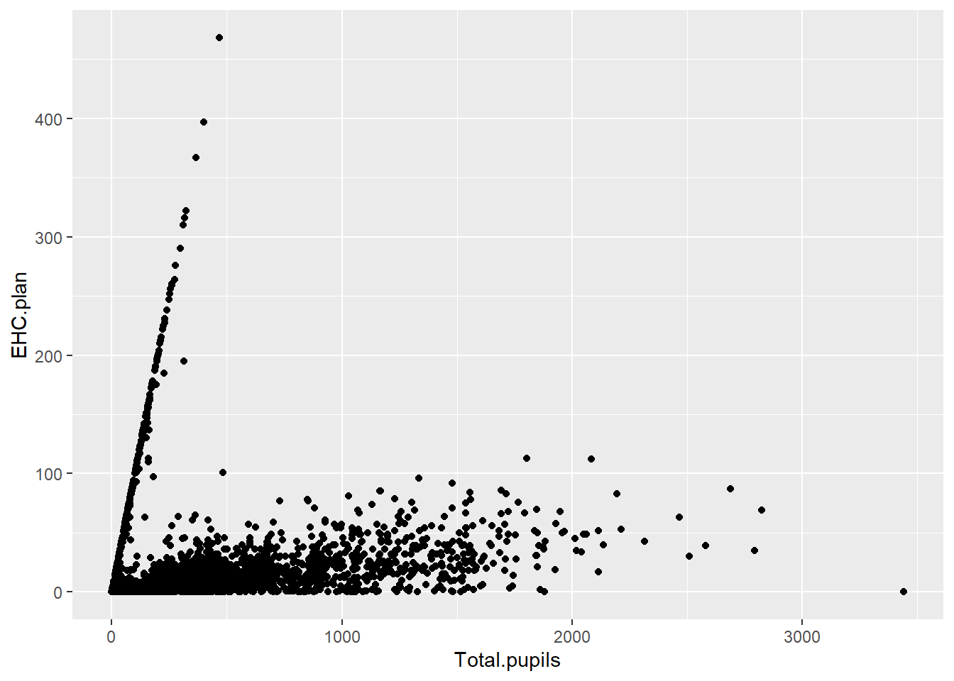
We can make things more pleasing by adding more features to the aesthetic variable. For example, I can add colour (geom_point(colour="blue")) and rename the axes labs(x="Total number of pupils", y="Number of pupils on EHC plans"). Note when adding to ggplot, the + should come at the end of the line before the new addition to avoid an error.
# Filter to create a dataframe of only London schools
plotdata<-DfE_SEN_data %>%
filter(region_name=="London")
# Plot the type of school data
ggplot(data=plotdata,
aes(x=Total.pupils,y=EHC.plan)) +
geom_point(colour="blue")+
labs(x="Total number of pupils", y="Number of pupils on EHC plans")
I can also add a line using (geom_smooth(method='lm')) - here ‘lm’ specifies a linear plot (i.e. a straight line).
# Filtter to create a dataframe of only London schools
plotdata<-DfE_SEN_data %>%
filter(region_name=="London")
# Plot the type of school data
ggplot(data=plotdata,
aes(x=Total.pupils,y=EHC.plan)) +
geom_point(colour="blue")+
labs(x="Total number of pupils", y="Number of pupils on EHC plans")+
(geom_smooth(method='lm'))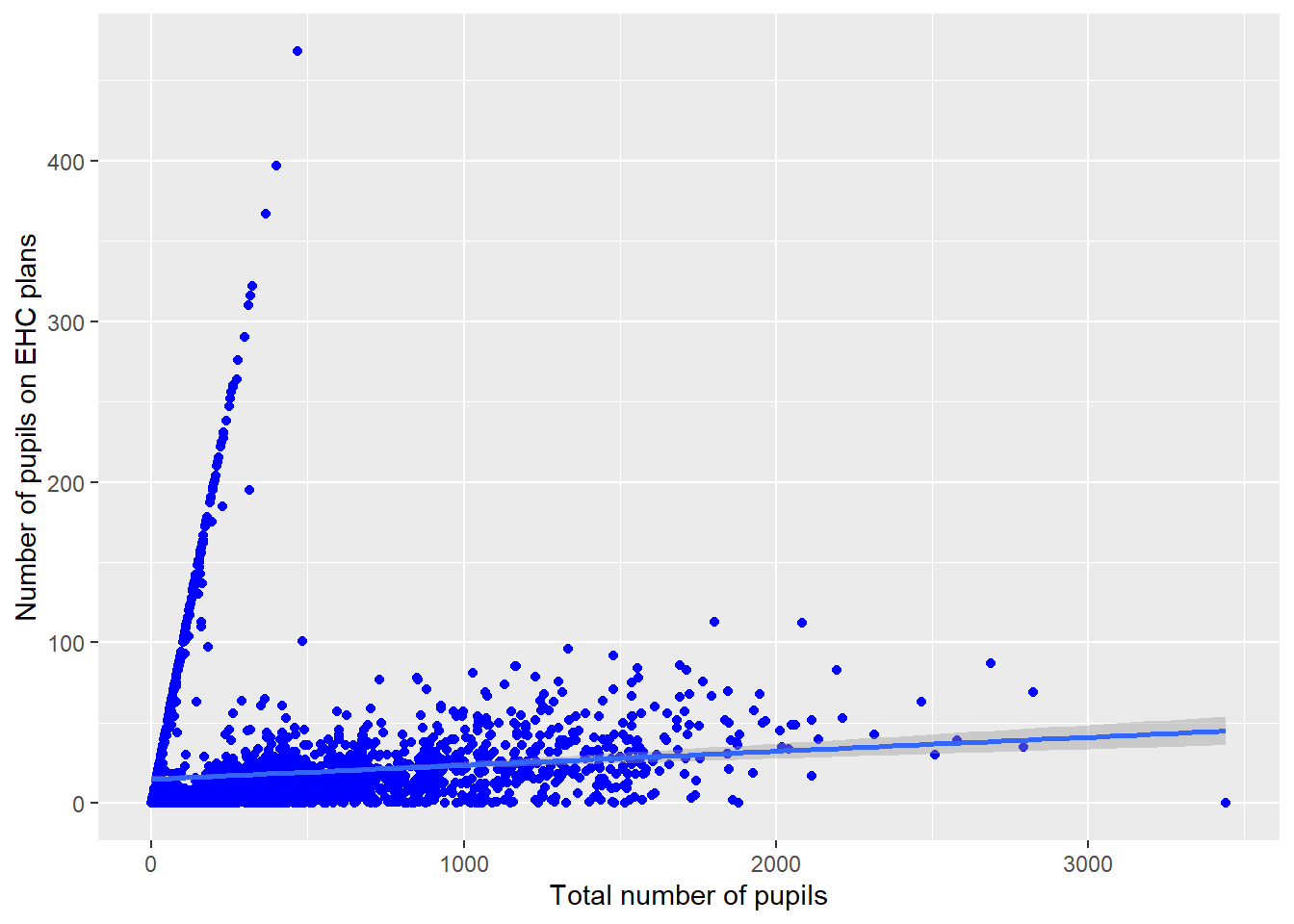
I can also change the colour of the points by a variable in the dataframe - for example by the type of school (aes(colour=type_of_establishment)). I can vary the size of points and make them slightly transparent (their alpha level): geom_point(alpha=0.4, size=0.6), and I can move the legend to the bottom
# Filter to create a dataframe of only London schools
plotdata<-DfE_SEN_data %>%
filter(region_name=="London")
# Plot the type of school data
ggplot(data=plotdata,
aes(x=Total.pupils,y=EHC.plan, colour=sex_of_school_description)) +
geom_point(alpha=0.4, size=0.6)+
labs(x="Total number of pupils", y="Number of puupils on EHC plans") +
theme(legend.position = "bottom")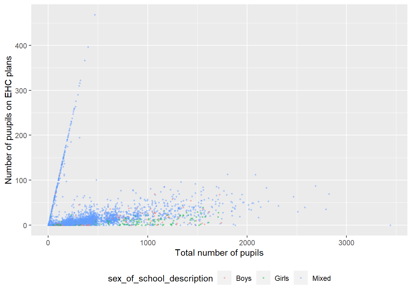
For a summary of all the elements of a graph you can change in ggplot - see this help sheet
4.1.5.1 Task 6
For schools in London, plot the number of students receiving SEN support (SEN.Support) against those on an EHC plan (EHC.plan). The try varying the colour of points by type of school, adding a line and changing the size of plot point by size of school
Answer
# Filter to create a dataframe of only London schools
plotdata<-DfE_SEN_data %>%
filter(region_name=="London")
# Plot the type of school data
ggplot(data=plotdata,
aes(x=SEN.support,y=EHC.plan, colour="red", size=Total.pupils)) +
geom_point(alpha=0.4)+
labs(x="Total number of pupils", y="Number of puupils on EHC plans")4.1.5.2 Extension task - Binning data
If we want to plot a frequency plot, the kind of chart that often gives a normal distribution, we need to divide data into counts of ranges of data.
For example, if we wanted to plot a frequency chart of heights, we might divide the counts into those between 1.5m-1.6m, 1.6m-1.7m etc. To do this we can use the cut(<field>,<breaks>) function within the mutate command on a ‘data.frame’.
In the example below, I will use the data on Total.pupils. I use cut(Total.pupils, breaks=seq(0,1500, 25)) to create a new vector (column in the table) with the total number of pupils divided up into bins. The specification breaks=seq(0,1500, 25)) sets how the data are broken up - into bins (i.e. groups of schools) of pupil numbers starting at 0 and rising to 1500 in steps of 25.
# Creates distribution of schools by size
binnedsize <- DfE_SEN_data %>% # Creates a new data frame with binned data
mutate(Total.pupils = cut(Total.pupils, breaks=seq(0,1500, 25)))%>%
na.omit()
ggplot(binnedsize,
aes(x=Total.pupils)) +
geom_bar(fill="dark green") +
theme(axis.text.x = element_text(angle = 90, vjust = 0.5, hjust=1)) +
labs(y="Number of schools", x="Pupil range")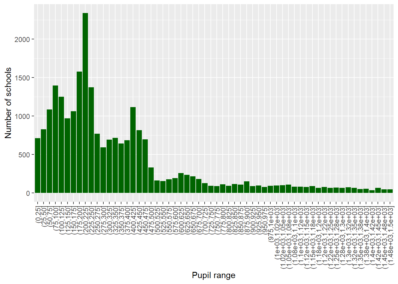
Create a graph of the binned counts of number of students on SEN support in schools in the UK
To find out a range of a vector, you can use the range function in the console - for example, to get a sense of the range of numbers of students on SEN support. I can type: range(DfE_SEN_data$SEN.support)
Answer
# Creates distribution of those on SEN support
binnedSEN <- DfE_SEN_data %>% # Creates a new data frame with bins
mutate(SENbins = cut(SEN.support, breaks=seq(0,100, 2)))%>%
na.omit()
ggplot(binnedSEN,
aes(x=SENbins)) +
geom_bar(fill="dark green") +
theme(axis.text.x = element_text(angle = 90, vjust = 0.5, hjust=1)) +
labs(y="Number of schools", x="Number on SEN support")5 Presentations
10% of total marks
Prepare a 5-minute presentation: Compare a qualitative and quantitative paper on the same theme. What are the strengths and limitations of each approach for addressing the question?
Ensure the two papers address a broadly similar question (for example, what factors impact female students' decision to study post-compulsory design education?). The research questions of the papers need not be identical but should be similar enough for the comparison to be valid.
The presentations should include the following elements
The research questions/aims of both papers are set out.
The sample and methods of each paper are clearly described.
The strengths and limitations of each paper are set out. Take care to avoid generic critiques, for example, the sample size of the quantitative paper could be larger. Try and develop critiques of specific elements of each paper.
Areas to focus on include:
Are concepts and variables meaningful and well-defined?
Are the impacts of the sample selection on the findings acknowledged?
Is the impact of the tools on the data acknowledged? For example, how might interview or survey questions shape responses?
Are claims in the findings presented in a way that acknowledges how they were produced? For example, are limits of generalisability and validity acknowledged?
The marking points are:
Were the research aims of both papers described?
Were the samples and methods of both papers clearly reported?
Were strengths of the qualitative paper reported?
Were strengths of the quantitative paper reported?
Were limitations of the qualitative paper reported?
Were limitations of the quantitative paper reported?
Make sure you practice your presentation to fit into the time
Avoid generic strengths and limitations such as, the quantitative paper has higher statistical generalisability. Aim to refer to unique features of the papers. How were the variables constructed? What was unique about the findings in each case?
6 Gender differences
6.1 Statistical analysis
There are probably statistical libraries in R to do every sort of test you will ever need, from the typical ANOVA to cutting edge machine learning. The full list of R packages sits on the cran server and you can load packages as and when you need them at no cost. R comes pre-packaged with some common statistical tools, for example, the t.test() and linear model regression lm(). For other stats tools you’ll need to install the package and load it (see Section 2.6.1) before you can use the functions.
6.2 T-tests
T-tests are statistical tests that determine if there are statistically significant differences between the means of two groups. Consider the data giving the results of girls and boys on a test:
Boys’ scores
| Boy | Score (/10) |
|---|---|
| A | 7 |
| B | 8 |
| C | 6 |
| D | 5 |
| E | 8 |
| Mean | 6.8 |
Girls’ scores
| Girls | Score (/10) |
|---|---|
| A | 9 |
| B | 4 |
| C | 7 |
| D | 8 |
| E | 8 |
| Mean | 7.2 |
The means of the two groups are different (6.8 for boys and 7.2 for girls) but the difference may simply be due to random variation. A t-test can report the probability that a difference is means is due to chance.
library(tidyverse)
Boys<-data.frame(Score=c(7,8,6,5,8))
Girls<-data.frame(Score=c(9,4,7,8,8))
print(mean(Boys$Score))[1] 6.8[1] 7.2
Welch Two Sample t-test
data: Boys$Score and Girls$Score
t = -0.3849, df = 7.035, p-value = 0.7117
alternative hypothesis: true difference in means is not equal to 0
95 percent confidence interval:
-2.854915 2.054915
sample estimates:
mean of x mean of y
6.8 7.2 The t.test function returns a p-value greater than 0.05 so the mean test-results can be assumed to the result of chance, and we conclude there are no detectable differences by gender for this data set.
6.2.1 Task 1
Consider the following scenarios. Which (if any) of the t-tests would be most of appropriate, including whether it would be a one or two tailed test.
One and two-tailed tests
Remember that a one-tailed test only looks for differences in one direction from the mean (for example, that one sample has a higher mean than the other). A two-tailed tests tests for the possibility of the means of the two groups being higher or lower than each other.
An educational researcher wants to test a teaching approach with a group of 12 students to see if an intervention increases performance in their year 6 SATs results. Pupils are given a SATS paper before the intervention and again after. The results of these are normalised and then compared.
A teacher wants to see if their pupils’ GCSE computer science test scores are in line with the national average or not. The tests are out of 180 marks.
The DfE want to compare uptake of STEM subjects pre and post pandemic to see if there has been any change in the percentage of students studying at least one STEM subject for A level.
A school wants to compare salaries of staff between this academic year and last academic year to see whether there has been a significant increase.
The same school as in d) wants to compare salaries of support staff and teaching staff to see if there is a significant difference.
A researcher wants to find out how much time pupils spend looking at screens during lesson time, to see if there is a difference between year 7 and year 10 students. 10 pupils in year 7 and 10 pupils in year 10 are randomly selected across a school and observed throughout a school day in November. The times are recorded to the nearest minute.
A business manager wants to check if the financial expenditure on STEM teachers per year is similar to the national average (based on average numbers of pupils on role)
6.2.2 Task 2
Progress 8 is a ‘value-added’ measure (DfE 2023). It indicates how much a secondary school has helped pupils progress academically over a five year period, from the end of primary school (age 11) to the end of the end year 11 (age 16).
The score is calculated across 8 subjects (hence Progress 8): English; mathematics; three other English Baccalaureate (EBacc) subjects (sciences, computer science, geography, history and languages); and three further subjects
- A progress 8 score of zero means a pupil did as well as other pupils in England who got similar results
- Positive and negative scores indicate a pupil did better or less well than similar pupils
The Department for Education dataset that we will use can be downloaded here: DfE_Data_2019
You can then load the data into R using the read_excel function from the readxl package. This function will need two “strings”, one giving the location of the including the file name and file extension, and the second giving the name of the sheet within the excel file that you are trying to open
read_excel("<file_location>", "<sheet_name>")My example of using this code is here:
# A tibble: 4 × 15
LA_nu…¹ Local…² DfE_n…³ Uniqu…⁴ Schoo…⁵ NFTYPE Insti…⁶ Admis…⁷ Gende…⁸ Gende…⁹
<dbl> <chr> <dbl> <dbl> <chr> <chr> <chr> <chr> <chr> <chr>
1 302 Barnet 3025950 144784 Oak Hi… ACCS Specia… 999 ot… Mixed Mixed
2 211 Tower … 2117171 143630 Ian Mi… ACCS Specia… 999 ot… Boys Boys
3 872 Woking… 8727000 143862 Northe… ACS Academ… 999 ot… Mixed Mixed
4 354 Rochda… 3547006 105861 Brownh… CYS Commun… 999 ot… Mixed Mixed
# … with 5 more variables: `New_academy?` <chr>, Pupils_at_end_KS4 <dbl>,
# P8SCORE <dbl>, BASICS94 <dbl>, BASICS95 <dbl>, and abbreviated variable
# names ¹LA_number, ²Local_Authority_name, ³`DfE_number_(LAESTAB)`,
# ⁴`Unique_Reference_Number_(URN)`, ⁵School_or_college_name,
# ⁶Institution_type, ⁷Admissions_policy, ⁸Gender_of_Entry,
# ⁹Gender_of_Sixth_Form_EntryUse the dataset to complete the following tasks:
- Replicate the t-test used in example 2 in the lecture with boys’ schools and girls’ schools in Birmingham local authority. Check for normality of the data and whether variances are equal also.
Normality checking
To check for normality we can use a number of different tests and approaches, some of which will be covered in the seminar. For data sets that are below 5000 observations then Sharpiro-Wilk is a good test to use. For data sets above 5000 (as with the PISA data) then the D’Agostino-Pearson test is a good approach. Histograms and qqplots can also be used to help visualise the data and compare with the normal distribution.
Checking for Equal Variances
To check for equal variances, we can divide the variance of one sample by the other sample. If the ratio of the variances is greater than 2 or less than 0.5 then we conclude that they are unequal. R will check this for you, and if they are unequal, will use the test for unequal variances (Welch’s test).
Answer
Birminghamboys <- DfE_2019 %>%
select(Local_Authority_name, Gender_of_Entry, P8SCORE)%>%
filter(Local_Authority_name == "Birmingham" &
Gender_of_Entry=="Boys")
Birminghamgirls<-DfE_2019 %>%
select(Local_Authority_name, Gender_of_Entry, P8SCORE)%>%
filter(Local_Authority_name =="Birmingham" &
Gender_of_Entry=="Girls")
shapiro.test(Birminghamboys$P8SCORE)
#Shapiro-Wilk normality test
#data: Birminghamboys$P8SCORE
#W = 0.85654, p-value = 0.05193
shapiro.test(Birminghamgirls$P8SCORE)
#Shapiro-Wilk normality test
#data: Birminghamgirls$P8SCORE
#W = 0.97786, p-value = 0.9675
varboys <- var(Birminghamboys$P8SCORE)
vargirls <- var(Birminghamgirls$P8SCORE)
varboys/vargirls
#12.43959
t.test(Birminghamboys$P8SCORE, Birminghamgirls$P8SCORE, var.equal=FALSE, alternative = 'two.sided')
#Welch Two Sample t-test
#data: Birminghamboys$P8SCORE and Birminghamgirls$P8SCORE
#t = -1.3796, df = 11.363, p-value = 0.1943
#alternative hypothesis: true difference in means is not equal to 0
#95 percent confidence interval:
# -1.1825235 0.2690969
#sample estimates:
#mean of x mean of y
#0.1263636 0.5830769 - Now, filter out any outliers in the data for part a) i) and repeat the t-test.
Checking and Filtering for Outliers
Often, we need to check and filter for outliers in the data. There are many ways to do this, depending on the distribution of the data and how extreme the outliers are that we want to remove. A good rule of thumb is the median +/- 1.5 times the interquartile range (IQR), where the IQR is the upper quartile - lower quartile. If the data is normally distributed, then the mean +/- 1.5 time the standard deviation (sd) can be used. If we only want to remove more extreme outliers, then 2 or even 3 times the IQR (or sd) from the median (or mean) can be used instead.
Once we have determined the upper and lower bound of our outliers, we can remove any data points that lie outside of this and then perform our statistical test on the data.
Answer
outl_h_b <- mean(Birminghamboys$P8SCORE) + 1.5 * sd(Birminghamboys$P8SCORE)
outl_l_b <- mean(Birminghamboys$P8SCORE) - 1.5 * sd(Birminghamboys$P8SCORE)
outl_h_g <- mean(Birminghamgirls$P8SCORE) + 1.5 * sd(Birminghamgirls$P8SCORE)
outl_l_g <- mean(Birminghamgirls$P8SCORE) - 1.5 * sd(Birminghamgirls$P8SCORE)
Birminghamboys <- Birminghamboys %>%
select(Local_Authority_name, Gender_of_Entry, P8SCORE)%>%
filter(P8SCORE > outl_l_b &
P8SCORE < outl_h_b)
shapiro.test(Birminghamboys$P8SCORE)
#Shapiro-Wilk normality test
#data: Birminghamboys$P8SCORE
#W = 0.94364, p-value = 0.5942
shapiro.test(Birminghamgirls$P8SCORE)
#Shapiro-Wilk normality test
#data: Birminghamgirls$P8SCORE
#W = 0.97786, p-value = 0.9675
varboys <- var(Birminghamboys$P8SCORE)
vargirls <- var(Birminghamgirls$P8SCORE)
varboys/vargirls
#4.101412
t.test(Birminghamboys$P8SCORE, Birminghamgirls$P8SCORE,
var.equal=FALSE,
alternative = 'two.sided')
#Welch Two Sample t-test
#data: Birminghamboys$P8SCORE and Birminghamgirls$P8SCORE
#t = -0.89463, df = 12.366, p-value = 0.3881
#alternative hypothesis: true difference in means is not equal to 0
#95 percent confidence interval:
# -0.6446256 0.2684718
#sample estimates:
#mean of x mean of y
#0.3950000 0.5830769 - Replicate the t-test used in Example 3 of the lecture when comparing 2018 and 2019 data in Birmingham. Again, check for normality and equal variances.
The data for 2018 and 2019 can be found in the Filtered 3 sheet, so make sure you load this data, as follows:
# A tibble: 4 × 18
LA_nu…¹ Local…² DfE_n…³ Uniqu…⁴ Schoo…⁵ NFTYPE Insti…⁶ Admis…⁷ Gende…⁸ Gende…⁹
<dbl> <chr> <dbl> <dbl> <chr> <chr> <chr> <chr> <chr> <chr>
1 302 Barnet 3025950 144784 Oak Hi… ACCS Specia… 999 ot… Mixed Mixed
2 872 Woking… 8727000 143862 Northe… ACS Academ… 999 ot… Mixed Mixed
3 354 Rochda… 3547006 105861 Brownh… CYS Commun… 999 ot… Mixed Mixed
4 390 Gatesh… 3907006 108426 Furrow… CYS Commun… 999 ot… Mixed Mixed
# … with 8 more variables: `New_academy?` <chr>, Pupils_at_end_KS4 <dbl>,
# P8SCORE2019 <dbl>, BASICS942019 <dbl>, BASICS952019 <dbl>,
# P8SCORE2018 <dbl>, BASICS942018 <dbl>, BASICS952018 <dbl>, and abbreviated
# variable names ¹LA_number, ²Local_Authority_name, ³`DfE_number_(LAESTAB)`,
# ⁴`Unique_Reference_Number_(URN)`, ⁵School_or_college_name,
# ⁶Institution_type, ⁷Admissions_policy, ⁸Gender_of_Entry,
# ⁹Gender_of_Sixth_Form_EntryAnswer
Birminghamall <- DfEdata20182019 %>%
select(Local_Authority_name, Institution_type, Gender_of_Entry, P8SCORE2018, P8SCORE2019)%>%
filter(Local_Authority_name == "Birmingham")
shapiro.test(Birminghamall$P8SCORE2018)
#p-value is 4.76e-05 – not normally distributed
shapiro.test(Birminghamall$P8SCORE2019)
#p-value is is 7.78e-– not normally distributed
t.test(Birminghamall$P8SCORE2018, Birminghamall$P8SCORE2019,
var.equal=TRUE, alternative = 'greater', paired = TRUE)
#Paired t-test
#data: Birminghamall$P8SCORE2018 and Birminghamall$P8SCORE2019
#t = -3.3994, df = 87, p-value = 0.9995
#alternative hypothesis: true mean difference is greater than 0
#95 percent confidence interval:
# -0.1516149 Inf
#sample estimates:
#mean difference
# -0.1018182 - Using the data in Example 3, filter out any schools designated as
Special Academy,Foundation Special SchoolorCommunity Special Schoolas theirInstitution_typefrom the data set, then repeat the t-test.
Answer
BirmNOTspecial <- Birminghamall %>%
filter(Institution_type != "Special Academy" &
Institution_type != "Community Special School" &
Institution_type != "Foundation Special School")
# The following filter() commands would achieve the same outcome:
# filter(!grepl("Special|special", Institution_type))
# filter(!Institution_type %in%
# c("Special Academy", "Community Special School", "Foundation Special School"))
shapiro.test(BirmNOTspecial$P8SCORE2018)
#p-value 0.5729 - normally distributed
shapiro.test(BirmNOTspecial$P8SCORE2019)
#p-value 0.8679 - normally distributed
t.test(BirmNOTspecial$P8SCORE2019, BirmNOTspecial$P8SCORE2018, var.equal=TRUE, alternative = 'greater', paired = TRUE)
#Paired t-test
#data: BirmNOTspecial$P8SCORE2019 and BirmNOTspecial$P8SCORE2018
#t = 3.6533, df = 77, p-value = 0.0002352
#alternative hypothesis: true mean difference is greater than 0
#95 percent confidence interval:
# 0.06196414 Inf
#sample estimates:
#mean difference
# 0.1138462 - Choose different data sets from either the 2018 or 2019 (or both) data to compare. Set out your null and alternative hypothesis, your significance level, the type of t-test and number of tails, and then calculate the p-value. State the outcome of the test.
6.2.3 Task 3
Look at the PISA_2018 dataset. You can load the PISA_2018 data set using these steps. Click here to download the parquet file: PISA_2018.parquet
To load the data, use the code below:
Testing for normality
One way to test whether a sample is normal (a condition of a t-test), is to plot a quantile-quantile plot ggqqplot.If the data are normal, the dots should form a straight line.

- Replicate the test Richard performs in the video, comparing performance in males and females
ST004D01Tin the UK in mathematicsPV1MATHusing at.test.
Answer
# Are there differences between the mean scores of UK boys and girls in PISA mathematics?
#
library(tidyverse)
# Select the gender (ST004D01T) and math score columns (PV1MATH)
# Filter the data to select UK responses
MaleUK <- PISA_2018 %>%
select(CNT, ST004D01T, PV1MATH) %>%
filter(CNT=='United Kingdom',
ST004D01T=='Male')
FemaleUK <- PISA_2018 %>%
select(CNT, ST004D01T, PV1MATH) %>%
filter(CNT=='United Kingdom',
ST004D01T=='Female')
# The conditions to do a t-test include that the data are normally distributed
# and there is homogeneity (similarity) of the variances (the squared standard deviations)
# Let us check the conditions are met by calculating first if the data sets are normally
# distributed using the qq plot in the ggpubr package
ggqqplot(MaleUK$PV1MATH)
ggqqplot(FemaleUK$PV1MATH)
# The plots produces relatively straight lines so the distributions can be assumed to be normal
#
# We will then check the variances of the two data sets
VarM <- var(MaleUK$PV1MATH)
VarF <- var(FemaleUK$PV1MATH)
VarM / VarF
# The variance ratio is close to 1 (1.1)
# So our two conditions are met and can we can perform the t-test
t.test(MaleUK$PV1MATH, FemaleUK$PV1MATH)
# The p-value is <0.05 (4.061e-08) suggesting there are statistically
# differences between boys and girls- Choose a different country of interest to compare performance in males and females in that country
Answer
# Are there differences between the mean scores of boys and girls in China PISA mathematics?
#
# Select the gender (ST004D01T) and math score columns (PV1MATH)
# Filter the data to select UK responses
MaleChina <- PISA_2018 %>%
select(CNT,ST004D01T, PV1MATH) %>%
filter(CNT=='B-S-J-Z (China)', ST004D01T=='Male')
FemaleChina<-PISA_2018 %>%
select(CNT,ST004D01T, PV1MATH) %>%
filter(CNT=='B-S-J-Z (China)', ST004D01T=='Female')
# The conditions to do a t-test include that the data are normally distributed
ggqqplot(MaleChina$PV1MATH)
ggqqplot(FemaleChina$PV1MATH)
# The plots produces relatively straight lines so the distributions can be # assumed to be normal
#
# We will then check the variances of the two data sets
VarM<-var(MaleChina$PV1MATH)
VarF<-var(FemaleChina$PV1MATH)
VarM/VarF
# The variance ratio is close to 1 (1.17)
# So our two conditions are met and can we can perform the t-test
t.test(MaleChina$PV1MATH, FemaleChina$PV1MATH)
# The p-value is <0.05 (2.414e-07) suggesting there are statistically
# differences between boys and girls in mathematics in China- Now try to compare the performance of males and females in all
OECDcountries in the PISA dataset. You may need to think about how to do this using R without repeating the test for each country
Answer
MaleOECD <- PISA_2018 %>%
select(OECD, ST004D01T, PV1MATH) %>%
filter(OECD=='Yes', ST004D01T=='Male')
FemaleOECD <- PISA_2018 %>%
select(OECD, ST004D01T, PV1MATH) %>%
filter(OECD=='Yes', ST004D01T=='Female')
ggqqplot(MaleOECD$PV1MATH)
ggqqplot(FemaleOECD$PV1MATH)
# The plots produces relatively straight lines so the distributions can be assumed to be normal
# We will then check the variances of the two data sets
VarM <- var(MaleOECD$PV1MATH)
VarF <- var(FemaleOECD$PV1MATH)
VarM / VarF
# The variance ratio is close to 1 (1.1)
# So our two conditions are met and can we can perform the t-test
# The p-value is <0.05 (2.2e-16) suggesting there are statistically
# differences between boys and girls
t.test(MaleOECD$PV1MATH, FemaleOECD$PV1MATH)6.2.4 Task 4
Looking at the reading Cook (2014), consider the following
- Is it possible to replicate the results using the PISA 2018 data set? Make a graph showing the difference in male and female
PV1MATHresults for each countryCNT. To do this we are going to have to:
- work out the
mean()maths scorePV1MATHfor each countryCNTand genderST004D01Tgrouping, call thismeanmathand create a new dataframe to store this - from this dataframe, create two new dataframes, one for males only and one for females only
-
rename()(see Section 2.10.3) themeanmathscore in each dataframe tomale_meanandfemale_mean - bind the dataframes together using using column bind function
cbind(<male_df>, <female_df>)and store this in a new dataframe calledMathgendergap. NOTE: cbind only accepts tables with different names, so you’ll need to selectselect(CNT, male_mean)from the male dataframe andselect(female_mean)from the female dataframe. - use
mutate(see Section 2.10.5) to calculate the difference in male and female mean maths scores for each country - plot the results for each country
creating difference dataset
# A relatively simple recreation (without significance testing)
Mathgendergap <- PISA_2018 %>%
select(CNT,PV1MATH,ST004D01T) %>%
group_by(CNT,ST004D01T)%>%
summarise(meanmath=mean(PV1MATH)) %>%
ungroup()
# alternative, using column binding, cbind():
Mathgendergap<- cbind(Mathgendergap %>%
filter(ST004D01T == "Male") %>%
rename(male_mean = meanmath) %>%
select(CNT, male_mean),
Mathgendergap %>%
filter(ST004D01T == "Female") %>%
rename(female_mean = meanmath) %>%
select(female_mean))
# alternatively you can use pivot_wider
# Mathgendergap <- pivot_wider(Mathgendergap, names_from = ST004D01T, values_from = meanmath)
Mathgendergap <- Mathgendergap %>%
mutate(difference = female_mean - male_mean) %>%
arrange(desc(difference))The above code doesn’t include the t-test results for each country, to do this we need to run some more complex code, you can see how it works below:
Answer
# A fuller recreation with t-tests
# conduct a ttest across countries on a specified column
library(broom)
ttest_by_country <- function(data, column = PV1MATH){
# work out which countries have full 30+ datasets for this ttest
countries <- data %>% ungroup() %>%
filter(!is.na({{column}})) %>% # {{column}} allows you to change the field of focus
select(CNT, ST004D01T, {{column}}) %>%
group_by(CNT) %>%
filter(n() > 30) %>%
pull(CNT) %>% # the pull command returns the column as a vector, not a table
unique()
# list the countries that don't meet that criteria
message("dropping: ", setdiff(unique(data$CNT), countries), " as too few entries for ttest")
# reduce the dataset to only those countries with 30+ entries
data <- data %>%
filter(CNT %in% countries)
# for each country in this new dataset perform a set of calculations
test_result <- map_df(unique(data$CNT),
function(x){
# make a subset of the data just for that country
df <- data %>% filter(CNT == x)
# get the results pull({{column}}) for females and males as two separate vectors
f_data <- df %>% filter(ST004D01T == "Female") %>% pull({{column}})
m_data <- df %>% filter(ST004D01T == "Male") %>% pull({{column}})
# tell us the number of results
message(x, " f:", length(f_data), " m:", length(m_data))
# work out the means of each vector
f_mean <- mean(f_data)
m_mean <- mean(m_data)
t.test(m_data, f_data) %>% # conduct a ttest on the male and female results
tidy() %>% # convert the ttest result into a dataframe
mutate(CNT = x, # add columns to record the country
f_mean = f_mean, # the mean female grade
m_mean = m_mean, # the mean male grade
gender_diff = m_mean - f_mean, # the difference between the two
prop_male = length(m_data) / (length(m_data) + length(f_data)))
# and the proportion who are male in the dataset
})
return(test_result)
}
plot_ttest_by_country <- function(data, column = "PV1MATH"){
ggplot(data %>% mutate(sig = p.value < 0.05),
aes(x=reorder(CNT, gender_diff), y=gender_diff, colour=sig))+
geom_point(aes(size = prop_male)) +
geom_hline(yintercept = 0, lty=2) + # add a line on 0
coord_flip() + # rotate the graph
xlab("country") +
ylab("mean(male - female)") +
ggtitle(paste("gender differences for:", column)) +
theme(axis.text.x = element_text(angle = 90, vjust = 0.5,
hjust=1, size=5))
}
# run the first function using 2018 data and the PV1MATH column
ttest_results <- ttest_by_country(PISA_2018, PV1MATH)
#plot the results
plot_ttest_by_country(ttest_results, "PV1MATH")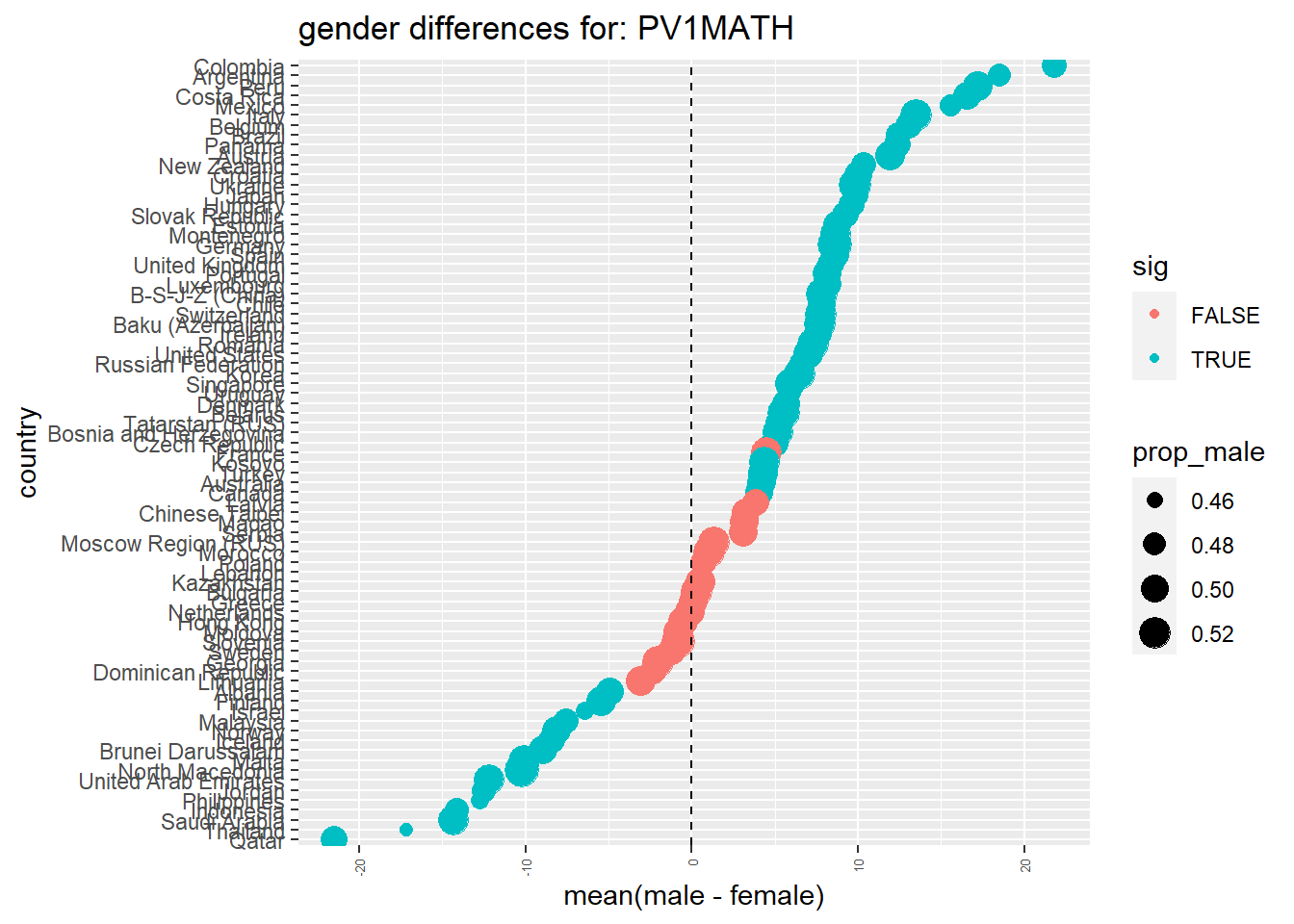
Answer
# Alternatively, you could run the following:
# run a ttest for each country
# ttest_results <- PISA_2018 %>%
# filter(!is.na(PV1MATH)) %>% # Vietnam no results?!
# select(CNT, ST004D01T, PV1MATH) %>%
# group_by(CNT) %>%
# nest(data = c(ST004D01T, PV1MATH)) %>% #create a dataframe of gender results for each country
# summarise(tt = map(data, function(df){ # apply a ttest to each country
# t.test(df %>% filter(ST004D01T == "Female") %$% PV1MATH,
# df %>% filter(ST004D01T == "Male") %$% PV1MATH) %>%
# tidy() # convert results into a dataframe
# })) %>%
# unnest(tt)What issues are there with using a t-test for the context given in the paper?
How do your findings from question 3 and the 2018 dataset compare with those in the paper? Are there any differences or disagreements with your findings?
How could the paper be improved?
6.3 Doing t-tests in R
You can find the code from the video below:
Show the Code
# Introduction to t-tests in R
#
# Download data from /Users/k1765032/Library/CloudStorage/GoogleDrive-richardandrewbrock@gmail.com/.shortcut-targets-by-id/1c3CkaEBOICzepArDfjQUP34W2BYhFjM4/PISR/Data/PISA/subset/Students_2018_RBDP_none_levels.rds
# You want the file: Students_2018_RBDP_none_levels.rds
# and place in your own file system
# change loc to load the data directly. Loading into R might take a few minutes
install.packages("nortest")
library(tidyverse)
library(nortest)
loc <- "/Users/k1765032/Library/CloudStorage/GoogleDrive-richardandrewbrock@gmail.com/.shortcut-targets-by-id/1c3CkaEBOICzepArDfjQUP34W2BYhFjM4/PISR/Data/PISA/subset/Students_2018_RBDP_none_levels.rds"
PISA_2018 <- read_rds(loc)
# Are there differences between the mean scores of UK boys and girls in PISA mathematics?
#
# Select the gender (ST004D01T) and math score columns (PV1MATH)
# Filter the data to select UK responses
MaleUK<-PISA_2018 %>%
select(CNT,ST004D01T, PV1MATH) %>%
filter(CNT=='United Kingdom') %>%
filter(ST004D01T=='Male')
FemaleUK<-PISA_2018 %>%
select(CNT,ST004D01T, PV1MATH) %>%
filter(CNT=='United Kingdom') %>%
filter(ST004D01T=='Female')
# The conditions to do a t-test include that the data are normally distributed
# and there is homogeneity (similarity) of the variances (the squared standard deviations)
# Let us check the conditions are met by calculating first if the data sets are normally
# distributed using the Pearson test of normality from the nortest package
pearson.test(as.numeric(MaleUK$PV1MATH))
pearson.test(as.numeric(FemaleUK$PV1MATH))
# The p-values are over 0.05 so both distriburtions are normal
# Pearson chi-square normality test
#
# data: as.numeric(MaleUK$PV1MATH)
# P = 75.714, p-value = 0.1936
# Pearson chi-square normality test
#
# data: as.numeric(FemaleUK$PV1MATH)
# P = 74.06, p-value = 0.2589
#
# We will then check the variances of the two data sets
VarM<-var(MaleUK$PV1MATH)
VarF<-var(FemaleUK$PV1MATH)
VarM/VarF
# The variance ratio is close to 1 (1.1)
# So our two conditions are met and can we can perform the t-test
t.test(MaleUK$PV1MATH, FemaleUK$PV1MATH)
# The p-value is <0.05 (4.061e-08) suggesting there are statistically
# differences between boys and girls7 Maths anxiety
7.1 Chi-square tests
Chi squared (\(\chi^2\)) tests are non-parametric tests, this means that the test isn’t expecting the underlying data to be distributed in a certain way. Chi-squared determines how well the frequency distribution for a sample fits the population distribution and will let you know when things aren’t distributed as expected. For example you might expect girls and boys to have the same coloured dogs, a chi squared test can tell you whether the null hypothesis, that there is no difference between the colours of dogs owned by girls and boys, is true or not.
In more mathematical terms, chi squared examines differences between the categories of an independent variable with respect to a dependent variable measured on a nominal (or categorical) scale. A nominal scale has values that aren’t ordered, or continuous, for example gender or favourite flavour of icecream.
Chi-square tests can be categorised in two groups:
A test of goodness of fit - this is a form of hypothesis test which determines whether a sample fits a wider population. For example, does the pattern of exam results in one school fit the national distribution?
A test of independence - allows inference to be made about whether two categorical variables in a population are related. For example, are there differences in the uptake of careers by gender?
In the example below you will be loading data about Ofsted inspections to see if the Ofsted grade of a state secondary school varies dependent on whether the school is all boys, all girls or mixed.
7.2 An example: Are schools with more students from socio-economically deprived backgrounds scored in the same as schools with more affluent students by Ofsted?
In England, the Office for Standards in Education, Children’s Services and Skills (Ofsted), inspects schools to judge the quality of education. They categorise schools into five categories: Outstanding, Good, Requires Improvement, Inadequate, and Special Measures.
Free School Meals refers to support for students who receive free meals at school - this funding is available for students whose parents or carers receive certain government benefits, typically due to relatively low income. It is taken, by some policy makers and researchers, as a marker of socioeconomic disadvantage
7.3 Loading the data
The data for this example come from the DfE edubase system. This system is updated almost daily with information on all education providers in the country.
Note, we will use the term ‘providers’ rather than, for example, schools, as some of the institutions in the data set are not schools, but providers of education also inspected by Ofsted, such as childminders
The snapshot below was taken in 2018, you are welcome to download a later copy.
7.4 Categorising the data
The dataset is very large, about 60Mb of data about 50,000 educational providers, both historic and current. For this exercise, we will filter the data set to state secondary schools that are currently open. As Chi-squared uses categorical variables, we will sort the schools into three categories (high, medium and low) based on the number of students receiving free school meals. The proportion of students receiving free school meals is sometimes taken as a proxy variable for social disadvantage (though that assumption has been critiqued Taylor (2018)).
# note that 2018 data doesn't have inadequate
Ofsted_ratings <- DfE_schools_2018 %>%
filter(Open == "Open",
EstablishmentGroup != "Independent schools",
Phase == "Secondary",
OfstedRating %in% c("Outstanding", "Good",
"Requires improvement","Inadequate",
"Special Measures")) %>%
mutate(FSM_group = ntile(FSM, n=3)) %>%
mutate(FSM_group = ifelse(FSM_group == 3,
"High",
ifelse(FSM_group == 2,
"Medium",
"Low")))7.5 Contingency tables
To get a feel for what the data looks like we can build a contingency table. A contingency table is a table which shows the frequency of occurrence of different groups.
In our example, the contingency table, will show the number of providers that match each combination of of the two groupings we are looking at, OfstedRating and the FSM_group. To make a contingency table, we will first count each group of OfstedRating and FSM_group. This makes a list of the number of instances of each group:
# to get a frequency table of the above we can use group_by
Ofsted_ratings_freq <- Ofsted_ratings %>%
group_by(OfstedRating, FSM_group) %>%
count()
print(Ofsted_ratings_freq)# A tibble: 12 × 3
# Groups: OfstedRating, FSM_group [12]
OfstedRating FSM_group n
<chr> <chr> <int>
1 Good High 486
2 Good Low 506
3 Good Medium 577
4 Outstanding High 90
5 Outstanding Low 252
6 Outstanding Medium 100
7 Requires improvement High 222
8 Requires improvement Low 69
9 Requires improvement Medium 145
10 Special Measures High 34
11 Special Measures Low 5
12 Special Measures Medium 10To put this into a contingency table we can use pivot_wider (see below), this will keep the FSM_group and by fetching names_from = OfstedRating, it will create a new column for each OfstedRating and will then show how many instances of each combined OfstedRating and FSM_group there are.
# build a contingency table of Ofsted rating
contingency_table <- Ofsted_ratings_freq %>%
pivot_wider(names_from = OfstedRating,
values_from = n)
print(contingency_table)# A tibble: 3 × 5
# Groups: FSM_group [3]
FSM_group Good Outstanding `Requires improvement` `Special Measures`
<chr> <int> <int> <int> <int>
1 High 486 90 222 34
2 Low 506 252 69 5
3 Medium 577 100 145 10An important step in using chisq.test (and many statistical functions in R) is getting the data into the right format to pass to chisq.test. As you can see, most of the steps above involve formatting the data so it is in a form the function expects. R tends to use a long format, whereas in the real world we tend to use a wide format.
The wide format looks like this (there are multiple measurements per row and the school names don’t repeat):
| Math | English | Science | |
|---|---|---|---|
| School A | 82 | 91 | 88 |
| School B | 52 | 56 | 57 |
| School C | 23 | 31 | 32 |
The long format has values that repeat in the first column
| Subject | Avg Score | |
|---|---|---|
| School A | Math | 82 |
| School A | English | 91 |
| School A | Science | 88 |
| School B | Math | 52 |
| School B | English | 56 |
The pivot_wider and pivot_longer functions switch between the two forms of table
Using pivot_wider
pivot_wider is a function that turns a table in wide form into long form. The inputs of pivot wider are first, the names of the columns you want to turn into a single column. For example, to produce the long form of the table of results above, I want to turn the three columns of Math, English and Science scores into a single column.
The first information I pass pivot_wider is the names of those columns: cols=c("Math", "English", "Science"). Second, when I stack those values, I will end up with two new columns, one with the names of the subjects, and one with the values of the scores. I tell pviot_wider what I want the titles of the new column to be: names_to= "subject" with the values stored in a column called values_to= "scores".
# Imagine you start with this table of data on students
#
# | Student | Math | English | Science |
# |---------|------|---------|---------|
# | A | 27 | 31 | 21 |
# | B | 81 | 92 | 78 |
#
# pivot_longer can convert this table into a long form table:
#
# | Student | Subject | Score
# | A | Math | 27
# | A | English | 31
# | A | Science | 21
# | B | Math | 81
# | B | English | 92
# | B | Science | 78
#
#
#
library(tidyverse)
results <- data.frame(student=c("A","B"), # Create the data.frame of the table above
Math=c(27,81),
English=c(31,92),
Science=c(21,78))
print(results) # Display the wide form of the table student Math English Science
1 A 27 31 21
2 B 81 92 78longresults <- results %>%
pivot_longer(cols=c("Math", "English", "Science"),
# indicates we want to stack these 3 columns
names_to= "Subject", # gives the name of the new, longer label column
values_to= "Score") # gives the name of the new, longer values column
print(longresults) # Print the wide form of the table# A tibble: 6 × 3
student Subject Score
<chr> <chr> <dbl>
1 A Math 27
2 A English 31
3 A Science 21
4 B Math 81
5 B English 92
6 B Science 787.6 Plotting the chi-square relationships
The numbers in the contingency table are hard to interpret - it is challenging to see how far out the numbers for each row are from each other. Alternatively, we can visualise the data from the contingency table by building a mosaic plot, a form of stacked bar chart. Mosaic plots can be a useful visulations before running a chi-squared test.
To create a mosaic plot, you are going to need to install and load the ggmosaic package. See Section 2.6.1 for more details on how to do this. To create the mosaic plot we use ggplot, as we used for previous graphs. As before, we first pass the data (in this case Ofsted_ratings) to ggplot. Then, to create the graph, geom_mosaic is used. geom_mosaic does not have a direct mapping of input to x and y variable so we need to pass it what we want plotted on the y-axis (OfstedRating) and x-axis (FSM_group) within the product function. We can also specify how we want the rectangles to be coloured (in our case, by OfstedRating).
# install.packages("ggmosaic")
library(ggmosaic)
# plot results
ggplot(data = Ofsted_ratings) +
geom_mosaic(aes(x = product(OfstedRating,
FSM_group),
fill = OfstedRating))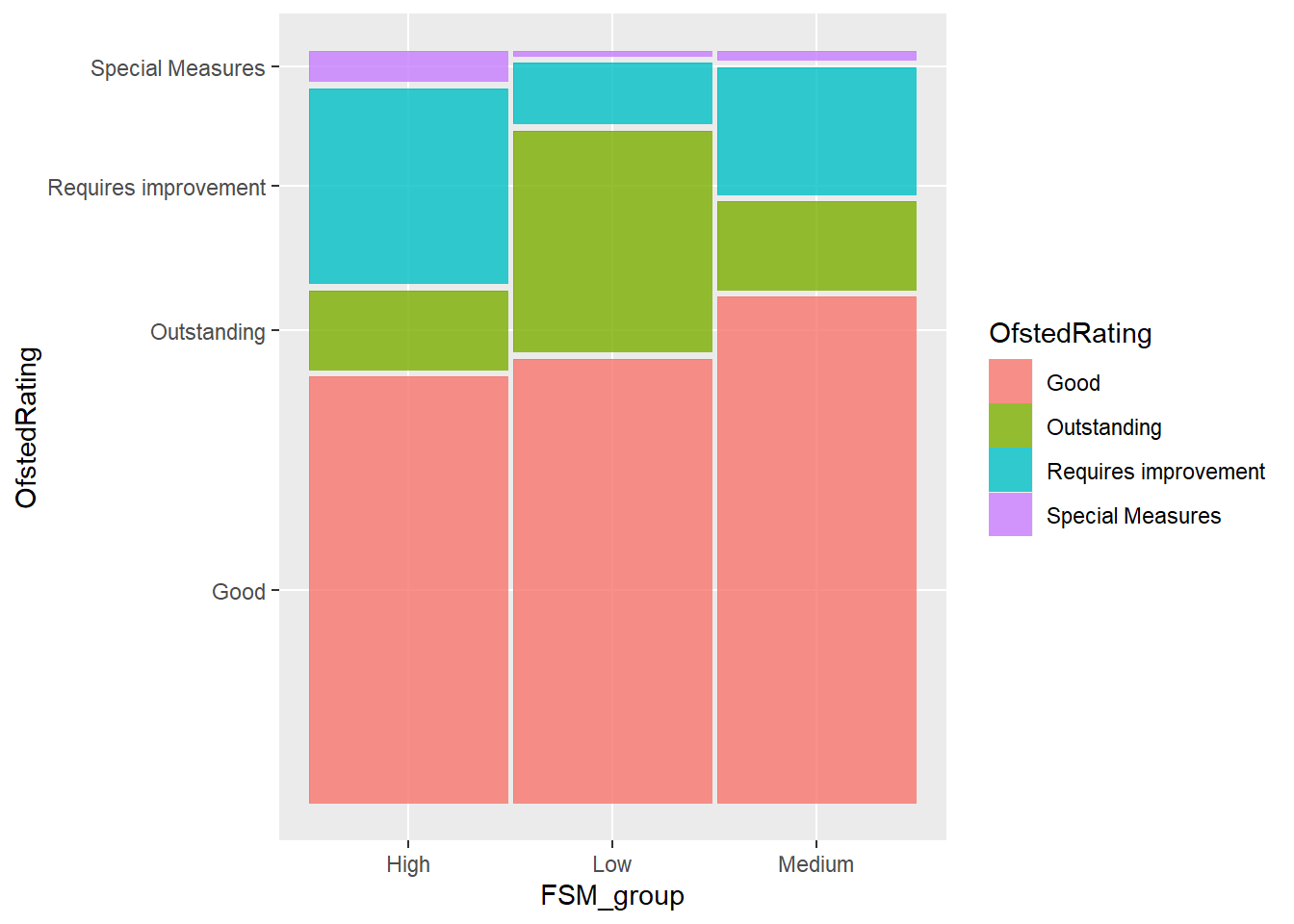
You can see in the example above, that the order of the axes is not what we would normally expect. The y-axis goes from requires improvement, to outstanding, and then to good. The x-axis runs: high, low, medium.
The order of the x and y axis on the table are defined by the levels of the data. This is an R-specific concept. Where R stores categorical variables, for example, high, medium and low, to save space, the variables are converted to numbers, e.g. low=0, medium=1, high=2. These values are known as factors and can be ordered or unordered (for more information about factors see Section 2.11.2). To reorder the factors in the axes, we can reorder the factors, by creating a vector that sets out the order we want (rdr <- c("Outstanding", "Good", "Requires improvement", "Special Measures")). We then use mutate to make the change to the data.frame. In the case of the FSM_groups, rather than defining a new vector (as we did for Ofsted_rating, e.e. the vector rdr), we set the new order directly in the mutate function: FSM_group = factor(FSM_group, levels=c("Low", "Medium", "High"))
# install.packages("ggmosaic")
library(ggmosaic)
# add order to the factors involved in the mosaic
rdr <- c("Outstanding", "Good", "Requires improvement", "Special Measures")
Ofsted_ratings <- Ofsted_ratings %>%
mutate(OfstedRating = factor(OfstedRating,
levels=rdr),
FSM_group = factor(FSM_group,
levels=c("Low", "Medium", "High")))
# plot results
ggplot(data = Ofsted_ratings) +
geom_mosaic(aes(x = product(OfstedRating,
FSM_group),
fill = OfstedRating))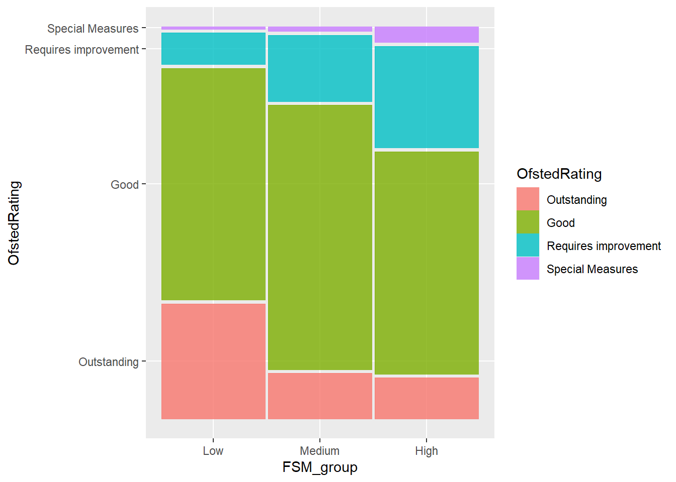
7.7 Running Chi square tests
Now we have the providers that we want, we can start to build a chi-square test. This is very easy in R and it follows the following structure:
chisq.test(<column_one>, <column_two>)For the data above, we are comparing the combinations of entries for OfstedRating and FSM_group:
Pearson's Chi-squared test
data: Ofsted_ratings$OfstedRating and Ofsted_ratings$FSM_group
X-squared = 230.58, df = 6, p-value < 2.2e-16In the case of a goodness of fit test, we can set the two columns to the observed populations and the expected probabilities. The expected vector should be of the form of probabilities and so add to one. With a goodness of fit, the null hypothesis is that the sample is part of the population. A p-value of greater than 0.05 implies that the null hypothesis should be accepted and that the sample fits well with the population as a whole.
For example, imagine we want to determine whether the biology a-level results of a school match, the national scores. We can look up the national levels of performance and express them as probabilities:
| Grade | Percentage nationally (in 2022) | Probability nationally | Observed numbers in school |
|---|---|---|---|
| A* | 13.3% | 0.133 | 10 |
| A | 21.6 | 0.216 | 15 |
| B | 21.6 | 0.216 | 20 |
| C | 19.5 | 0.195 | 5 |
| D | 14.2 | 0.142 | 1 |
| E | 7.6 | 0.076 | 0 |
| U | 2.2 | 0.022 | 0 |
We need to define an expectedbio vector which contains the probabilities of gaining a particular grade. We create the observedbio vector with the actual numbers getting a grade in school. Then pass the vectors to chisq.test:
expectedbio<-c((13.3/100), (21.6/100), (21.6/100), (19.5/100), (14.2/100),(7.6/100), (2.2/100))
observedbio<-c(10,15,20,5,1,0,0)
chisq.test(observedbio, expectedbio)
Pearson's Chi-squared test
data: observedbio and expectedbio
X-squared = 28, df = 25, p-value = 0.3079The test here returns a p-value of 0.3079. This implies there is no statistically significant deviation from the null hypothesis. Hence, the null hypothesis, that the school sample matches the national population can be accepted.
7.8 Seminar Tasks
7.8.1 Activity 1 - Uptake of single science in a school
For the initial activity, we will replicate the chi-square goodness of fit test in example on in the lecture. By goodness of fit test, we mean to determine if the data in a sample match the whole population (that is, is a there a good fit between the sample and the whole population?). In this activity we ask, does the number of students taking single or combined science in a particular school matches the national pattern.
In England, studying science till the age of sixteen is compulsory. However, schools and students can decide on the depth of material they wish to study.
Students opting for the lowest level, take a course called single science. Those wanting to learn more about science can take double science (and the highest level of study is triple science, where students study the three sciences, physics, biology, and chemistry as separate courses).
A school has a frequency count of 129 students taking combined sciences and 111 opting for single science. The national total for combined sciences was 424,704 and for single sciences was 164,944. Use a chi squared test (as a goodness of fit test) to determine whether the proportion of students taking combined and single science in the school is inline or not with the national average.
! Hint - look at the example above. Make two vectors, an expected vector, for the country and an observed vector for the school. Recall you can simply use the <- operator to put data into a vector (e.g. observed<-c(50,100)) . You will need to calculate percentages for the expected values.
Show the code
#Find totals
TotalSchool <- sum(129,111)
TotalNational <- sum(424704,164944)
#create contingency tables
observed <- c(129,111)
expected <- c(424704/TotalNational,164944/TotalNational)
#For R, the expected must total 1, so you find the percentage expected not the total
#Check you've done the calculation correctly for expected by printing
print(expected)
#run the chi-square test
chisq.test(x=observed,p=expected)
#Chi-squared test for given probabilities
#data: observed
#X-squared = 39.79, df = 1, p-value = 2.828e-10
#since p<0.05 we reject H0 (the null hypothesis), so accept H1 (the alternative hypothesis) that the school does not fit the national pattern7.8.2 Activity 2 - Vocational schools and gender in the PISA dataset
For these activities, we will first use the PISA 2018 data set.You can load the PISA_2018 data set using these steps. Click here to download the parquet file: PISA_2018.parquet
To load the data, use the code below:
We will now use the the chi-squared test as a test of independence.
We want to see if there are more boys or girls in vocational schools than might be expected. That is, we want to test if the variables of gender and school orientation are independent.
The null hypothesis in this case is: gender and school orientation are independent.
Recall that a p-value greater than 0.05 suggest the null hypothesis is accepted (i.e. there is no statistically significant difference in gender distribution by school orientation). If p is less than 0.05, then the null hypothesis can be rejected, and we assume there are statistically significant differences in the gender distribution by school orientation.
Determine if the distribution of genders (ST004D01T) and school orientation (ISCEDO) (Pre-vocational, Vocational, General) is independent or not, for:
a) the whole data set,
b) the UK,
c) Germany,
d) a country of your choice.
ST004D01T is the gender variable (Male, Female) and ISCEDO is a categorical variable (Vocational, General, Pre-Vocational).
Complete the following steps to help answer the question:
a) Create a table to display sets of data for each case and use this to check for any issues with the data such as missing frequency counts. Note that R requires the two vectors passed to chisq.test to be the same length. if a particular type of school is missing in your table, you will need to add it in to make sure the two vectors are the same length. You can add another row, with zeros using: add_row(ISCEDO="Modular", type=0) Note that, ISCEDO and type are the names of the two columns.
b) Run the chi-square test.
c) Write down the p-value and the result of your chi-square test in the context of the question.
d) Extension- Display the data using geom_mosaic
Show the code
# Are there differences in the type of school by gender
# ST004D01T is the gender variable (Male, Female)
# ISCEDO is a categorical variable (Vocational, General, Pre-Vocational)
#i) a)
#Sort data and table
Totalchidata <- PISA_2018 %>%
select(ST004D01T,ISCEDO)%>%
drop_na()
table(Totalchidata$ST004D01T, Totalchidata$ISCEDO)
#i) b)
# run the test
chisq.test(Totalchidata$ST004D01T, Totalchidata$ISCEDO)
#check expected values
chisq.test(Totalchidata$ST004D01T, Totalchidata$ISCEDO)$expected
#i) c)
# p-value < 2.2e-16, so reject H0 and accept H1 that proportion of gender is related to institution type
#i) d)
library(ggmosaic)
ggplot(data = Totalchidata) +
geom_mosaic(aes(x = product(ST004D01T,
ISCEDO),
fill = ISCEDO), check_overlap=TRUE)+
theme(axis.text.x = element_text(angle = 90, vjust = 0.5, hjust=1))
#ii) a)
UKchidata <- PISA_2018 %>%
select(CNT,ST004D01T,ISCEDO)%>%
filter(CNT=="United Kingdom")%>%
drop_na()
table(UKchidata$ST004D01T,UKchidata$ISCEDO)
#ii)b)
# run the test
chisq.test(UKchidata$ST004D01T, UKchidata$ISCEDO)
#check expected values
chisq.test(UKchidata$ST004D01T, UKchidata$ISCEDO)$expected
#note than one value is <5, but over 80% cells are >5 so OK. Perhaps consider removing one variable
#ii)c)
#p-value = 0.9956 so >0.05 so accept H0 that proportion of gender is independent of school type.
#ii)d)
ggplot(data = UKchidata) +
geom_mosaic(aes(x = product(ST004D01T,
ISCEDO),
fill = ISCEDO))+
theme(axis.text.x = element_text(angle = 90, vjust = 0.5, hjust=1))
# iii)a)
Gerchidata <- PISA_2018 %>%
select(CNT,ST004D01T,ISCEDO)%>%
filter(CNT=="Germany")%>%
drop_na()
table(Gerchidata)
#iii)b)
# run the test
chisq.test(Gerchidata$ST004D01T, Gerchidata$ISCEDO)
#check expected values
chisq.test(Gerchidata$ST004D01T, Gerchidata$ISCEDO)$expected
#iii)c)
#p-value = 6.892e-07, so <0.05, therefore reject H0 and accept H1 that gender proportion is related to school type
#iii)d)
ggplot(data = Gerchidata) +
geom_mosaic(aes(x = product(ST004D01T,
ISCEDO),
fill = ISCEDO))+
theme(axis.text.x = element_text(angle = 90, vjust = 0.5, hjust=1))7.8.3 Activity 3 - Are the number of students in vocational and general schools in Germany proportionate to the whole PISA 2018 data set?
Complete the following steps to determine if the number of students in general and vocational schools in Germany are proportionate to the whole PISA 2018 data set.
Create the expected vector with the proportions of General, Pre-Vocational, Vocational and Modular schools out of the overall total.
Create the observed vector the total number of General, Pre-Vocational, Vocational and Modular schools in Germany.
Calculate the chi-square test p-value.
State the p-value and interpret the result in the context of the question.
Show the code
#a)
Totalchidata2<- PISA_2018 %>%
select(ISCEDO) %>%
drop_na() %>%
mutate(total = n()) %>%
group_by(ISCEDO) %>%
summarise(type = n(), per = type /unique(total))
Totalexpected<-c(Totalchidata2$per)
#b)
Gerchidata2 <- PISA_2018 %>%
select(CNT,ISCEDO)%>%
filter(CNT=="Germany")%>%
drop_na()%>%
mutate(total = n()) %>%
group_by(ISCEDO) %>%
summarise(type = n())
Gerchidata3 <- Gerchidata2%>% add_row(ISCEDO="Modular", type=0)
Totalobserved<-c(Gerchidata3$type)
#c)
chisq.test(x=Totalobserved,p=Totalexpected)
#d) p-value < 2.2e-16, so p<0.05, therefore reject H0 and accept H17.8.4 Activity 4 - Create your own question that uses the chi-square test from the PISA Dataset
Create your own question that investigates the PISA data using either the chi-square test for independence or chi-square goodness of fit test.
7.8.5 Activity 5 - Determine if admissions type in LAs are proportionate to national averages
Looking at the DfE Data set, choose a Local Authority (I suggest Dorset) and determine if the proportion of selective and non-selective schools are statistically similar or different to the national average. Comment on any potential issues with the data or the approach.
Show the code
# Load the file for the task
loc<-"https://drive.google.com/uc?export=download&id=1tp9xe3dS__eg7RrXf0T_oMxcrz_TbMdM"
DfE_schools_2018 <- read.xlsx(loc,sheet="Schools")
# Create a dataframe of the admission policies of Dorset schools
DorsetschAd<-DfE_schools_2018 %>%
select(LA,AdmissionsPolicy)%>%
filter(LA=="Dorset")
# Create a dataframe of the admission policies of all non-Dorset schools (note LA! means
# not equal to)
OtherUKSch<-DfE_schools_2018 %>%
select(LA,AdmissionsPolicy)%>%
filter(LA!="Dorset")
# OtherUKSchs are labelled by LA so reset all these names just to UK
OtherUKSch$LA<-"UK"
# Join the two frames to give one long list
AllSch<-rbind(OtherUKSch, DorsetschAd)
# To check what test to do print the frequency table
table(AllSch)
# And a percentage version
(100*prop.table(table(AllSch)))
# Expected values are fine so use the Chi squared test
# AdmissionsPolicy
# LA Non-selective Not applicable Selective
# Dorset 0.059974356 0.349505729 0.006204244
# UK 16.075195434 81.718161889 1.790958349
# Note
chisq.test(AllSch$LA, AllSch$AdmissionsPolicy, simulate.p.value = TRUE)7.8.6 Activity 6 - Determine if Ofsted rating and gender of school are independent
Looking again at the DfE Data set, compare Ofsted rating of the school against gender to determine if these are independent or not. You may wish to focus on a particular phase (such as secondary) and only include certain Ofsted ratings. Comment on any issues with the data.
Show the code
# Is there a relationship between school gender and Ofsted Rating?
chisq.test(DfE_schools_2018$Gender,DfE_schools_2018$OfstedRating, simulate.p.value = TRUE)
# Yes!
# Pearson's Chi-squared test with simulated p-value (based on 2000 replicates)
#
# data: DfE_schools_2018$Gender and DfE_schools_2018$OfstedRating
# X-squared = 675.4, df = NA, p-value = 0.00049987.8.7 Activity 7 - Create your own problem
Using the DfE Data set (or otherwise), create a research question which requires one of the chi-square tests to answer the question. State clearly what your null and alternative hypothesis are, what you are using as the significance level, what the chi-square calc and/or p-values for the test are, what conclusion you make, and any issues you think there are with the test.
7.8.8 Activity 8 - Checking chi-square test in a research paper
In this activity you are going to look at the data presented in a paper by Mutodi and Ngirande (2014). They present the relationships between a number of demographic factors and maths anxiety. For example, table 3 in the paper looks at the relationship between gender and maths anxiety.
| Gender | High level of anxiety | Moderate level of anxiety | No math anxiety | Not sure | Total |
|---|---|---|---|---|---|
| Female | 14 | 10 | 3 | 9 | 36 |
| Male | 26 | 35 | 6 | 17 | 84 |
| Total | 40 | 45 | 9 | 26 | 120 |
| Source: Table 3, Mutodi, P. and Ngirande, H. (2014) The influence of studentsperceptions on Mathematics performance. A case of a selected high school in South Africa. Mediterranean Journal of Social Sciences | |||||
The raw survey data is available in a two column csv format, with each row equal to one survey response. The first column being the demographic data; in the case below, Gender, and the second column listing the student’s answer to the questions about maths anxiety, listed here as name:
# A tibble: 3 × 2
Gender name
<chr> <chr>
1 Male High level of anxiety
2 Male High level of anxiety
3 Male High level of anxiety- Using the gender and maths anxiety dataset,
grouptheGenderandnamefields, counting the number of responses in each group. - Comment on any issues you find with the data, the methodological or the calculations.
- repeat this for Table 4 (HINT: you won’t be grouping by Gender this time!)
- repeat this for Table 5
Now you have had a brief explore of the data we need to conduct some chi-square tests to check whether the results between groups are
Show the code
# Load the csv files for the three tables
loc<-"<your HDD>/anx_table_3.csv"
anxiety_table_3 <- read_csv(loc)
loc<-"<your HDD>/anx_table_4.csv"
anxiety_table_4 <- read_csv(loc)
loc<-"<your HDD>/anx_table_5.csv"
anxiety_table_5 <- read_csv(loc)
# This section gets the data into the correct format for the square test in R
# The Count tables are turned back into a long list of entries like this:
# A tibble: 120 × 2
#Gender name
#<chr> <chr>
# 1 Male High level of anxiety
# 2 Male High level of anxiety
# 3 Male High level of anxiety
#
# That is done by
# 1) Select(-total) removes the total column which we don't need
# 2) filter(Gender !="Total") removes the row that stores totals
# leaving just the rows storing actual data
# 3) pivot_longer turns the table into a long dataframe, -Gender
# ignores/keeps the Gender column and converts all the other
# columns into one column, with the heading and matching value
# making up new rows
# 4) uncount turns the counts stored in value in the table into
# individual entries, e.g. Male, No anxiety, 45 would create
# 45 rows with "Male, No anxiety"
anx_3 <- Anxietytable3 %>%
select(-Total) %>%
filter(Gender != "Total") %>%
pivot_longer(-Gender) %>%
uncount(value)
anx_4 <- Anxietytable4 %>%
select(-Total) %>%
filter(Age != "Total") %>%
pivot_longer(-Age) %>%
uncount(value)
anx_5 <- Anxietytable5 %>%
select(-Total) %>%
filter(HomeLang != "Total") %>%
pivot_longer(-HomeLang) %>%
uncount(value)
# save long dataframes
# write.csv(anx_3, glue("{loc_amy}Amy/anx_table_3.csv"), row.names = FALSE)
# write.csv(anx_4, glue("{loc_amy}Amy/anx_table_4.csv"), row.names = FALSE)
# write.csv(anx_5, glue("{loc_amy}Amy/anx_table_5.csv"), row.names = FALSE)
# conduct chi-square tests
chisq.test(anx_3$Gender, anx_3$name)
chisq.test(anx_4$Age, anx_4$name)
chisq.test(anx_5$HomeLang, anx_5$name)
# conduct - Kruskal-Wallis tests
kruskal.test(anx_3$Gender, anx_3$name)
kruskal.test (anx_4$Age, anx_4$name)
kruskal.test (anx_5$HomeLang, anx_5$name)7.8.9 Doing Chi-Square tests in R
You can find the code used in the video below
# Introduction to Chi-square
#
# Download data from /Users/k1765032/Library/CloudStorage/GoogleDrive-richardandrewbrock@gmail.com/.shortcut-targets-by-id/1c3CkaEBOICzepArDfjQUP34W2BYhFjM4/PISR/Data/PISA/subset/Students_2018_RBDP_none_levels.rds
# You want the file: Students_2018_RBDP_none_levels.rds
# and place in your own file system
# change loc to load the data directly. Loading into R might take a few minutes
loc <- "https://drive.google.com/open?id=14pL2Bz677Kk5_nn9BTmEuuUGY9S09bDb&authuser=richardandrewbrock%40gmail.com&usp=drive_fs"
PISA_2018 <- read_rds(loc)
# Are there differences between how often students change school?
# ST004D01T is the gender variable (Male, Female)
# SCCHANGE is a categorical variable (No change / One change / Two or more changes)
chidata <- PISA_2018 %>%
select(CNT,ST004D01T,SCCHANGE) %>%
filter(CNT=="United Kingdom")
chidata<-chidata[-c(1)]
chidata<-drop_na(chidata)
chidata <- PISA_2018 %>%
filter(CNT=="United Kingdom")
select(ST004D01T,SCCHANGE) %>%
drop_na()
# Above is the approiach I took in the video
# An alternative, Pete suggests, which is more elegant, is below
# Note he drops the country varibale, within the piped section
# using: elect(-CNT)
#
# chidata <- PISA_2018 %>%
# select(CNT,ST004D01T,SCCHANGE) %>%
# filter(CNT=="United Kingdom") %>%
# select(-CNT) %>%
# drop_na()
# run the test
chisq.test(chidata$ST004D01T, chidata$SCCHANGE)8 Inquiry learning in science
8.1 Analysis of Variation (Anova)
You have now learned how to find if the means of two groups are different to a statistically significant degree - you use a t-test. However, t-tests are used to compare two groups. When more than two groups are compared, a different test is required, an analysis of variation or anova test.
Anova refers to a collection of tests that can be used to analyse the varriance in means between groups (hence analysis of variation, or anova for short). For example, consider the data below, which show students scores on a test, their age in years and socio-economic class (categorised as high or low):
| Socio | Age | Score |
|---|---|---|
| High | 15 | 100 |
| High | 16 | 98 |
| High | 11 | 89 |
| High | 15 | 98 |
| Low | 11 | 21 |
| High | 14 | 31 |
| Low | 12 | 23 |
| High | 16 | 92 |
| High | 12 | 99 |
| Low | 15 | 19 |
Note that an assumption of an anova test is that the variables are normally distributed, and have equal variance. This is not the case with the small data set in this example. It is a teaching illustration.
Which variable, age or socio-economic class, seems to explain the variation in test scores?
We can use anova to determine, first, if there is statistically significant differences in the variation of scores by class and age. Second an additional anova analysis (a post-hoc analysis, so-called because it comes after the first test) can determine how much variation each variable (class and age) accounts for.
You can get a sense of this difference graphically by plotting graphs of the distribution of scores by socio-economic class:
Testscores <- data.frame(socio=c("High","High","High","High","Low","High","Low","High","High","Low"),
score=c(100,98,89,98,21,31,23,92,99,19),
Age=c(15,16,11,15,11,14,12,16,12,15))
ggplot(Testscores,
aes(x=score, fill=socio))+
geom_density(alpha=0.5)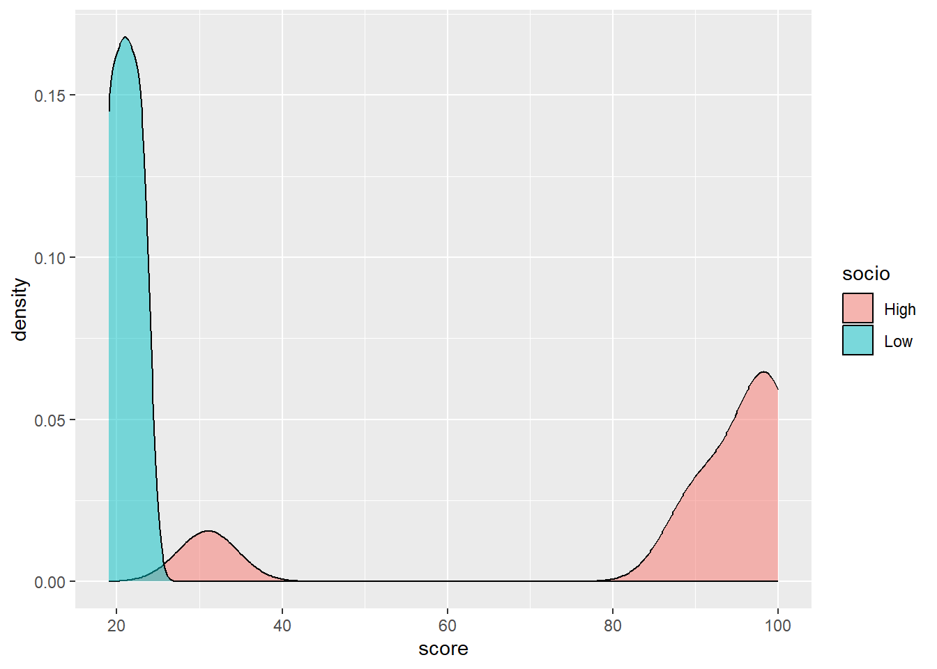
It looks like there might be a difference in the variation of scores by those in different classes (notice that the normal distribution seems more spread out for the high socio-economic students’ group, i.e. there is a larger variance than for low socio-economic group students’ scores).
To simply the analysis of variation with age, we can categorise ages into two groups, under 15, and 15 and over:
# Testscores$Age[Testscores$Age>=15] <- "Fifteen and over"
# Testscores$Age[Testscores$Age<15] <- "Under fifteen"
Testscores <- Testscores %>%
mutate(Age = ifelse(Age >= 15,
"Fifteen and over",
"Under fifteen"))
# Here the mutate function changes the column age
# ifelse changes the Age column to "Fifteen and over" if
# the varibale is over 15, and otherwise (ifelse) to
# "Under fifteen"
# Then we plot a graph, using geom_density, to get a representaiton of the
# distribution
ggplot(Testscores,
aes(x=score, fill=Age))+
geom_density(alpha=0.5)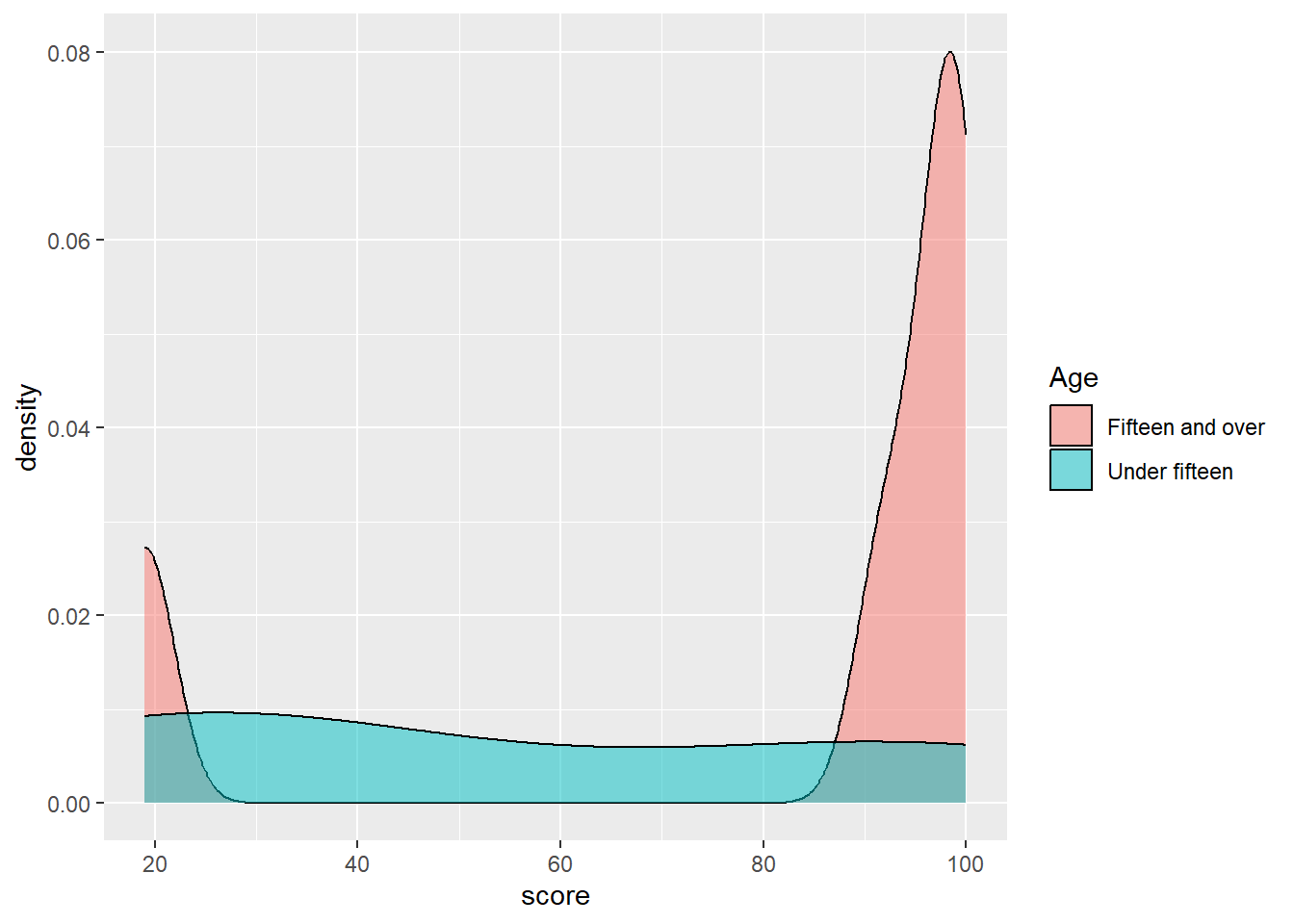
The difference is less clear for age than class, but, visually, there appears to be some difference in variance between the two groups.
To determine if there is a statistically significant difference between groups we run an anova calculation, using the aov function in R. The dependent variable is the one we are interested in explaining, the independent variables are the factors we think might explain the variance.
aov(data, dependent_var ~ independent_var + independent_var + ...)
We pass the function the data we wish to focus on (Testscores) and then indicate we wish to look for variation in the score, by Age and socio (social class) - aov(data=Testscores, score ~ Age + socio). We then summarise the result to get a table.
Df Sum Sq Mean Sq F value Pr(>F)
Age 1 2074 2074 4.707 0.06667 .
socio 1 7638 7638 17.338 0.00422 **
Residuals 7 3084 441
---
Signif. codes: 0 '***' 0.001 '**' 0.01 '*' 0.05 '.' 0.1 ' ' 1The resulting table has three rows: Age and socio (the two vectors we input to examine) and a third, residuals. The aov function looks to determine if there is a difference in the variance of groups of different ages (under fifteen and over) and class (high and low). After determining any variation from those two variables, any remaining variation is associated with residuals - you can think of this as the unexplained variation that isn’t associated with the vectors we specified (age and class).
First, look at the Pr(>F) column. This is a test of significance and reports if the groups in that row show statistically significant variation. For example, Age returns Pr(>F) 0.07 - which is over 0.05 therefore there is no significant difference in variance between the two age groups. However, for class, Pr(>F) is 0.00422** suggesting there is a significant difference by class.
8.2 Eta-squared
Now knowing that there are significant differences between the two class groups, we can next determine how much variation in the test score is explained by class. To do this we calculate a variable called eta-squared.
Eta-squared gives the proportion of variance explained by each variable. The eta squared function is in the package lsr so we will install lsr, and then use the result of our anova (resaov) to calculate the eta squared variable using the function etaSquared. To report the value of eta as a percentage we need to multiply the output of eta by 100.
Eta squared tells us the proportion of the total variance that is explained by a variable (you can also think of it as an effect size). An eta squared value of 1 indicates all the variance of a sample is explain by some variable and 0 means the variable is not responsible for any of the observed variance. We can multiply the eta-squared score by 100 to get a value for the percentage of variance explained.
The percentage of variance explained is a useful figure. For example, it has been reported that schools only account for 14% of the variance in progress 8 scores, whilst family explains 43% (Wilkinson, Bryson, and Stokes (2018)).
eta.sq eta.sq.part
Age 5.028982 17.26414
socio 59.694279 71.23853The important column here is the eta.sq column - it tells us that age only explains 5% of the variance in test scores, but socioeconomic class, explains 60%. (The second column contains information about partial eta-squared, which we won’t go into, but are used when the results of each measure are not independent i.e. one result influences another).
As a rule of thumb, a percentage variance explained of 1% is considered small, 6% medium and 14% and more large
We can now apply anova to the PISA_2018. Let us focus on science scores (PV1SCIE).
First, load the PISA data and create a data.frame containing the UK results for the vectors of science scores (PV1SCIE), parental wealth (WEALTH), gender (ST004D01T) and age (AGE).
Two assumptions of anova tests are a) the normality of the groups and b) that the groups have equal variance. We can do those checks using the quantile-quantile plot of normality we have seen earlier, and the var function to find the variance.
PISAUKmale <- PISAUK %>% filter(ST004D01T=="Male")
PISAUKFemale <- PISAUK %>% filter(ST004D01T=="Female")
ggqqplot(PISAUKmale$PV1SCIE)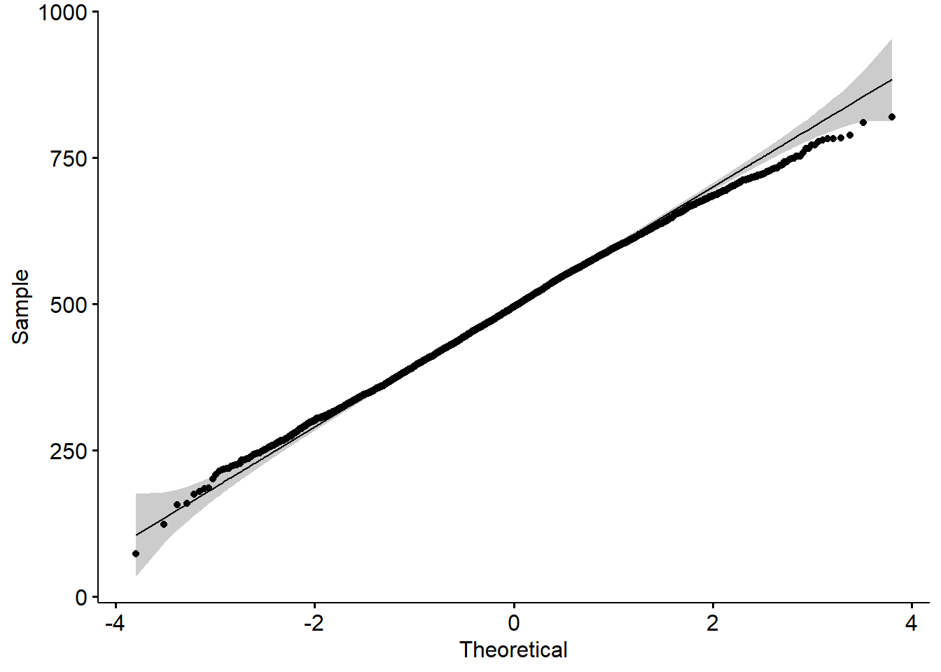
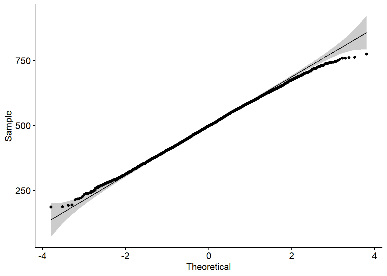
[1] 1.176446Both plots come out as straight lines indicating normality. The ratio of variance is 1.2, close enough to equal variance to suggest the conditions for anova tests are met. The rule of thumb for equal variances is taken as anything less than 3:1.
Currently, the wealth scores are a numeric measure of family wealth, normalised around 0 (being the mean) and in the range of -0.935 to 1.20. To make the calculation simpler, we will categorise the scores into two groups, high wealth (over 0) and low wealth (0 or under). We will drop any NA values.
To visualise the difference in means, here are graphs of the science scores for the two wealth groups:

Visually, there appear to be some differences, the high wealth group seems to have a higher mean, but to determine if they are statistically significant, we need to run an anova test.
Below is code to run the anova, just like in the example with test scores. We use aov and specify the data set as PISAUK. Then we state we wish to compare the variance in science scores PV1SCIE, against gender (ST004D01T), wealth and age: PV1SCIE ~ ST004D01T + WEALTH + AGE.
We then summarise and print the table:
Df Sum Sq Mean Sq F value Pr(>F)
ST004D01T 1 6200 6200 0.695 0.405
WEALTH 1 1038412 1038412 116.371 < 2e-16 ***
AGE 13 610655 46973 5.264 1.66e-09 ***
Residuals 13351 119134784 8923
---
Signif. codes: 0 '***' 0.001 '**' 0.01 '*' 0.05 '.' 0.1 ' ' 1Note that the p value for gender (ST004D01T) is 0.405, which is over 0.05, so there are no significant differences by gender. By contrast, for WEALTH and AGE, the p values are below the 0.05 cut off, so the two wealth groups and 14 different age groups are statistically significantly different.
Note that, in the anova table, the df (degrees of freedom column), tells you how many groups there are. df is the number of groups minus one. So, for WEALTH groups, df is 1, because there are two groups (high and low, which we created) and so df=2-1=1. For age, which gives participants’ birth month, there are df=13-1=12 groups, i.e. the number of months of the year.
Finally, we are interested in finding how much of the variance is explained by age and wealth, so we can run an eta-squared test, and multiply by 100 to get percentage variance explained
eta.sq eta.sq.part
ST004D01T 0.01017853 0.01031889
WEALTH 0.85001629 0.85446249
AGE 0.50555112 0.50996135WEALTH and AGE only explain a small amount of the variation, 0.85% and 0.5% respectively.
8.3 Pre-seminar tasks - please complete the two tasks below before the seminar
8.4 Pre-seminar task 1
Determine if there is significant variation in UK PISA science scores by gender, and having a quiet place to study (ST011Q03TA). Then find the proportion of variance explained by each variable.
answer
# Create a dataframe of UK results with science scores, gender and
# the quiet place to study item
PISAUK <- PISA_2018 %>%
select(CNT, PV1SCIE, ST004D01T, ST011Q03TA)%>%
filter(CNT=="United Kingdom")%>%
drop_na()
# Perform the anova using the dataframe PISAUK
# finding the variance in PV1SCIE by gender (ST004D01T) and
# having a quiet place to study (ST011Q03TA)
resaov<-aov(data=PISAUK, PV1SCIE ~ ST004D01T + ST011Q03TA)
# summarise the results and print
sumresaov<-summary(resaov)
sumresaov Df Sum Sq Mean Sq F value Pr(>F)
ST004D01T 1 1007 1007 0.113 0.737
ST011Q03TA 1 530338 530338 59.502 1.31e-14 ***
Residuals 13201 117659885 8913
---
Signif. codes: 0 '***' 0.001 '**' 0.01 '*' 0.05 '.' 0.1 ' ' 1answer
# No significant difference by gender (Pr(>)=0.737)
# Significant differences by quiet space (Pr(>)=1.31e-14)
#
# To perform the eta-sqaured caluclation - i.e. how much
# variation is explained by each varibale, install the
# lsr package
# Carry out the eta-squared calculation and times by 100 to get %s
eta=etaSquared(resaov)
eta=eta*100
eta eta.sq eta.sq.part
ST004D01T 0.002130537 0.002140113
ST011Q03TA 0.448711871 0.4487156938.5 Pre-seminar task 2
Determine if there is significant variation in UK PISA mathematics scores by gender, and having an internet link in the home (ST011Q06TA). Then find the proportion of variance explained by each variable.
answer
# Create a dataframe of mathematics scores, gender and internet connection
# for UK students and remove NAs
PISAUK <- PISA_2018 %>%
select(CNT, PV1MATH, ST004D01T, ST011Q06TA)%>%
filter(CNT=="United Kingdom")%>%
drop_na()
# Perform the anova on the PISAU data, find variance in PV1MATH ~ (by)
# gender (ST004D01T) and having an internet connection (ST011Q06TA)
resaov<-aov(data=PISAUK, PV1MATH ~ ST004D01T + ST011Q06TA)
sumresaov<-summary(resaov)
sumresaov Df Sum Sq Mean Sq F value Pr(>F)
ST004D01T 1 317167 317167 39.84 2.84e-10 ***
ST011Q06TA 1 1635601 1635601 205.45 < 2e-16 ***
Residuals 13259 105553812 7961
---
Signif. codes: 0 '***' 0.001 '**' 0.01 '*' 0.05 '.' 0.1 ' ' 1answer
eta.sq eta.sq.part
ST004D01T 0.321931 0.3268152
ST011Q06TA 1.521397 1.52589838.6 Seminar Tasks - please leave these to complete in the seminar
8.7 Task 1
Discussion points:
Recall the presentation slide on validity. As you are already aware, it is important that we keep in mind what the data we are analysing are based on, so:
What threats are there to the validity of PISA for its intended interpretations (e.g. scientific literacy) and uses (i.e. informing education policy)?
To what extent does the content of the PISA items used in the recommended reading reflect what you consider to be “inquiry-based teaching” and “teacher-directed teaching”?
Inquiry based science teaching (IBTEACH) items:
• Students spend time in the laboratory doing practical experiments
• Students do experiments by following the instructions of the teacher
• Students are asked to draw conclusions from an experiment they have conducted
• Students are required to design how a school science question could be investigated in the laboratory
• Students are allowed to design their own experiments
• Students are given the chance to choose their own investigations
• Students are asked to do an investigation to test out their own ideas
Teacher-directed science teaching (TDTEACH) items
• The teacher explains scientific ideas
• A whole class discussion takes place with the teacher.
• The teacher discusses our questions.
• The teacher demonstrates an idea.
c) What are the assumptions of a one-way anova test? How might it be misapplied to some variables in the PISA dataset?
8.8 Task 2
Determine if there is significant variation in UK PISA mathematics scores by gender, wealth, and having a computer in the home (ST011Q04TA). Then find the proportion of variance explained by each variable.
Hint, wealth is a normalised score which you can sort into two categories, high and low. We can consider a score above 0, high wealth, and scores below 0, low wealth.
To do this you can use the mutate (see Section 2.10.5) function to change a column, combined with the ifelse function (see Section 2.11.1).
This line mutates the WEALTH column, writing “High” when the value is over 0 and, if else, “Low”
mutate(WEALTH = ifelse(WEALTH > 0, "High", "Low"))
answer
PISAUK <- PISA_2018 %>%
select(CNT, PV1MATH, ST004D01T, WEALTH, ST011Q04TA)%>%
filter(CNT=="United Kingdom")%>%
drop_na()
PISAUK <- PISAUK %>%
mutate(WEALTH = ifelse(WEALTH > 0, "High", "Low"))
# PISAUK$WEALTH<-replace(PISAUK$WEALTH,PISAUK$WEALTH>0, "High")
# PISAUK$WEALTH<-replace(PISAUK$WEALTH,PISAUK$WEALTH<=0, "Low")
resaov<-aov(PV1MATH ~ ST004D01T + WEALTH + ST011Q04TA, data=PISAUK)
sumresaov<-summary(resaov)
sumresaov Df Sum Sq Mean Sq F value Pr(>F)
ST004D01T 1 324200 324200 41.54 1.19e-10 ***
WEALTH 1 1318840 1318840 169.00 < 2e-16 ***
ST011Q04TA 1 2176070 2176070 278.84 < 2e-16 ***
Residuals 13244 103356592 7804
---
Signif. codes: 0 '***' 0.001 '**' 0.01 '*' 0.05 '.' 0.1 ' ' 1 eta.sq eta.sq.part
ST004D01T 0.2978265 0.3078806
WEALTH 0.5907302 0.6088288
ST011Q04TA 2.0303766 2.06198768.9 Task 3
Try the same task again, determine if there is significant variation in UK mathematics scores by gender, Wealth, and having a computer in the home. This time, divide the wealth variable into four levels.
answer
PISAUK <- PISA_2018 %>%
select(CNT, PV1MATH, ST004D01T, WEALTH, ST011Q04TA)%>%
filter(CNT=="United Kingdom")%>%
drop_na()
PISAUK <- PISAUK %>%
mutate(WEALTH = ifelse(WEALTH >= 0.5, "High",
ifelse(WEALTH > 0, "Medium High",
ifelse(WEALTH <= -0.5, "Low",
ifelse(WEALTH <= 0,"Medium Low", "ERROR")))))
# PISAUK$WEALTH<-replace(PISAUK$WEALTH,PISAUK$WEALTH>=0.5, "High")
# PISAUK$WEALTH<-replace(PISAUK$WEALTH, PISAUK$WEALTH>0, "Medium High")
# PISAUK$WEALTH<-replace(PISAUK$WEALTH,PISAUK$WEALTH<=-0.5, "Low")
# PISAUK$WEALTH<-replace(PISAUK$WEALTH,PISAUK$WEALTH<=0,"Medium Low")
resaov<-aov(PV1MATH ~ ST004D01T + WEALTH + ST011Q04TA, data=PISAUK)
sumresaov<-summary(resaov)
sumresaov Df Sum Sq Mean Sq F value Pr(>F)
ST004D01T 1 324200 324200 41.65 1.13e-10 ***
WEALTH 3 1830726 610242 78.40 < 2e-16 ***
ST011Q04TA 1 1946438 1946438 250.06 < 2e-16 ***
Residuals 13242 103074339 7784
---
Signif. codes: 0 '***' 0.001 '**' 0.01 '*' 0.05 '.' 0.1 ' ' 1 eta.sq eta.sq.part
ST004D01T 0.2874810 0.2980291
WEALTH 0.8540855 0.8802526
ST011Q04TA 1.8161186 1.85338378.10 Tukey’s HSD
When an anova test reports that are some statistically significant differences between groups, it does not imply there are statistically significant differences between all subgroups. For example, if the anova reports statistically significant differences by age, statistically significant differences might exist between 11, 12 and 13-year old students, but not between 13 and 14-year olds.
We can use an additional anova test, Tukey’s Honest Significant Difference test (or Tukey’s HSD for short), to find out which pairs of subgroups have statistically significant differences in means.
Consider the question: Are there statistically significant differences in the variance of science scores of the UK, US, France and Germany? To determine if such differences exist, we create a new subset for those countries’ science scores, and then run an anova test by country, reporting the eta squared value.
PISAMULTI <- PISA_2018 %>%
select(CNT, PV1SCIE)%>%
filter(CNT=="United Kingdom" | CNT=="United States" | CNT=="Germany" | CNT=="France")
# filter(CNT %in% c("United Kingdom", "United States", "Germany", "France"))
ggplot(PISAMULTI,
aes(x=PV1SCIE, fill=CNT))+
geom_density(alpha=0.5)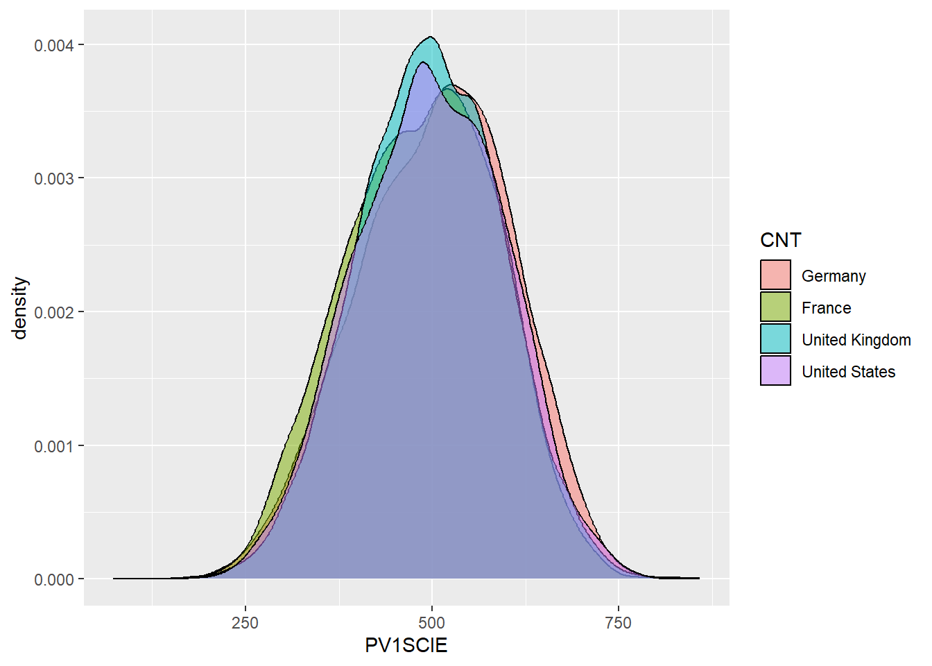
Df Sum Sq Mean Sq F value Pr(>F)
CNT 3 1071227 357076 37.36 <2e-16 ***
Residuals 30411 290638789 9557
---
Signif. codes: 0 '***' 0.001 '**' 0.01 '*' 0.05 '.' 0.1 ' ' 1 eta.sq eta.sq.part
CNT 0.3672231 0.3672231The anova results tell us there are significant differences between the countries, which account for 0.4% of variance in scores. We can then run a Tukey HSD test to determine which countries have significant differences between mean scores.
Tukey multiple comparisons of means
95% family-wise confidence level
Fit: aov(formula = PV1SCIE ~ CNT, data = PISAMULTI)
$CNT
diff lwr upr p adj
France-Germany -18.844787 -23.489214 -14.200359 0.0000000
United Kingdom-Germany -9.056104 -13.073086 -5.039123 0.0000000
United States-Germany -7.024614 -11.985354 -2.063874 0.0015665
United Kingdom-France 9.788682 5.972393 13.604971 0.0000000
United States-France 11.820172 7.020499 16.619845 0.0000000
United States-United Kingdom 2.031490 -2.164019 6.226999 0.5987930From that we get a table with p values (p adj) for different pairs of countries. Note that these are below 0.005 for all pairs of countries, except the US and the UK. So we can conclude there are significant differences in science scores between all countries except the UK and the US.
8.11 Task 4
For the China, Thailand, Japan and Korea, determine if there are statistically significant differences in variation in mathematics scores.
answer
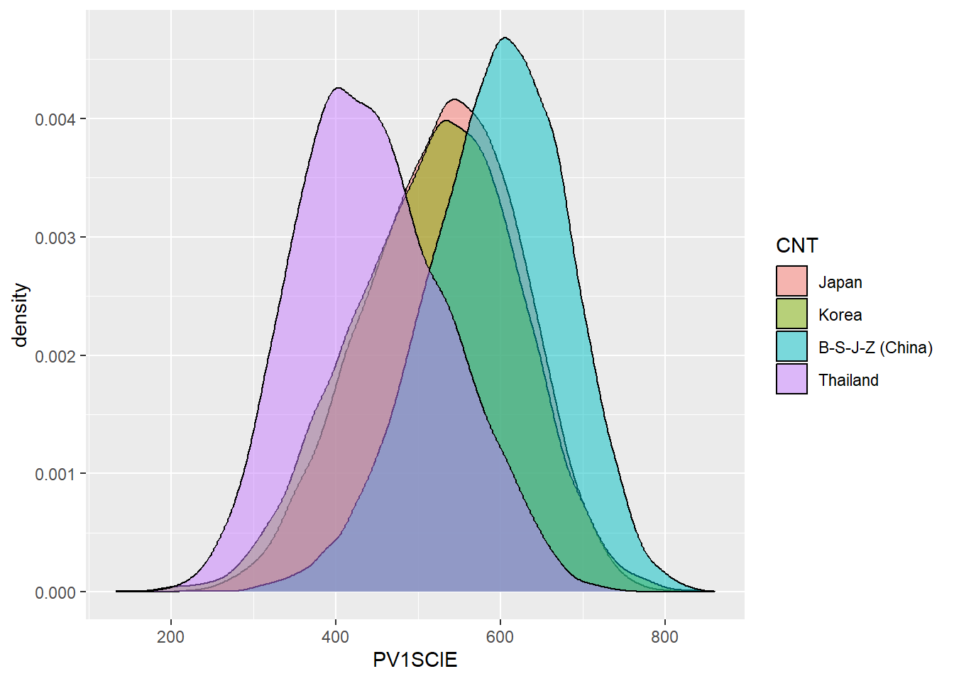
Df Sum Sq Mean Sq F value Pr(>F)
CNT 3 114287180 38095727 4596 <2e-16 ***
Residuals 33446 277230531 8289
---
Signif. codes: 0 '***' 0.001 '**' 0.01 '*' 0.05 '.' 0.1 ' ' 1 eta.sq eta.sq.part
CNT 29.19081 29.19081 Tukey multiple comparisons of means
95% family-wise confidence level
Fit: aov(formula = PV1SCIE ~ CNT, data = PISAMULTI)
$CNT
diff lwr upr p adj
Korea-Japan -8.504429 -12.64948 -4.359374 8e-07
B-S-J-Z (China)-Japan 64.662840 60.98971 68.335975 0e+00
Thailand-Japan -85.694331 -89.60481 -81.783850 0e+00
B-S-J-Z (China)-Korea 73.167270 69.59468 76.739859 0e+00
Thailand-Korea -77.189902 -81.00610 -73.373707 0e+00
Thailand-B-S-J-Z (China) -150.357171 -153.65471 -147.059631 0e+008.12 Task 5
Finally, a significant open question is the extent to which discovery learning impacts students’ results. The PISA 2015 data contains a couple of variables related to whether students report their teachers use direct instruction (teacher-led activities) or not, and whether they experience inquiry based teaching (student-led activities), or not. In 2015, the two composite variables related to students’ reports of their teachers’ teaching styles in science are:
-
IBTEACHquantifies teachers’ use of inquiry based teaching. It is based on responses to nine questions: frequency with which they experienced specific activities:- students are given opportunities to explain their ideas;
- students spend time in the laboratory doing practical experiments;
- students are required to argue about science questions;
- students are asked to draw conclusions from an experiment they have conducted;
- the teacher explains how a science idea can be applied to different phenomena;
- students are allowed to design their own experiments;
- there is a class debate about investigations;
- the teacher clearly explains the relevance of science concepts; and,
- students are asked to do an investigation to test ideas
-
TDTEACHscores teachers use of teacher-directed approaches. It is based on 4 items on the survey asking the frequency of:- The teacher explains scientific ideas;
- A whole class discussion takes place with the teacher;
- The teacher discusses our questions;
- and the teacher demonstrates an idea.
First, download the PISA 2015 dataset: PISA_2015 and load the data using this code:
Task: For science, determine the amount of variation in scores explained by IBTEACH and TDTEACH for the whole data set. What is true in the context of students in the UK, China and the US? Are the patterns different for mathematics?
8.13 Repeating research
The direct instruction vs inquiry learning debate is a current one with impact upon national policy and classroom practice (Gove 2013). A piece of research by Mourshed, Krawitz, and Dorn (2017) suggested that there was a “sweet spot” which in practice is:
teacher-directed instruction in most to all classes and inquiry-based learning in some
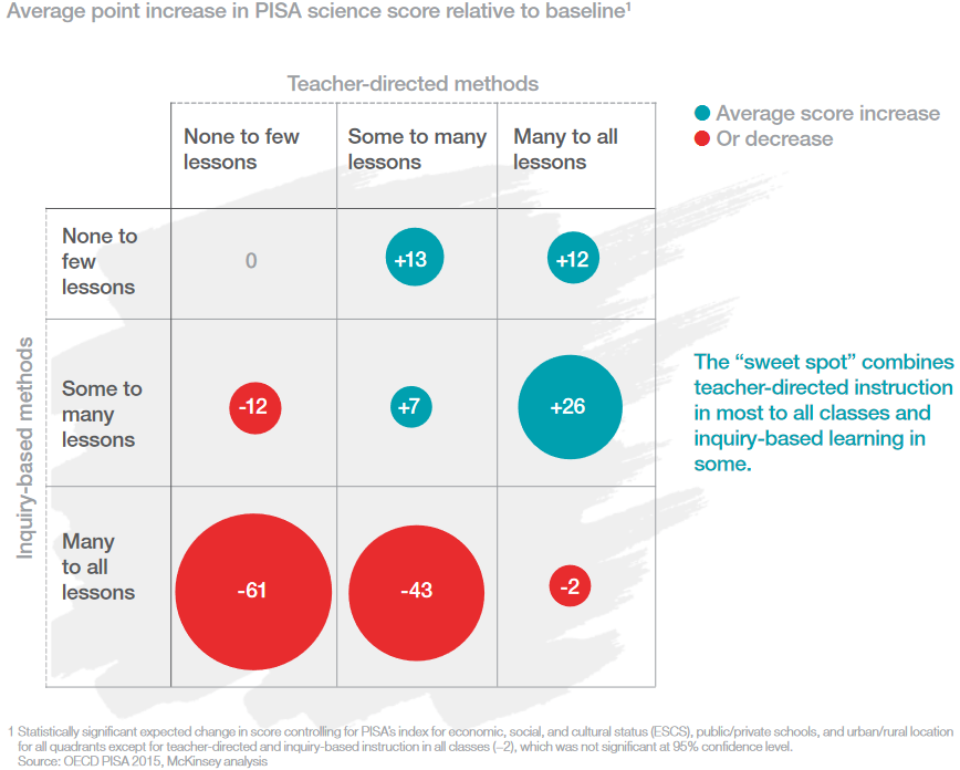
Unfortunately Mourshed, Krawitz, and Dorn (2017) never published the code behind their study and it’s not actually clear how we can recreate their findings. Others have tried, but failed (Bokhove 2021). Now it’s our turn!
8.13.1 Exploring the data
First, let’s make sure that we have a dataset without any missing values for IBTEACH and TDTEACH
8.13.2 A simple attempt to recreate the sweet spot analysis
To recreate the sweet spot analysis: a) divide IBTEACH and TDTEACH intro three categories, using ifelse, as we have done above. b) Use group_by with IBTEACH and TDTEACH and summarise the mean to create a summary table c) use ggplot, with geom_point, and change the point size by the mean to create a similar plot to the McKinsey graph.
answer
# Create a data set to plot including IBTEACH, TDTEACH and PV1SCIE
PISAIBTD <- PISA_2015 %>%
select(IBTEACH, TDTEACH, PV1SCIE) %>%
na.omit()
# Create data to plot
Plotdata <- PISAIBTD %>%
# Categorise IBTEACH into three levels
mutate(IBTEACH = ifelse(IBTEACH >= 1, "High",
ifelse(IBTEACH > -1.2, "Medium","Low")))%>%
# Categorise TDTEACH into three levels
# The function range(PISAIBTD$TDTEACH) and range(PISAIBTD$IBTEACH)
# was used to determine the range of the two variables
# The range was roughly divided into three parts
mutate(TDTEACH = ifelse(TDTEACH >= 0.5, "High",
ifelse(TDTEACH > -1, "Medium","Low")))%>%
# Group by the IBTEACH and TDTEACH to create a table, and find the mean
# science scores
group_by(IBTEACH, TDTEACH)%>%
summarise(Mean_Sci_Score = mean(PV1SCIE))
# Set an order for the levels of IBTEACH and TDTeach
# so the plot comes out in right order
Plotdata$IBTEACH=factor(Plotdata$IBTEACH, levels=c("Low","Medium","High"))
Plotdata$TDTEACH=factor(Plotdata$TDTEACH, levels=c("Low","Medium","High"))
ggplot(Plotdata,
aes(x=IBTEACH, y=TDTEACH, size=Mean_Sci_Score))+
geom_point(colour="red")+
labs(x="Inquiry Based Teaching", y="Teacher directed Teaching") +
geom_text(aes(label=signif(Mean_Sci_Score,3)), size=4)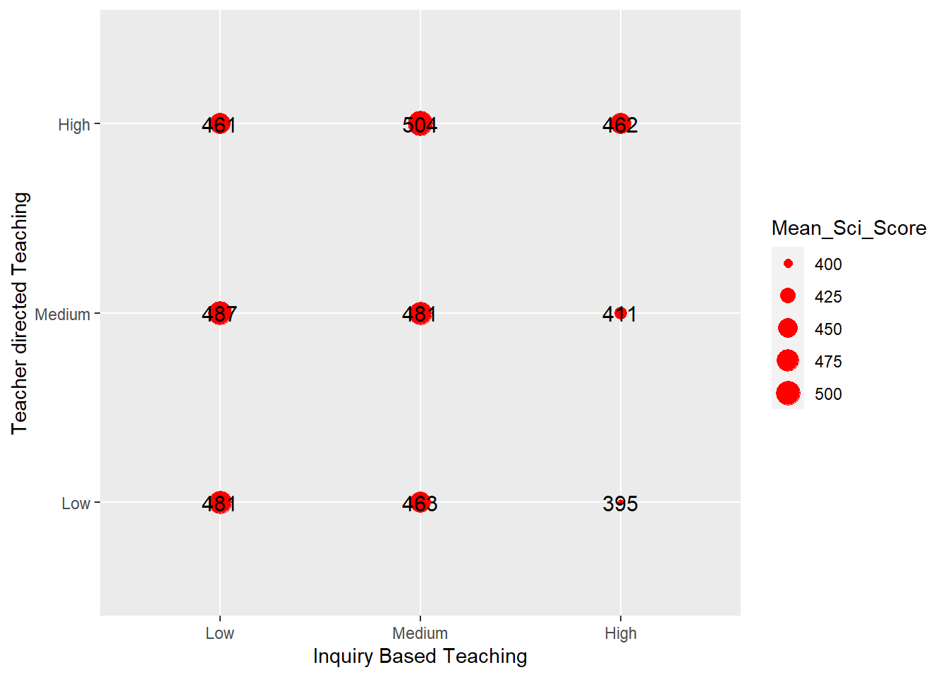
anova, Tukey HSD and eta squared output
# Recreate the categorised dataset
Anovdata <- PISAIBTD%>%
mutate(IBTEACH=ifelse(IBTEACH >= 1, "High",
ifelse(IBTEACH > -1.2, "Medium","Low")))%>%
mutate(TDTEACH=ifelse(TDTEACH >= 0.5, "High",
ifelse(TDTEACH > -1, "Medium","Low")))
# Perform the anova, Tukey HSD and eta-squared test.
resaov<-aov(data=Anovdata, PV1SCIE~ TDTEACH + IBTEACH)
summary(resaov)
TukeyHSD(resaov)
eta<-etaSquared(resaov)
eta<-100*eta
eta8.13.3 A fuller attempt - Step 1, Wrangling the data
Now we have a statistical grasp of the data we can try to recreate the study. First, we need to categorise IBTEACH and TDTEACH into three levels, high, medium and low, we will use these instead of the “None to few lessons”, “Some to many lessons” and “Many to all lessons”. We can use the quantile function to do this. The function tells us the value of IBTEACH and TDTEACH which contain 1/3 and 2/3 of this responses. We can use these values to divide the data into 3 parts with equal numbers of students in each by using the mutate function with ifelse (as above) to replace the values with the categories, High, Medium and Low.
# split into three 'quantiles'. The function returns the value of IBTEACH and TD teach which account for 33% and 66% of students
quant_IBTEACH <- quantile(PISA_2015$IBTEACH, prob=c(.33,.66), na.rm=TRUE)
quant_TDTEACH <- quantile(PISA_2015$TDTEACH, prob=c(.33,.66), na.rm=TRUE)
# Mutate the IBTEACH and TDTEACH columns, replacing values with 'High', 'Low' and 'Medium' based on the quantile calculation values
PISA_2015IBTD <- PISA_2015 %>%
select(PV1SCIE, IBTEACH, TDTEACH, ST004D01T, OECD, CNT) %>%
mutate(IBTEACH = ifelse(IBTEACH < quant_IBTEACH["33%"], "Low",
ifelse(IBTEACH >= quant_IBTEACH["33%"] &
IBTEACH < quant_IBTEACH["66%"],
"Medium", "High"))) %>%
mutate(TDTEACH = ifelse(TDTEACH < quant_TDTEACH["33%"], "Low",
ifelse(TDTEACH >=quant_TDTEACH["33%"] &
TDTEACH < quant_TDTEACH["66%"],
"Medium", "High"))) %>%
filter(!is.na(IBTEACH), !is.na(TDTEACH)) %>%
rename(gender = ST004D01T)
# Plot graphs of variation in science score by level of inquiry based teaching
ggplot(PISA_2015IBTD,
aes(x=PV1SCIE, fill=IBTEACH))+
geom_density(alpha=0.5)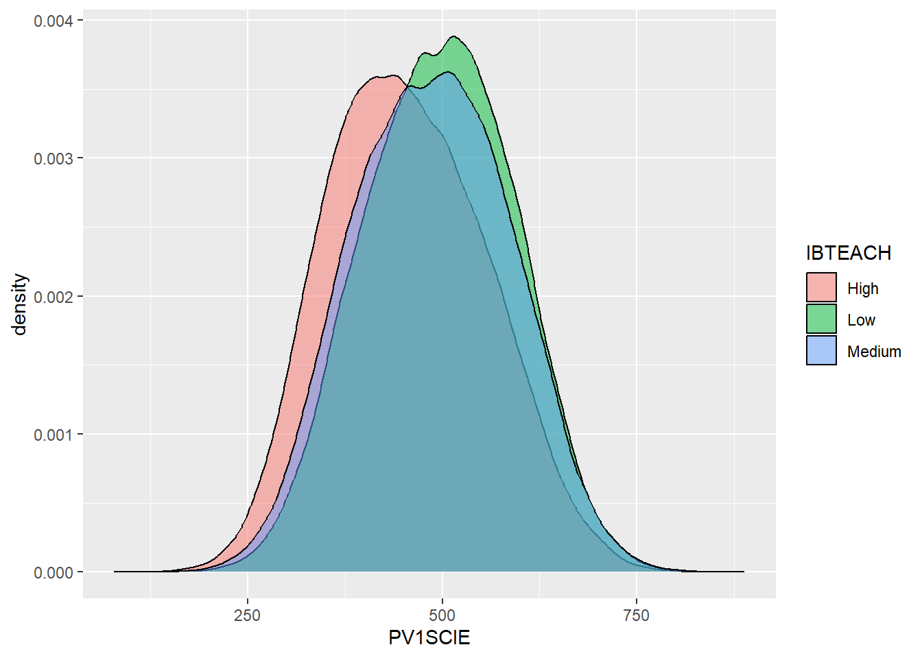
This graph shows the peak of High IBTEACH (in red) having a smaller PV1SCIE grade than the other categories. This suggests we should avoid high levels of IBTEACH
# Plot graphs of variation in science score by level of teacher directed teaching
ggplot(PISA_2015IBTD,
aes(x=PV1SCIE, fill=TDTEACH))+
geom_density(alpha=0.5)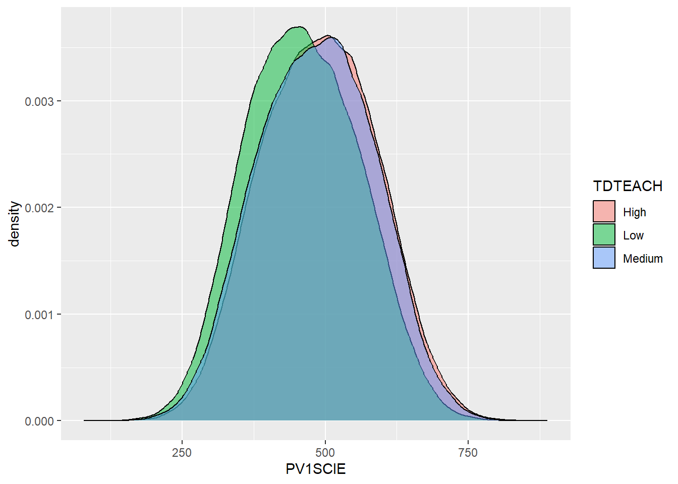
This graph shows the peak of Low TDTEACH (in green) having a smaller PV1SCIE grade than the other categories. This suggests we should avoid low levels of TDTEACH
8.13.4 Searching for the sweet spot(s)
The “sweet spot” chart by Mourshed, Krawitz, and Dorn (2017) looks at the average point increase in PISA scores given different teaching methods. We need to calculate this average difference.
Here the mean score for PV1SCIE are calculated and then compared to the means for the groups by the levels of TDTEACH and IBTEACH.
# Using ggplot
# optional gender filter
plot_data <- PISA_2015IBTD %>%
mutate(mean_sci = mean(PV1SCIE),
median_sci= median(PV1SCIE)) %>%
group_by(IBTEACH, TDTEACH, mean_sci, median_sci) %>%
summarise(group_mean_sci=mean(PV1SCIE),
group_median_sci=median(PV1SCIE),
mean_diff = unique(group_mean_sci - mean_sci),
median_diff = unique(group_median_sci - median_sci),
mean_col = mean_diff > 0,
median_col = median_diff > 0,
n=n()) %>%
ungroup() %>%
mutate(IBTEACH = factor(IBTEACH, levels=c("Low", "Medium", "High")),
TDTEACH = factor(TDTEACH, levels=c("Low", "Medium", "High")))- line 4 and 5 creates an overall mean and median score for
PV1SCIE - line 6 we want to find out the difference in average score for each combination of
IBTEACHandTDTEACH, e.g.IBTEACH-LowandTDTEACH-Low,IBTEACH-LowandTDTEACH-Medium, etc. So we need to group these, and group themean_sci,median_scivalues so we don’t lose them when summarising. - line 7 and 8 - creates a mean and median
PV1SCIEscore for each grouping - line 9 and 10 - calculates the differences from the overall mean and median
PV1SCIEscore for each grouping - line 11 and 12 - calculates whether this difference is positive (or negative) and stores this as
TrueorFalse - line 13 stores the number of students in each grouping
- line 15 and 16 uses
factorto set the order ofIBTEACHandTDTEACH, we want them running"Low", "Medium", "High"on our graph
Now we can try and build our graph using geom_point
plt_sweetspot <- ggplot(plot_data %>%
select(IBTEACH, TDTEACH, mean_diff, mean_col) %>%
mutate(mean_diff = signif(mean_diff,2),
mean_diff_txt = ifelse(sign(mean_diff)==1,
paste0("+",mean_diff),
paste0(mean_diff))),
aes(x =IBTEACH, y = TDTEACH)) +
geom_point(aes(size=abs(mean_diff), colour=mean_col)) +
scale_size(range = c(0, 40)) +
geom_text(aes(label=mean_diff_txt,
colour=ifelse(abs(mean_diff) > 8, "big",
ifelse(mean_diff > 0, "positive", "negative")))) +
scale_color_manual(values = c("big" = "white", "positive" = "#6592a5",
"negative" = "#c37d7f",
"TRUE" = "#6592a5", "FALSE"= "#c37d7f")) +
theme(panel.background=element_rect(fill = "#dce1e5"),
legend.position = "none") +
ggtitle("Point change in PISA science scores relative to mean") +
xlab("Inquiry-based science teaching") +
ylab("Teacher-directed science instruction")- line 1 to 6 - we pass the
plot_datadataframe specified above toggplot, we also make a few changes to this dataframe, usingsignifto reduce the number of signficant digits inmean_diffand we createmean_diff_txtwhich ismean_diffbut with the sign+/-on the front. - line 7 - we pass the
IBTEACHandTDTEACHto x and y, this means we’ll plot a point for each combination, Low/Low, Low/Medium, Low/High, etc. - line 8 -
geom_pointtakes the x and y from line 7 and adjusts the size of the points based on theabs(the number without a sign) value ofmean_diff, and set the colourmean_col, whether the point is positive or negative. - line 9 - this increases the overall size of the points to range from 0, the smallest, to 40 the biggest
- line 10 to 12 - add a text label to each point with the value of the difference and added sign
mean_diff_txt. Change the colour of the text, ifabs(mean_diff) > 8then the text will go on top of the points and will need to bewhite, otherwise the colour of the text should be a colour to reflect positive or negative. - line 13 to 15 - manually set the colours of the text and the points.
- line 16 to 17 - change the background colour, and get rid of the legend
- line 18 to 20 - add a title and new labels
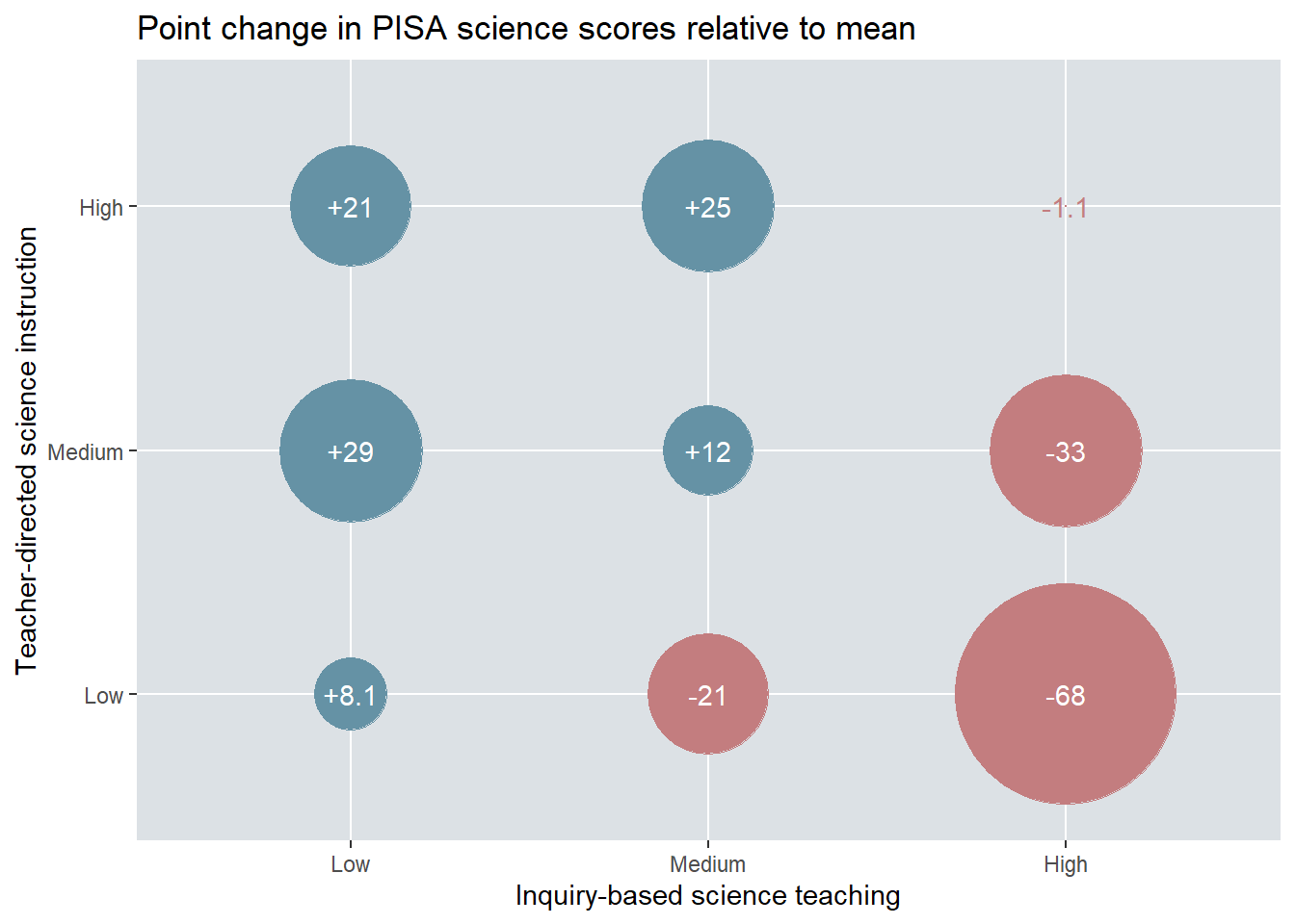
We can see that our graph is very different to theirs?! We have two “sweet spots”, Low Inquiry and Medium Directed at +29 and Medium inquiry and High Directed at +25. Going back to our exploration above, this matches what we saw in the density charts (Section 8.13.3), where High Inquiry and Low Directed gave the worst results.
But why is ours different? It’s very hard to tell and without seeing the original code or a well written methodology; we might never know. Is our model better than theirs? Maybe! It’s just hard to tell. People have taken the McKinsey report very seriously and it does seem unlikely that national centres of education will be reading this subsection of session 7 of an MA STEM Quantitative methods course at KCL to shape their policy making decisions. Maybe you could explore this further in your dissertation and try to come up with a stronger conclusion.
How does the sweet spot change for the UK? Repeat the analysis above only looking at student results for the “United Kingdom”
Code
PISA_2015_UK <- PISA_2015 %>% filter(CNT == "United Kingdom")
quant_IBTEACH <- quantile(PISA_2015_UK$IBTEACH, prob=c(.33,.66), na.rm = TRUE)
quant_TDTEACH <- quantile(PISA_2015_UK$TDTEACH, prob=c(.33,.66), na.rm = TRUE)
# Mutate the IBTEACH and TDTEACH columns, replacing values with 'High', 'Low' and 'Medium' based on the quantile calculation values
PISA_2015IBTD <- PISA_2015_UK %>%
select(PV1SCIE, IBTEACH, TDTEACH, ST004D01T, OECD, CNT) %>%
mutate(IBTEACH = ifelse(IBTEACH < quant_IBTEACH["33%"], "Low",
ifelse(IBTEACH >= quant_IBTEACH["33%"] &
IBTEACH < quant_IBTEACH["66%"],
"Medium", "High"))) %>%
mutate(TDTEACH = ifelse(TDTEACH < quant_TDTEACH["33%"], "Low",
ifelse(TDTEACH >=quant_TDTEACH["33%"] &
TDTEACH < quant_TDTEACH["66%"],
"Medium", "High"))) %>%
filter(!is.na(IBTEACH), !is.na(TDTEACH)) %>%
rename(gender = ST004D01T)
# Plot graphs of variation in science score by level of inquiry based teaching
ggplot(PISA_2015IBTD,
aes(x=PV1SCIE, fill=IBTEACH))+
geom_density(alpha=0.5)
ggplot(PISA_2015IBTD,
aes(x=PV1SCIE, fill=TDTEACH))+
geom_density(alpha=0.5)
# optional gender filter
plot_data <- PISA_2015IBTD %>%
mutate(mean_sci = mean(PV1SCIE),
median_sci= median(PV1SCIE)) %>%
group_by(IBTEACH, TDTEACH, mean_sci, median_sci) %>%
summarise(group_mean_sci=mean(PV1SCIE),
group_median_sci=median(PV1SCIE),
mean_diff = unique(group_mean_sci - mean_sci),
median_diff = unique(group_median_sci - median_sci),
mean_col = mean_diff > 0,
median_col = median_diff > 0,
n=n()) %>%
ungroup() %>%
mutate(IBTEACH = factor(IBTEACH, levels=c("Low", "Medium", "High")),
TDTEACH = factor(TDTEACH, levels=c("Low", "Medium", "High"))) %>%
select(IBTEACH, TDTEACH, mean_diff, mean_col, n) %>%
mutate(mean_diff = signif(mean_diff,2),
mean_diff_txt = ifelse(sign(mean_diff)==1,
paste0("+",mean_diff),
paste0(mean_diff)),
per = signif(100 * (n / sum(n)),3))
plt_sweetspot <- ggplot(plot_data,
aes(x =IBTEACH, y = TDTEACH)) +
geom_point(aes(size=abs(mean_diff), colour=mean_col)) +
scale_size(range = c(0, 40)) +
geom_label(aes(label=paste(per, "%"), vjust=3.5)) +
geom_text(aes(label=mean_diff_txt,
colour=ifelse(abs(mean_diff) > 8, "big",
ifelse(mean_diff > 0, "positive", "negative")))) +
scale_color_manual(values = c("big" = "white", "positive" = "#6592a5",
"negative" = "#c37d7f",
"TRUE" = "#6592a5", "FALSE"= "#c37d7f")) +
theme(panel.background=element_rect(fill = "#dce1e5"),
legend.position = "none") +
ggtitle("Point change in PISA science scores relative to mean (UK only)") +
xlab("Inquiry-based science teaching") +
ylab("Teacher-directed science instruction")9 Writing a Quantitative Report
In the lecture you looked at Du and Wong (2019) as an example of a quantitative report. This session will help you structure your writing for your own quantitative report in assignment 3.
9.1 Activity 1: Proposing a question
Spend 10 minutes researching a problem (this can’t be extensive but find something that is flagged as requiring more research). Alternatively, you make already have a problem, in which case move onto the next step
-
State a rough research problem:
e.g., There is an imbalance in the number of students studying a-level biology (i.e., too few boys)
-
Turn the problem into a question:
e.g., What school features correlate with higher and lower level of male uptake of a-level biology?
-
Increase the specificity of the question:
e.g., In DfE school census data for the period 2017-2022 what school variables (including number of biology teachers, uptake of GCSE triple science, % of FSM students etc.) correlate with higher and lower level of male uptake of a-level biology?
9.2 Activity 2: Find a data set and check its applicability
- Use the list of open data sets to choose an appropriate data set
- Does it include all the data to answer your question? Which items will you use in your analysis? What form is the data you will use in?
- What form of cleaning will the data require?
- Will you need to draw on multiple data sets?
9.3 Activity 3: Decide on approaches to analysis
- What types of data are relevant to your questions (continuous, discontinuous?)
- What types of test will you need to run?
- What kind of descriptive statistics will be useful?
9.4 Activity 4: Sketch a research plan
- When will you finalize your question?
- When will you carry out your data analysis?
- When will you write up?
- What help will you need?
- How can you collaborate with peers?
- What R/SPSS/Excel skills do you need to acquire?
10 Assignment tutorials
11 Correlation and Regression
In this session we will be exploring the use of linear regression to describe data and predict results. We will be looking for patterns within the PISA data sets, as well we trying to recreate some of the controversial findings from Stoet and Geary (2018) by linking PISA_2018 data to global gender equality indices using the left_join function.
There are two types of statistics that we can create:
Descriptive statistics describe/summarise a data set. E.g. what’s the average height of a woman, how many people called George were born in Somerset each year since 1921?
Inferential statistics estimate something from a set of data, make generalisations about larger populations. E.g. If I know the height of a woman, can I predict her shoe size? If I meet someone called George, what is the likelihood that they were born in Somerset?
The first few sessions of this course taught you how to use R to perform descriptive statistics, with you finding the mean, max, min etc of data. Following sessions have given you a range of inferential tools, for example chi-square, t-tests and ANOVA. This session will introduce you to linear regression a means by which you can predict the value of a variable based on the value of another variable. Before we can start using linear regression we will introduce you to correlation, another type of inferential statistics.
11.1 Correlation
Correlation gives the direction and strength of the relationship between two numeric variables. For example we might see a relationship between the reading level of a student and their maths results in the UK: the better a student is at reading, typically, the higher their maths grade. Correlation allows us to describe this relation statistically:
code
corr_data <- PISA_2018 %>%
filter(CNT == "United Kingdom") %>%
select(PV1MATH, PV1READ, ST004D01T)
corr <- cor.test(corr_data$PV1MATH, corr_data$PV1READ, method = "pearson")
corr_est <- signif(corr[["estimate"]],4)
ggplot(data = corr_data, aes(PV1MATH, PV1READ)) +
geom_point(alpha=0.1) +
geom_smooth(method="lm", se = FALSE) +
geom_text(label=paste("r = ", corr_est), aes(x=700,y=-4.5))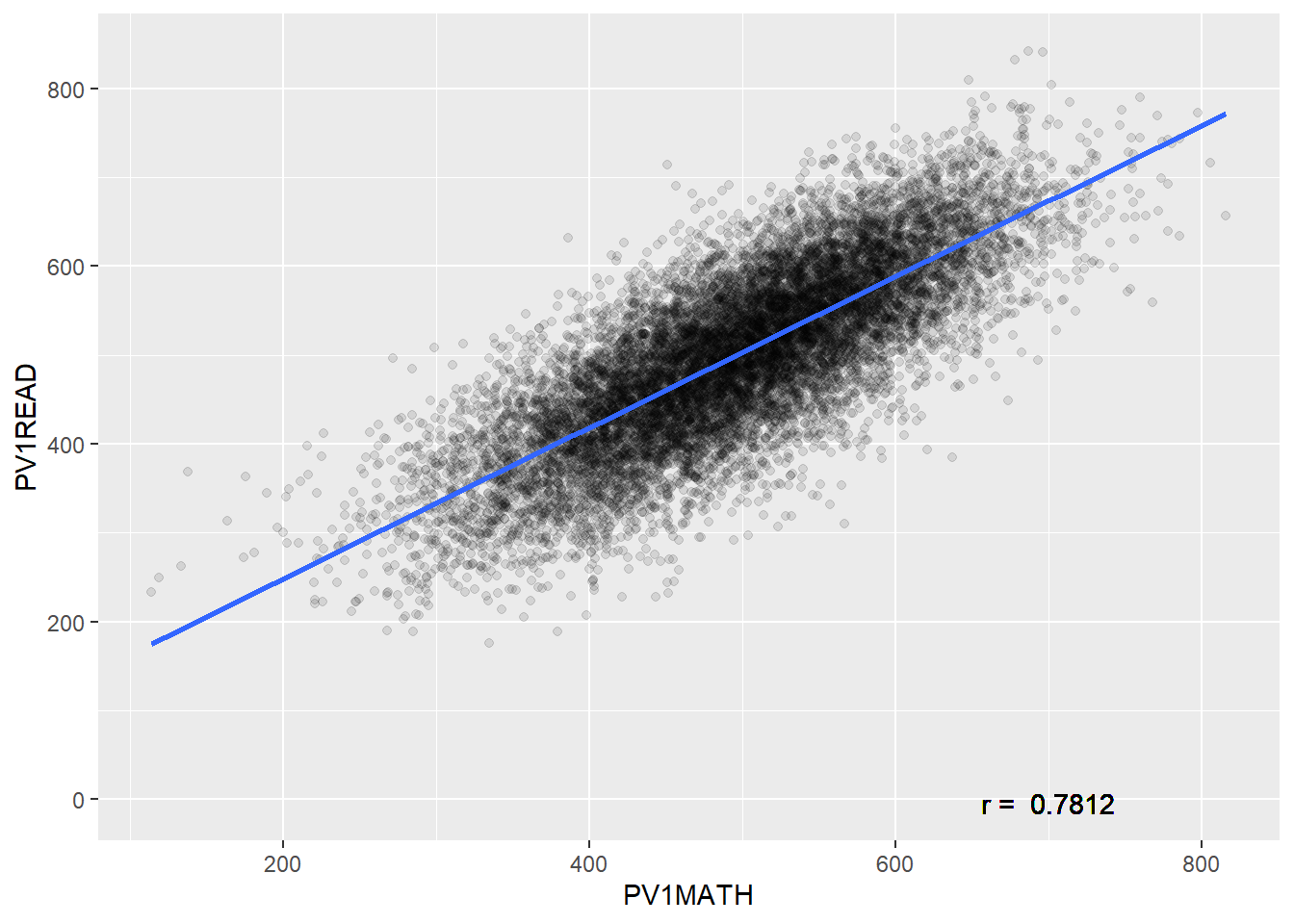
The graph above shows that there is a correlation between Maths score and wealth. This relationship is a positive one, i.e. as the reading level of an individual increases the maths grade is also likely to increase. The strength, correlation coefficient (Pearson's r) of the relationship between these two numeric fields is 0.7812. The correlation coefficient runs from -1 to +1.
- If the correlation coefficient (r) is negative, i.e. as one factor increase the other declines, the slope of the line of best-fit will be negative. E.g “The more time you spend running on a treadmill, the more calories you will burn”
- If the correlation coefficient (r) is positive, i.e. as one factor increase the other increases, the slope of the line of best-fit will be positive. E.g. “As the temperature decreases, more heaters are purchased.”
- If the correlation coefficient (r) is 0, i.e one factor increasing doesn’t impact the other factor, the slope of the line of best-fit will be flat. E.g. “the number of trees in a city has no relation to the number of chocolate bars purchased by children”
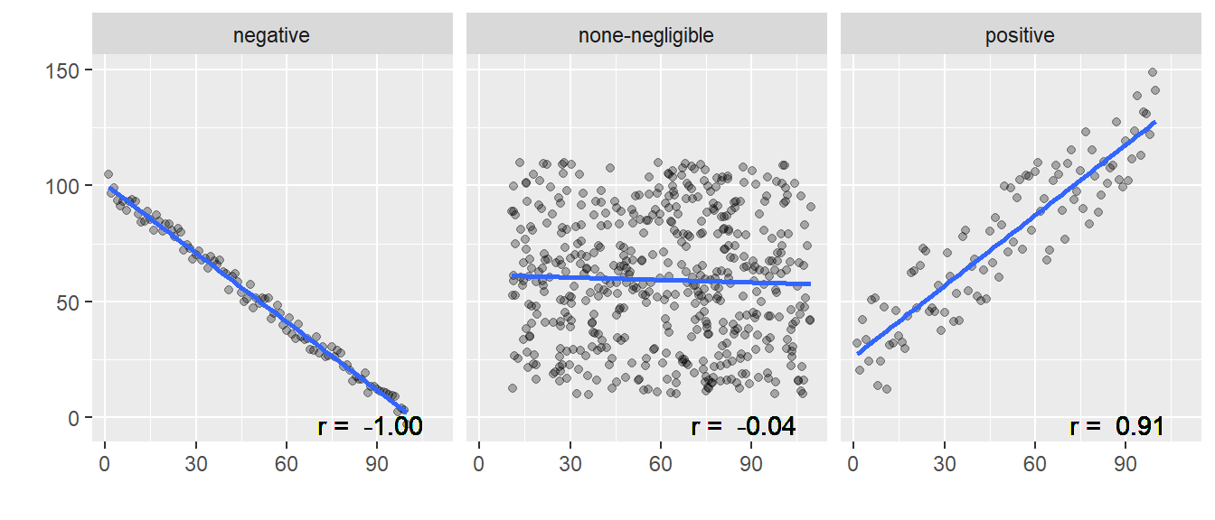
To run the correlation test in R we use the cor.test function:
cor.test(<vector1>, <vector2>, method = "pearson")
For our data we will be using the PV1MATH and PV1READ columns.
Pearson's product-moment correlation
data: corr_data$PV1MATH and corr_data$PV1READ
t = 147.09, df = 13816, p-value < 2.2e-16
alternative hypothesis: true correlation is not equal to 0
95 percent confidence interval:
0.7746249 0.7876230
sample estimates:
cor
0.7812086 -
dfthe number of ways that the data can vary, the larger this number the more ways the data could have been different -
p-valuesignificance of the result, can we dismiss the null-hypothesis that there isn’t a relationship between maths score and wealth as the p-value is less than0.05 -
sample estimatesthe strength of the relationship between the factors -
confidence intervalsthe upper and lower limit of where the correlation coefficient is likely to lie, with 95% confidence.
Degrees of freedom (df)
Two individuals from different countries might have a weight difference of 5 KG. So what?! But if average weights between whole populations of countries vary by 5 KG then this becomes much more interesting.
Roughly: Number of independent values that can vary without questioning the significance of the model. So the more df you have, the safer your model. Degrees of freedom can be calculated by looking at the number of values that can vary, often this is the number of observations that you have minus one – if you had just one element it wouldn’t be able to vary against anything else:
df = n - 1
11.1.1 Other correlation-coefficients
When looking for correlations in data that is non-parametric, i.e. not normally distributed you could use Spearman’s rank order correlation-coefficient (rho ρ) rather than Pearson’s r. cor.test(... method = "...") allows you to specify the method used for correlation, you can set this to Spearman’s rho by writing method = "spearman"
Data will need to contain continuous or ordinal variables. The Spearman correlation coefficient is based on the ranked values for each variable rather than the raw data. The Spearman correlation between two variables is equal to the Pearson correlation between the rank values of those two variables.
We want to look at the correlation between attitudes towards the learning activities in schools (ATTLNACT) and wealth (WEALTH) for females from the UK with fathers who are Cooks.
Graphing this data, it is unclear if it is normalised:
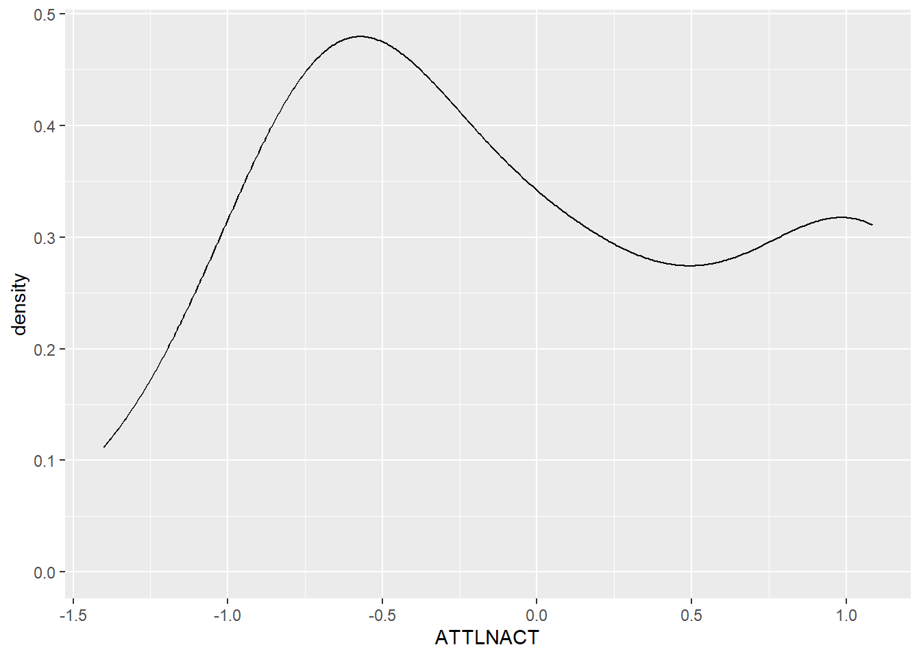
We can run the Shapiro-Wilk Test to check for the the normality of the data, any alpha value greater than 0.05 means we can assume that the data is normally distributed.
Shapiro-Wilk normality test
data: sub_data$ATTLNACT
W = 0.84971, p-value = 0.003354In this case the data isn’t normally distributed as p < 0.05 and we need to use a non-parametric correlation test. We need to run Spearman rather than Pearson:
Spearman's rank correlation rho
data: sub_data$WEALTH and sub_data$ATTLNACT
S = 1369, p-value = 0.3097
alternative hypothesis: true rho is not equal to 0
sample estimates:
rho
0.2269763 The result shows no significant correlation (p=0.31) between wealth and attitude to school for this group of students
the central limit theorem means that when you have a sufficiently large sample you can presume that the data is normally distributed. As a rule of thumb “30 is the magic number”, and any samples you are studying with 30 or more data items can be treated as parametric, e.g. you would always use pearson when running correlation analysis on 30 or more items.
When dealing with non-parametric and small data sets you can also use Kendall’s Tau i.e. cor.test(... method = "kendall")
11.1.2 Reporting correlations
To interpret the correlation co-efficient of a model we can use the following table:
| Correlation co-efficient | Relationship |
|---|---|
| .70 or higher | very strong positive |
| .40 to .69 | strong positive |
| .30 to .39 | moderate positive |
| .20 to .29 | weak positive |
| .01 to .19 | negligible or none |
| 0 | no relationship |
| -.01 to -.19 | negligible or none |
| -.20 to -.29 | weak negative |
| -.30 to -.39 | moderate negative |
| -.40 to -.69 | strong negative |
| -.70 or higher | very strong negative |
When writing a report we might present our findings like this:
There was no significant relationship between the perceived quality of sleep and its impact on Mood, r = -.12, p = .17
or
There is a significant very strong correlation between overall well-being and life satisfaction, r = .86, p = .00
11.1.3 Questions
Use cor.test to explore the following relationships:
-
PV1MATHtoPV1SCIE, is this a stronger relationship than that between Maths and Reading?
- The wealth
WEALTHof femalesST004D01Tand their ReadingPV1READscore, how does this compare to males? Why might they be different?
- For the
United KingdomHow does the sense of belonging to schoolBELONGcorrelate with the attitude to learning activitiesATTLNACT? How does the UK compare against other countries?
If you want to find all the numeric fields, i.e. the fields that you can easily run correlation calculations on, use the following code to list them:
11.2 Regression
Correlation allows us to see the strength of the relationship but it doesn’t allow us to predict what would happen if a variable changed. “When the wind blows, the trees move. When the trees move, the wind blows.” Which is it? Correlation suggests there is a link but tells us nothing about causation. To do this we need regression.
| Correlation | Regression |
|---|---|
| an example of inferential statistics | an example of inferential statistics |
| give direction and strength of the relationship between two (or more) numeric variables | give direction and strength of the relationship between two (or more) variables |
| Relationship between variables | The extent to which one variable predicts another |
| Effect only (no cause) | Cause and effect |
| p(x,y) == p(y,x) | One way (e.g. education affects income differently from how income affects education) |
| Single point/value | An equation that creates a best fitting line |
Regression is a way of predicting the value of one dependent variable from one or more independent variables by creating a hypothetical model of the relationship between them.
- independent variable - the cause of the change that is independent of other variables
- dependent variable - the effect of the cause
11.2.1 Linear models and regression
The model used is a linear one, therefore, we describe the relationship using the equation of a straight line. In linear regression, with one dependent and one independent variable, we use the Method of Least Squares to find the line of best fit. The means finding a straight line that passes as close as possible to all the points. The distance between a point and this line is called a residual. The line of best fit is the line where the sum of the residuals squared is the smallest number possible.
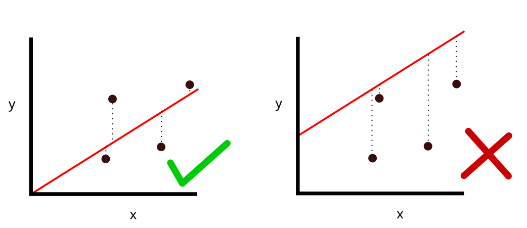
The line that is created can be described by the equation:
Output = Intercept + Coefficient * Input
Let’s use linear regression to explore the relationship between the score in maths(PV1MATH) and the score in reading (PV1READ). To build this model we use the lm command:
lm(<dependent_var> ~ <independent_var> , data=<dataframe>)
The first part defines the model we are going to explore, listing the dependent variable and separating it from the independent variable[s] with a tilde ~. You can specify multiple independent variables by adding more plusses, but for the example here we are only going to use one. Once the model has been built we can feed it into the summary(<mdl>) command to output the results:
Call:
lm(formula = PV1MATH ~ PV1READ, data = PISA_2018)
Residuals:
Min 1Q Median 3Q Max
-289.48 -39.35 -0.79 38.68 341.71
Coefficients:
Estimate Std. Error t value Pr(>|t|)
(Intercept) 9.617e+01 3.254e-01 295.5 <2e-16 ***
PV1READ 8.003e-01 6.942e-04 1152.9 <2e-16 ***
---
Signif. codes: 0 '***' 0.001 '**' 0.01 '*' 0.05 '.' 0.1 ' ' 1
Residual standard error: 58.42 on 606625 degrees of freedom
(5377 observations deleted due to missingness)
Multiple R-squared: 0.6866, Adjusted R-squared: 0.6866
F-statistic: 1.329e+06 on 1 and 606625 DF, p-value: < 2.2e-16If you look at the Coefficents: table we can see that PV1READ is significant in explaining the outcome of the model as the p-value Pr(>|t|) is less than 0.001 <2e-16 ***. The null hypothesis is that one variable does not predict another, we can dismiss this. By looking at the Estimate we can also see by how much a PV1MATH grade would increase if the PV1READ increased by one: 0.8003. Additionally, we have R2 value of 0.6866, this suggests that the model is very good at explaining the value of the dependent variable, 68.7% of the variance in the PV1MATH grade is explained by the PV1READ grade.
11.2.2 R squared
With large data sets you will often find a statistically significant difference, but p-values should be read with caution as the larger the data set you use the more likely you are to get a low p-value. The actual magnitude of a significant difference might be very small. r-squared and adjusted r-squared are ways for you to report on the magnitude of a significant difference and when you report the findings from a linear model you should be looking at the p and the R^2^ values. You have already met R, this is the correlation coefficient from earlier, R2 is this value squared:
- R - The correlation between the observed values of the outcome, and the values predicted by the model.
- R2 - The proportion of variance in the dependent variable accounted for by the model.
- Adj. R2 - An estimate of R2 in the population (shrinkage), often very similar to plain R2.
Imagine we take two experiments a) and b)
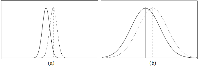
Both have statistically significant results, but it’s clear that the impact of the intervention in graph a) is larger as there is less overlap between the curves, i.e. there is more difference between the the outcomes.
if the difference were as in graph (a) it would be very significant; in graph (b), on the other hand, the difference might hardly be noticeable (Coe 2002, p2)
Different effect sizes have different meanings and there is some debate on how to interpret them, with different interpretations for different fields of research (Schäfer and Schwarz 2019)
| Effect size value | Effect size |
|---|---|
| 0.0 to 0.19 | negligible |
| 0.2 to 0.49 | small |
| 0.5 to 0.79 | medium |
| 0.8+ | large |
You might be familiar with the Education Endowment Foundation’s Teaching and Learning Toolkit which outlines the Impact of different interventions on student learning. For example, repeating a year is seen to decrease student progress by 3 months and providing students with feedback is seen to increase student progress by 6 months. Behind the scenes they are using effect-sizes to predict the impact of educational interventions. In their model an effect-size of 0.1 is considered to have “Low impact”, but also an effect size of this magnitude is translated to 2 months progress in the Toolkit (Higgins et al. 2016, 5).
11.2.3 Questions
Is it reasonable to presume that using 5 interventions from the education endowment foundation toolkit, each with effect-sizes of 0.1, i.e. 2 months improvement, will increase the progress for the average student in your class by 10 months (5 * 2)?
Run a regression model to look at how science grades predict Maths outcomes in UK students. How does this compare to students in France?
answer
mdl <- lm(PV1MATH ~ PV1SCIE,
data=PISA_2018 %>% filter(CNT=="United Kingdom"))
summary(mdl)
#> Estimate = 0.757
#> p<0.001
#> R2 = 0.6378
mdl <- lm(PV1MATH ~ PV1SCIE,
data=PISA_2018 %>% filter(CNT=="France"))
summary(mdl)
#> Estimate = 0.834
#> p<0.001
#> R2 = 0.7326
#> both models are significant, but the model in France has a higher R squared value, i.e. Science is a better predictor of maths outcomes in France than it is in the UK.- Create a linear model to look at how wealth
WEALTHinfluences Maths grades in the United Kingdom and Belarus. If we use the Education Endowment Foundation’s interpretation of effect sizes (Higgins et al. 2016, 5) what is the impact of increasing the wealth of students in each country?
answer
mdl <- lm(PV1MATH ~ WEALTH,
data=PISA_2018 %>% filter(CNT=="United Kingdom"))
summary(mdl)
#> Estimate = 14.3
#> p<0.001
#> R2 = 0.01999
#> this is just below 0.02, meaning the model has "Very low or no impact"
mdl <- lm(PV1MATH ~ WEALTH,
data=PISA_2018 %>% filter(CNT=="Belarus"))
summary(mdl)
#> Estimate = 31.4
#> p<0.001
#> R2 = 0.05476
#> Wealth has a greater impact on Maths results in Belarus than in the UK, with an effect size of "Low"11.2.4 Multiple linear regression
So far we have looked at the impact of a single independent variable on a single dependent variable. We are now going to look at building models that contain multiple independent variables, of both continuous and discrete values. For example, we might want to see how Gender (ST004D01T) and Reading score (PV1READ) help predict a maths score. To add extra independent variables, use the plus symbol +:
Call:
lm(formula = PV1MATH ~ PV1READ + gender, data = PISA_2018 %>%
rename(gender = ST004D01T))
Residuals:
Min 1Q Median 3Q Max
-289.42 -38.14 -0.68 37.51 356.24
Coefficients:
Estimate Std. Error t value Pr(>|t|)
(Intercept) 7.405e+01 3.368e-01 219.8 <2e-16 ***
PV1READ 8.180e-01 6.808e-04 1201.6 <2e-16 ***
genderMale 2.798e+01 1.471e-01 190.2 <2e-16 ***
---
Signif. codes: 0 '***' 0.001 '**' 0.01 '*' 0.05 '.' 0.1 ' ' 1
Residual standard error: 56.75 on 606622 degrees of freedom
(5379 observations deleted due to missingness)
Multiple R-squared: 0.7043, Adjusted R-squared: 0.7043
F-statistic: 7.223e+05 on 2 and 606622 DF, p-value: < 2.2e-16Both independent variables are significant (p<0.001), and the R2 of the model is high at 0.7043, this model explains 70% of the variance in Maths grade. Looking at the Estimates, we see both independent variables presented, this means we can read them as if the other factor has been controlled for; e.g. what is the impact of reading score if the impact of gender has been taken into consideration. PV1READ is 0.818, meaning for an increase of 1 in this score, the PV1MATH grade would increase by 0.818. Gender is different, this is a nominal field, being either Male or Female, and genderMale is shown in the coefficients table. This means that the model has taken gender == Female as the base state, and modeled what happens if the gender were to change to Male. Interestingly, it suggests that when controlling for the reading grade, e.g. comparing females and males of the same reading score, males would do 27.98 points better in their PV1MATH grade than females(!). We’ll be exploring these gender differences a little further in section Section 11.4.
11.2.5 Reporting regression
When reporting linear regression we should make note of the estimate (also known as beta β-value) of each factor along with their p-values. We need to know the R2 and p-value for the model as well as the F-statistic and the degrees of freedom. We can then construct a few sentences to explain our findings (Zach 2021):
Simple linear regression was used to test if [predictor variable] significantly predicted [response variable]. The overall regression was statistically significant (R2 = [R2 value], F(df regression, df residual) = [F-value], p = [p-value]). It was found that [predictor variable] significantly predicted [response variable] (β = [β-value], p = [p-value]).
For the example above, this would be:
Simple linear regression was used to test if a student reading grade significantly predicted student maths grade. The overall regression was statistically significant (R2 = 0.6866, F(1,606625) = 1329000, p = <0.001). It was found that reading grade significantly predicted maths grade (β = 0.8003, p = <0.001).
Alternatively, you could make use of the easystats package which will do most of the heavy lifting for you:
Call:
lm(formula = PV1MATH ~ PV1READ, data = PISA_2018)
Residuals:
Min 1Q Median 3Q Max
-289.48 -39.35 -0.79 38.68 341.71
Coefficients:
Estimate Std. Error t value Pr(>|t|)
(Intercept) 9.617e+01 3.254e-01 295.5 <2e-16 ***
PV1READ 8.003e-01 6.942e-04 1152.9 <2e-16 ***
---
Signif. codes: 0 '***' 0.001 '**' 0.01 '*' 0.05 '.' 0.1 ' ' 1
Residual standard error: 58.42 on 606625 degrees of freedom
(5377 observations deleted due to missingness)
Multiple R-squared: 0.6866, Adjusted R-squared: 0.6866
F-statistic: 1.329e+06 on 1 and 606625 DF, p-value: < 2.2e-16We fitted a linear model (estimated using OLS) to predict PV1MATH with PV1READ
(formula: PV1MATH ~ PV1READ). The model explains a statistically significant
and substantial proportion of variance (R2 = 0.69, F(1, 606625) = 1.33e+06, p <
.001, adj. R2 = 0.69). The model's intercept, corresponding to PV1READ = 0, is
at 96.17 (95% CI [95.53, 96.80], t(606625) = 295.53, p < .001). Within this
model:
- The effect of PV1READ is statistically significant and positive (beta = 0.80,
95% CI [0.80, 0.80], t(606625) = 1152.88, p < .001; Std. beta = 0.83, 95% CI
[0.83, 0.83])
Standardized parameters were obtained by fitting the model on a standardized
version of the dataset. 95% Confidence Intervals (CIs) and p-values were
computed using a Wald t-distribution approximation.11.2.6 Questions
Build a model to test if PV1SCIE is a
PV1MATH given PV1READ and PV1SCIE
11.3 Standardising results with z-values
When we are trying to compare data between countries, our results can be heavily skewed by the overall performance of a country. For example, imagine we have country A and country U. Students in country A generally get high grades with a very high standard deviation, whilst students in country U generally get very low grades with a very low standard deviation.
df <- data.frame(sex=c("M","M","M","F","F","F","M","M","M","F","F","F"),
country=c("A","A","A","A","A","A","U","U","U","U","U","U"),
grade=c(100,87,98,95,82,90,10,8,9,12,10,11))
df %>% group_by(country, sex) %>%
mutate(mgrade = mean(grade)) %>%
group_by(country) %>%
mutate(meancountry = mean(grade),
sdgrade = sd(grade)) %>%
pivot_wider(names_from = sex, values_from = mgrade) %>%
summarise(M_max = max(M, na.rm=TRUE),
`F_max` = max(`F`, na.rm=TRUE),
difference = M_max-`F_max`,
sd = max(sdgrade),
mean = max(meancountry))# A tibble: 2 × 6
country M_max F_max difference sd mean
<chr> <dbl> <dbl> <dbl> <dbl> <dbl>
1 A 95 89 6 6.90 92
2 U 9 11 -2 1.41 10If we look for the difference in grades between females and males in country A we might see a massive difference, whilst female and male students in country U have a much smaller difference. We might then conclude that country U is more equitable. But in reality, because the standard deviation in country U is so small, the relative difference between females and males is actually larger than that seen in country A! To get around this problem, when dealing with situations like this, we can use standardised, or z, values. These z-values would be a student’s grade in relation to the standard deviation of all of that country’s grades.
To calculate the standardised z-value for each entry, we use:
(entry - mean of grouping) / sd of grouping
For example, for the first Male student in country A who scored 100 points, we would calculate
(100 - 92) / 6.899 = 1.16
This shows that this student got 1.16 standard deviations more than the mean of the population. For the first female in country U, we would calculate:
(12 - 10) / 1.141 = 1.75
These two values are then directly comparable, the first males in country A is relatively closer to the mean grade of country A, than the first female in country U. How does this work out for the whole country? Going back to whether sex had a greater impact on results in country A or country U we can calculate the z-values for each student by using the scale() command:
# A tibble: 12 × 4
# Groups: country [2]
sex country grade zgrade[,1]
<chr> <chr> <dbl> <dbl>
1 M A 100 1.16
2 M A 87 -0.725
3 M A 98 0.870
4 F A 95 0.435
5 F A 82 -1.45
6 F A 90 -0.290
7 M U 10 0
8 M U 8 -1.41
9 M U 9 -0.707
10 F U 12 1.41
11 F U 10 0
12 F U 11 0.707We can then group by country and by sex and see how the mean z-value varies
# A tibble: 4 × 3
# Groups: country [2]
country sex mean_zgrade
<chr> <chr> <dbl>
1 A F -0.435
2 A M 0.435
3 U F 0.707
4 U M -0.707We can clearly see that the grades in country A are relatively closer to the mean of country A, than the grades in country U, meaning that there is less variation in country A.
11.4 Recreating Stoet and Geary’s paper
Stoet and Geary’s 2018 paper: “The Gender-Equality Paradox in Science, Technology, Engineering, and Mathematics Education” presented controversial findings, including how the increased female uptake of STEM degrees in country could be partially explained (using regression) by the decreased gender equality in that country. We are going to explore part of this paper by looking at another finding (figure 3a) that looked at girls’ achievement in the PISA_2015 science test compared to their maths and reading grades. Comparing this relative grade to boys in the same country, it showed that as gender equality of their country increased, the gap got bigger, i.e. the more gender equal a country, the worse the female relative performance in science.
The gender gap in intraindividual science scores (a) was larger in more gender-equal countries (rs = .42)
11.4.1 Loading data sets
To perform more complex analysis you will often want to join different data sets together. Stoet and Geary (2018) explore gender differences in outcomes with gender equality in countries (see their figures 3 and 4), by using the PISA_2015 data set with the science efficacy SCIEEFF, and science performance (maybe PV1SCIE, or a aggregation of PV1, PV2 etc ) fields; mapping this data set to the 2015 Global Gender Gap Index (GGGI). Let’s try and recreate what they did.
First we are going to download the GGGI, unfortunately, it’s difficult to find the 2015 data set, so we’ll use 2013 instead, which can be found here
The data is in a .csv format so we need to use read.csv to get it into R (make sure that you use read.csv rather than read_csv as the names will come out slightly differently)
If we look at the names of the GGGI fields we find that there is a Country column and the Overall.Score column, these are the columns that we are interested in. We can also see that many of the top scoring countries, i.e. those with better gender equality are Nordic countries.
Country Overall.Score
1 Iceland 0.8731
2 Finland 0.8421
3 Norway 0.8417
4 Sweden 0.8129
5 Philippines 0.7832Now we will load the 2015 PISA data set, we have a .parquet copy for you here
11.4.2 Linking data using left_join
To link the GGGI to the PISA_2015 data set we will use the left_join function from the tidyverse. This takes a few parameters
left_join(<table_1>, <table_2>, by=<matching_field[s]>)We will now join a subset of the PISA_2015 data set to a subset of the GGGI scores:
- line 1, assigns
<-the result of theleft_jointo a new object,PISA_2015_GGGI, - line 2, specifies
<table_1>to bePISA_2015with the selected fields, note we have chosen to usePV1grades here, it’s unclear what the original paper uses (See Section 15.1.4.1 for a discussion on the use ofPVgrades) - line 3, specifies
<table_2>to beGGGIwith just the country andOverall.Scorefields - line 4, specifies the
<matching_field>to beCNTfromPISA_2015andCountryfromGGGI, this means that the data in<table_2>will be added to<table_1>whereCNTandCountryare the same. For example for every entry ofFinlandinPISA_2015, theOverall.Scoreof0.8421will be added. Where it can’t find a matching country, e.g. Albania doesn’t have a GGGI entry,NAwill be added.
You can see the new data set has attached the Overall.Score field from GGGI to the selected fields from PISA_2015:
# A tibble: 3 × 7
CNT ST004D01T PV1MATH PV1SCIE PV1READ SCIEEFF Overall.Score
<chr> <fct> <dbl> <dbl> <dbl> <dbl> <dbl>
1 Algeria Female 389. 366. 347. -1.44 0.597
2 Algeria Female 364. 335. 300. 0.204 0.597
3 Algeria Male 293. 338. 225. -0.666 0.597There are multiple types of join in the tidyverse, you can find out more about them here
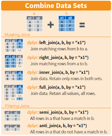
11.4.3 Standardising PISA results
Next, we will try to wrangle the data into shape to recreate figure 3 from Stoet and Geary (2018). To do this we first need to standardise the grades for maths, science and reading so we can compare the results of students between countries without low performing or high performing countries skewing the results (see Section 11.3 for details on how to standardise data). Following the steps outlined on page 7:
- We standardized the mathematics, science, and reading scores on a nation-by-nation basis. We call these new standardized scores zMath, zRead, and zScience.
- We calculated for each student the standardized average score of the new z-scores and we call this zGeneral.
- Then, we calculated for each student their intra-individual strengths by subtracting zGeneral as follows: relativeSciencestrength = zScience - zGeneral, relativeMathstrength = zMath - zGeneral, relativeReadingstrength = zReading - zGeneral.
- Finally, using these new intra-individual (relative) scores, we calculated for each country the averages for boys and girls and subtracted those to calculate the gender gaps in relative academic strengths
produces the following code:
code
# standardise the results for each student in line with pg7
# https://eprints.leedsbeckett.ac.uk/id/eprint/4753/6/symplectic-version.pdf
library(tidyverse)
library(arrow)
library(ggrepel)
# step 1
PISA_2015z <- PISA_2015_GGGI %>%
rename(gender = ST004D01T) %>%
group_by(CNT) %>%
mutate(zMaths = scale(PV1MATH),
zScience = scale(PV1SCIE),
zReading = scale(PV1READ))
# step 2
PISA_2015z <- PISA_2015z %>%
mutate(zGeneral = (zMaths + zScience + zReading) / 3)
# step 3
PISA_2015z <- PISA_2015z %>%
mutate(rel_MATH = zMaths - zGeneral,
rel_SCIE = zScience - zGeneral,
rel_READ = zReading - zGeneral)
# step 4 part 1
PISA_2015z <- PISA_2015z %>%
group_by(CNT, gender) %>%
summarise(zMaths = mean(zMaths, na.rm=TRUE),
zScience = mean(zScience, na.rm=TRUE),
zReading = mean(zReading, na.rm=TRUE),
zGeneral = mean(zGeneral, na.rm=TRUE),
rel_MATH = zMaths - zGeneral,
rel_SCIE = zScience - zGeneral,
rel_READ = zReading - zGeneral,
gggi = unique(Overall.Score))
# step 4 part 2
pisa_gggi_diff <- PISA_2015z %>%
select(CNT, gender, gggi, rel_SCIE) %>%
pivot_wider(names_from = gender,
values_from = rel_SCIE) %>%
mutate(difference = Male - Female)Finally we will plot the results:
graph code
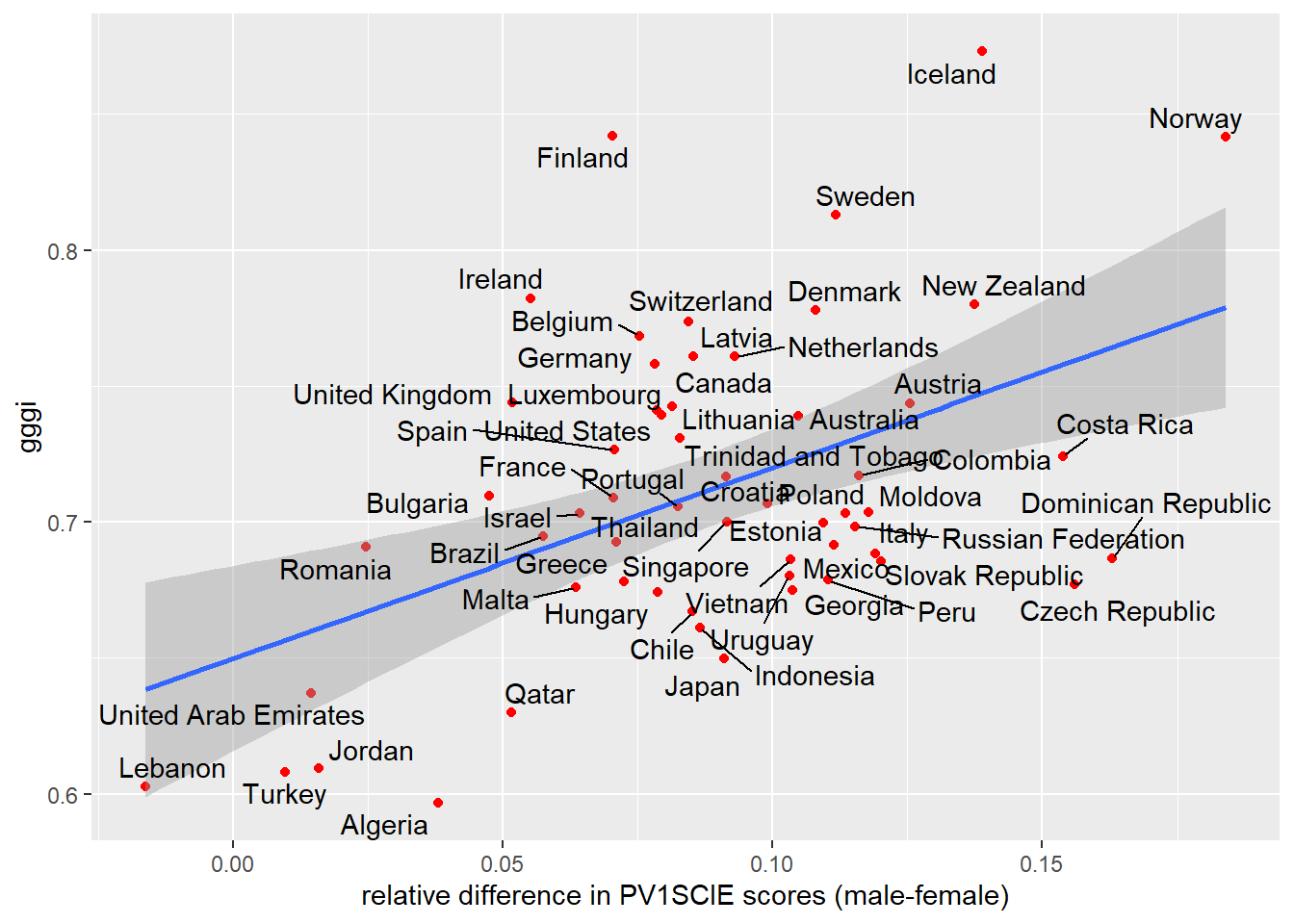
The graph is pretty good recreation of what the paper presented, with the general shape the same; differences in grades for each country might be explained by the original paper using 5 plausible values rather than just PV1SCIE, as we have used (Stoet and Geary 2020). Does the statistical model stand up to scrutiny? To find out we will use correlation. Stoet and Geary used Spearman’s rho, signified by the s in rs:
The most important and novel finding here is that the sex difference in intraindividual strength in science was higher and more favorable to boys in more gender-equal countries, rs = .42, 95% CI = [.19,.61], p < .001, n = 62 (Fig. 3a)
We can run our version of this model using the following:
Spearman's rank correlation rho
data: pisa_gggi_diff$gggi and pisa_gggi_diff$difference
S = 22512, p-value = 0.04222
alternative hypothesis: true rho is not equal to 0
sample estimates:
rho
0.2704174 Our model doesn’t show such a strong correlation. In fact, our model shows a “weak positive” relationship of just 0.27, albeit a significant one (p<0.05).
For our version of this model it seems unnecessary to use Spearman’s rho, the number of countries we are comparing with valid data is 57 (pisa_gggi_diff %\>% na.omit() %\>% nrow()), which is greater than 30 and using the central limit theorem we should be able to use Pearson’s r. Additionally,shapiro.teston both difference andgggi\ give non-significant results:
If we run the model again using Pearson’s r, we get:
Pearson's product-moment correlation
data: pisa_gggi_diff$gggi and pisa_gggi_diff$difference
t = 3.948, df = 55, p-value = 0.000226
alternative hypothesis: true correlation is not equal to 0
95 percent confidence interval:
0.2385535 0.6507938
sample estimates:
cor
0.4699118 A result much closer to the one published. The differences here might be the result of the different GGGI data set we used or a difference in the way we calculated difference, or something to do with the correlation model used. It would be good to know!
We can also explore this data using regression and a linear model looking at the relationship between difference in grades and the gggi value for each country:
Call:
lm(formula = difference ~ gggi, data = pisa_gggi_diff)
Residuals:
Min 1Q Median 3Q Max
-0.069888 -0.020869 -0.003463 0.026520 0.082969
Coefficients:
Estimate Std. Error t value Pr(>|t|)
(Intercept) -0.13591 0.05684 -2.391 0.020236 *
gggi 0.31438 0.07963 3.948 0.000226 ***
---
Signif. codes: 0 '***' 0.001 '**' 0.01 '*' 0.05 '.' 0.1 ' ' 1
Residual standard error: 0.0342 on 55 degrees of freedom
(14 observations deleted due to missingness)
Multiple R-squared: 0.2208, Adjusted R-squared: 0.2067
F-statistic: 15.59 on 1 and 55 DF, p-value: 0.000226This model also finds a significant difference (p<0.001) and an estimate for gggi of 0.314, i.e. for each increase of 1 in gggi, males will do 0.314 of a standard deviation better than females. The R2 is pretty decent too at 0.221 suggesting the finding that Stoet and Geary reported is a sound one.
11.5 Seminar Tasks
Group discussion:
- What were the most important findings from Stoet and Geary’s paper?
- How trustworthy are the results?
- What do these results mean for gender equality in STEM?
- What are Spearman’s Rho and Pearson’s r? When might you use one rather than the other?
- Identify dependent and independent variables in the following scenarios and select the most appropriate statistical test (from all that you have learnt) for the analysis.
- The government is trying to understand which groups of people have been affected by a pandemic. They have data on healthcare professionals, education professionals and train drivers and the number of days taken off ill in the last 6 months.
- A cigarette company, working in a country that still allows cigarette advertising(!), wants to work out which groups in society are not currently smoking that many cigarettes. They want to find out if city dwellers are more likely to smoke than people living in the countryside.
- A netball team is trying to work out how likely their players are to get injured in a season. They have data on the number of injuries per player and the number of minutes each player has been playing netball.
- A country is trying to find out whether girls or boys are better behaved in schools. They have access to school databases that record the number of bad behaviour slips for each student.
answer
# The government is trying to understand which groups of people have been affected by a pandemic. They have data on healthcare professionals, education professionals and train drivers and the number of days taken off ill in the last 6 months.
#> Dependendent: days off ill
#> Independent: job role
#> Suggested model: ANOVA to check if there are differences between jobs
# A cigarette company, working in a country that still allows cigarette advertising(!), wants to work out which groups in society are not currently smoking that many cigarettes. They want to find out if city dwellers are more likely to smoke than people living in the countryside.
#> Dependent: Smoker / Non Smoker
#> Independent: City / Countryside residence
#> Suggested model: Chi-square
# A netball team is trying to work out how likely their players are to get injured in a season. They have data on the number of injuries per player and the number of minutes each player has been playing netball.
#> Dependent: injuries
#> Independent: time on court
#> Suggested model: Linear model/regression
# A country is trying to find out whether girls or boys are better behaved in schools. They have access to school databases that record the number of bad behaviour slips for each student.
#> Dependent: behaviour slips
#> Independent: Gender (Girls/Boys)
#> Suggested model: t-test- Interpret this correlation coefficient between the Index of economic, social and cultural status
ESCSand Family wealthWEALTH
Pearson's product-moment correlation
data: PISA_2018$ESCS and PISA_2018$WEALTH
t = 751.83, df = 595193, p-value < 2.2e-16
alternative hypothesis: true correlation is not equal to 0
95 percent confidence interval:
0.6966207 0.6992267
sample estimates:
cor
0.697926 - Interpret this linear model based on the FBI’s 2006 crime statistics. It explores the relationship between size of population (1,000s) and the number of murders (units)6:
| Estimate | Std. Error | t value | Pr(>|t|) | |
|---|---|---|---|---|
| (Intercept) | -0.726 | 0.089 | -8.191 | <2e-16 *** |
| Pop_thou | 0.103 | 0.001 | 145.932 | <2e-16 *** |
Adj R2 0.721
- Work out the correlation between a country’s mean female science grade and mean male science grade. Should you use Spearman’s Rho or Pearson’s r in your model? Why?
answer
df <- PISA_2018 %>% group_by(CNT, ST004D01T) %>% summarise(maths = mean(PV1MATH))
maths_male <- df %>% filter(ST004D01T == "Male")
maths_female <- df %>% filter(ST004D01T == "Female")
cor.test(maths_male$maths, maths_female$maths)
#> you should use Pearson as the shapiro wilkes test has a p-vale > 0.05
shapiro.test(maths_female$maths)
#> p-value = 0.1727
shapiro.test(maths_male$maths)
#> p-value = 0.1414- Create a linear model to explore the relationship between the time spent in science lessons (
SMINS) and the grade in science (PV1SCIE)
Add the student maths score PV1MATH this model, how does this change the outcome?
answer
mdl <- lm(PV1SCIE ~ SMINS + PV1MATH, data = PISA_2018)
summary(mdl)
#> For every extra minute spent learning science each week,
#> there is now a grade increase of only 0.015,
#> i.e. when controlling for maths outcomes, time in science
#> lessons explains less of the overall science grade.
#> Both factors remain significant and the overall model
#> now has a very high R squared value of 0.6974- Load the school level data set for 2018 (file here) and explore the fields.
Using a linear model, how do “Shortage of educational staff” STAFFSHORT and “Shortage of educational material” EDUSHORT relate to “Student behaviour hindering learning” STUBEHA
answer
mdl <- lm(STUBEHA ~ STAFFSHORT + EDUSHORT, data=PISA_2018_school)
summary(mdl)
#> STAFFSHORT has a slightly larger estimate, 0.214186, than EDUSHORT, 0.17148.
#> This means as staff and educational resource shortages increase, so does
#> student behaviour hindering learning.
#> Both factors are significant p <2e-16 ***
#> The effect size of the overall model is low, at 0.08346Adjust the model to incorporate the percentage of boys in a school (see SC002Q01TA and SCHSIZE), what difference does this make?
answer
tbl_beh_predict <- PISA_2018_school %>%
mutate(boy_per = 100 * SC002Q01TA / SCHSIZE)
mdl <- lm(STUBEHA ~ STAFFSHORT + EDUSHORT + boy_per, data=tbl_beh_predict)
summary(mdl)
#> adding percentage of boys to the model increases the effect size 0.09553,
#> albeit, still a small one.
#> when controlling for boy_per the estimate of staff shortages
#> decreases slightly, and the estimate of educational shortages
#> increases. The estimate of boy_per is significant, for every
#> one percent increase in boys in a school, student behaviour
#> hindering learning increases by 0.005, this model shows an all
#> girls school would likely have a student behaviour hindering
#> learning value 0.5 lower than an all boys school!
#> it'd be worth double checking to see if boy_per is parametricHow does the explanatory value of this model change if you only look at schools in the UK?
answer
mdl <- lm(STUBEHA ~ STAFFSHORT + EDUSHORT + boy_per,
data=tbl_beh_predict %>% filter(CNT == "United Kingdom"))
summary(mdl)
#> for the UK the effect size is larger at 0.1686, more of the variance of
#> STUBEHA is explained by this model than for other countries
#> educational resource shortages have a negative impact on STUBEHA,
#> albeit with a very small estimate -0.003519
#> staff shortages have a bigger impact that other countries, with an
#> estimate of 0.396835- Using
left_join(see Section 11.4.2), link each student record inPISA_2018to their school details (file here). You will need need toselecta subset of the school table to cover:CNT, CNTSCHID, SC016Q02TA, SC156Q03HA, SC156Q04HA, SC154Q01HA,SC154Q02WA, SC154Q05WA, SC154Q08WA, SC154Q09HA, STRATIO, CLSIZE,EDUSHORT, STAFFSHORT, STUBEHA
left_join code
#> SC016Q02TA Percentage of total funding for school year from: Student fees or school charges paid by parents
#> SC156Q03HA At school: A programme to use digital devices for teaching and learning in specific subjects
#> SC156Q04HA At school: Regular discussions with teaching staff about the use of digital devices for pedagogical purposes
#> SC154Q01HA School's use of assessments of students: To guide students' learning
#> SC154Q02WA School's use of assessments of students: To inform parents about their child's progress
#> SC154Q05WA School's use of assessments of students: To compare the school to <district or national> performance
#> SC154Q08WA School's use of assessments of students: To identify aspects of instruction or the curriculum that could be improved
#> SC154Q09HA School's use of assessments of students: To adapt teaching to the students' needs
#> STRATIO Student-Teacher ratio
#> CLSIZE Class Size (cheating here slightly as this is a nominal field which roughly maps to the continuous)
#> EDUSHORT Shortage of educational material (WLE)
#> STAFFSHORT Shortage of educational staff (WLE)
#> STUBEHA Student behaviour hindering learning (WLE)
PISA_2018_stusch <-
left_join(PISA_2018 %>% select(CNT, CNTSCHID, ST004D01T, WEALTH,
ESCS, PV1SCIE, PV1MATH, PV1READ),
PISA_2018_school %>%
select(CNT, CNTSCHID, SC016Q02TA, SC156Q03HA, SC156Q04HA,
SC154Q01HA, SC154Q02WA, SC154Q05WA, SC154Q08WA,
SC154Q09HA, STRATIO, CLSIZE, EDUSHORT, STAFFSHORT, STUBEHA))Using a linear model, find out how well the student teacher ratio STRATIO in a school predicts the mean maths achievement PV1MATH in that school. HINT: you need one row for each school, so use summarise with unique on STRATIO and mean on PV1MATH:
answer
stu_tch_mat <- PISA_2018_stusch %>%
group_by(CNTSCHID) %>%
summarise(stu_tch_rat = unique(STRATIO),
maths = mean(PV1MATH))
mdl_stu_tch_mat <- lm(maths ~ stu_tch_rat, data=stu_tch_mat)
summary(mdl_stu_tch_mat)
#> it's significant p <2e-16 ***, but with a very low
#> estimates/betas, i.e. one extra student per teacher
#> decreases the maths score by just 1.3 points,
#> additionally the R squared value is low 0.02499
#> this is "low impact" in the EEF toolkitAdjust the linear model used above to incorporate STUBEHA “Student behaviour hindering learning” in addition to the student teacher ratio:
answer
stu_tch_mat_bev <- PISA_2018_stusch %>%
group_by(CNTSCHID) %>%
summarise(stu_tch_rat = unique(STRATIO),
behaviour = unique(STUBEHA),
maths = mean(PV1MATH))
#> max(stu_tch_mat_bev$behaviour, na.rm = TRUE)
#> min(stu_tch_mat_bev$behaviour, na.rm = TRUE)
mdl_stu_tch_mat_bev <- lm(maths ~ stu_tch_rat + behaviour, data=stu_tch_mat_bev)
summary(mdl_stu_tch_mat_bev)
#> both factors are significant p<2e-16 ***, but with low estimates/betas,
#> i.e. one extra student per teacher decreases
#> the maths score by 1.2 points and the aggregated student behaviour hinder
#> learning decreases maths by 11.1 points
#> (max behaviour = 3.6274, min = -4.3542), additionally the R squared value
#> is better, but still low 0.05619- Explore the schools data set to look at other interesting models. The school data set has a lot more numeric/continuous fields than the student table! To find these fields use this code:
In pairs discuss how you could use correlation and regression in your own research. Start building some models to explore the data sets.
Recreate the Stoet & Geary analysis (see Section 11.4.3) to see if there is a “gender gap in intraindividual mathematics scores” that is “larger in more gender-equal countries”. You might expect this to be the case as it exists for science. Is this a STEM wide finding? How does the science model look for 2018 data? Was it a one off finding?
answer
# standardise the results for each student in line with pg7
# https://eprints.leedsbeckett.ac.uk/id/eprint/4753/6/symplectic-version.pdf
library(tidyverse)
library(arrow)
library(ggrepel)
PISA_2015_GGGI <- left_join(
PISA_2015 %>% select(CNT, ST004D01T, PV1MATH, PV1SCIE, PV1READ, SCIEEFF),
GGGI %>% select(Country, Overall.Score),
by=c("CNT"="Country"))
# step 1
PISA_2015z <- PISA_2015_GGGI %>%
rename(gender = ST004D01T) %>%
group_by(CNT) %>%
mutate(zMaths = scale(PV1MATH),
zScience = scale(PV1SCIE),
zReading = scale(PV1READ))
# step 2
PISA_2015z <- PISA_2015z %>%
mutate(zGeneral = (zMaths + zScience + zReading) / 3)
# step 3
PISA_2015z <- PISA_2015z %>%
mutate(rel_MATH = zMaths - zGeneral,
rel_SCIE = zScience - zGeneral,
rel_READ = zReading - zGeneral)
# step 4 part 1
PISA_2015z <- PISA_2015z %>%
group_by(CNT, gender) %>%
summarise(zMaths = mean(zMaths, na.rm=TRUE),
zScience = mean(zScience, na.rm=TRUE),
zReading = mean(zReading, na.rm=TRUE),
zGeneral = mean(zGeneral, na.rm=TRUE),
rel_MATH = zMaths - zGeneral,
rel_SCIE = zScience - zGeneral,
rel_READ = zReading - zGeneral,
gggi = unique(Overall.Score))
# step 4 part 2
pisa_gggi_diff <- PISA_2015z %>%
select(CNT, gender, gggi, rel_MATH) %>%
pivot_wider(names_from = gender,
values_from = rel_MATH) %>%
mutate(difference = Male - Female)
ggplot(pisa_gggi_diff,
aes(x=difference, y=gggi)) +
geom_point(colour="red") +
geom_smooth(method="lm") +
geom_text_repel(aes(label=CNT),
box.padding = 0.2,
max.overlaps = Inf,
colour="black") +
xlab(paste0("relative difference in PV1MATH scores (male-female)"))
# perform correlation analysis
result <- cor.test(pisa_gggi_diff$gggi,
pisa_gggi_diff$difference,
method="spearman")
result
#> this result isn't significant as p-value > 0.05
#> additionally the correlation coefficient is negative
#> this suggests that the STEM gender paradox doesn't apply to maths.12 Selecting statistical tools
12.1 Choosing appropriate quantitative tests
In the lecture, this flow chart was introduced:
That chart will help you choose the test to use for the tasks below.
12.2 Seminar Tasks
Use the reduced PISA 2018 dataset
We will store the location of the file in loc and then use read-rds to import the file. This is a cut down version of the PISA 2018 student dataset.
Load the data from there dataset:
install.packages("tidyverse")
library(tidyverse)
# Download data from /Users/k1765032/Library/CloudStorage/GoogleDrive-richardandrewbrock@gmail.com/.shortcut-targets-by-id/1c3CkaEBOICzepArDfjQUP34W2BYhFjM4/PISR/Data/PISA/subset/Students_2018_RBDP_none_levels.rds
# You want the file: Students_2018_RBDP_none_levels.rds
# and place in your own file system
# change loc to load the data directly. Loading into R might take a few minutes
loc <- "/Users/k1765032/Library/CloudStorage/GoogleDrive-richardandrewbrock@gmail.com/.shortcut-targets-by-id/1c3CkaEBOICzepArDfjQUP34W2BYhFjM4/PISR/Data/PISA/subset/Students_2018_RBDP_none_levels.rds"
PISA_2018 <- read_parquet(loc)12.2.1 Task 1 Plot a graph of mean science scores by country
Imagine we wish to compare the mean scores of students on the science element of PISA by plotting a bar graph. First you need to use the sumarise function to calculate means by countries. Then use ggplot with geom_col to create the graph. Extension task: add error bars for the standard deviations of science scores.
Show the code
# Task 1: Plot a graph of mean science scores by country
# Create a variable avgscience - for every country (Group_by(CNT)) calcuate the mean
# science score (PV1SCIE) and ignore NA (na.rm=TRUE)
avgscience <- PISA_2018 %>%
group_by(CNT) %>%
summarise(mean_sci = mean(PV1SCIE, na.rm=TRUE)) %>%
# Arrange in descending order
arrange(desc(mean_sci))
# Plot the data in avgscience, x=CNT (reorder to ascending order), mean science score on the y
# Change the fill colour to red, rotate the text, locate the text and reduce the font size
ggplot(data = avgscience,
aes(x= reorder(CNT, -mean_sci), y=mean_sci)) +
geom_col(fill="red") +
theme(axis.text.x = element_text(angle = 90, hjust=0.95, vjust=0.2, size=5))+
labs(x="Country", y="Mean Science Score")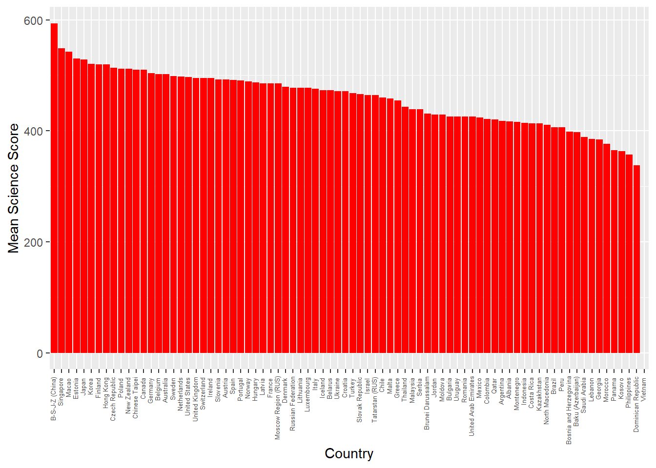
Show the code
# Extension version: added summarise to find standard deviation
avgscience <- PISA_2018 %>%
group_by(CNT) %>%
summarise(mean_sci = mean(PV1SCIE, na.rm=TRUE),
sd_sci=sd(PV1SCIE, na.rm=TRUE)) %>%
arrange(desc(mean_sci))
# Extension version: geom_errorbar added with aes y=mean_sci (the centre of the bar) and then the maximum and minimum set to the mean plus or minus the standard deviation (ymin=mean_sci-sd_sci, ymax=mean_sci+sd_sci)
ggplot(data = avgscience,
aes(x= reorder(CNT, -mean_sci), y=mean_sci)) +
geom_col(fill="red") +
theme(axis.text.x = element_text(angle = 90, hjust=0.95, vjust=0.2, size=5))+
labs(x="Country", y="Mean Science Score")+
geom_errorbar(aes(y=mean_sci, ymin=mean_sci-sd_sci,
ymax=mean_sci+sd_sci),
width=0.5, colour='black', size=0.5)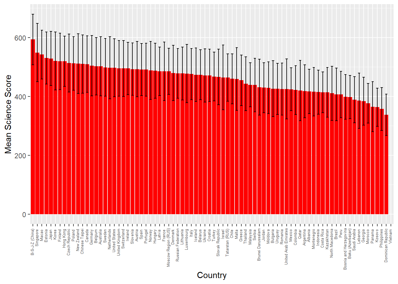
12.2.2 Task 2 Are there differences in science scores by gender for the total data set?
Consider the kinds of variables that represent the science score. What is an appropriate test to determine differences in the means between the two groups? Create two vectors, for boys and girls, that you can feed into the t.test function.
Show the code
# Task 2: Are there differences in Science scores by gender for the total data set? (No)
# A comparision of means of two continuous variables, use a t-test.
# Choose the gender (ST004D01T) and science score columns (PV1SCIE) from 2018 data, filter for males
# Put that data into MaleSci
MaleSci <- PISA_2018 %>%
select(ST004D01T, PV1SCIE) %>%
filter(ST004D01T == "Male")
# Choose the gender (ST004D01T) and science score columns (PV1SCIE) from 2018 data, filter for females
# Put that data into FemaleSci
FemaleSci <- PISA_2018 %>%
select(CNT, ST004D01T, PV1SCIE) %>%
filter(ST004D01T == "Female")
#Do a t-test comparing MaleSci and FemaleSci
t.test(MaleSci$PV1SCIE, FemaleSci$PV1SCIE)
Welch Two Sample t-test
data: MaleSci$PV1SCIE and FemaleSci$PV1SCIE
t = -16.184, df = 604181, p-value < 2.2e-16
alternative hypothesis: true difference in means is not equal to 0
95 percent confidence interval:
-4.781097 -3.748183
sample estimates:
mean of x mean of y
458.5701 462.8347 12.2.3 Task 3 Are there differences in science scores by gender for UK students?
As above, but include a filter by country.
Show the code
# Task 3: Are there differences in Science scores by gender for UK students? (No)
# A comparision of means of two continuous variables, use a t-test.
# Choose the country (CNT), gender (ST004D01T) and science score columns (PV1SCIE) from 2018 data, filter for males and the UK
# Put that data into UKMaleSci
UKMaleSci <- PISA_2018 %>%
select(CNT, ST004D01T, PV1SCIE) %>%
filter(ST004D01T == "Male") %>%
filter(CNT=="United Kingdom")
# Choose the country (CNT), gender (ST004D01T) and science score columns (PV1SCIE) from 2018 data, filter for females and the UK
# Put that data into UKFemaleSci
UKFemaleSci <- PISA_2018 %>%
select(CNT, ST004D01T, PV1SCIE) %>%
filter(ST004D01T == "Female") %>%
filter(CNT=="United Kingdom")
# Do a t-test comparing UKMaleSci and UKFemaleSci
t.test(UKMaleSci$PV1SCIE, UKFemaleSci$PV1SCIE)
Welch Two Sample t-test
data: UKMaleSci$PV1SCIE and UKFemaleSci$PV1SCIE
t = -1.5274, df = 13662, p-value = 0.1267
alternative hypothesis: true difference in means is not equal to 0
95 percent confidence interval:
-5.6282103 0.6983756
sample estimates:
mean of x mean of y
493.9977 496.4626 12.2.4 Task 4 For the whole data set, is there a correlation between students’ science score and reading scores?
Reflect on the appropriate test to show correlation between two scores. This test can be carried out quite simply using a couple of lines of code. Extensions: a) perform the same analysis, but consider the impact of gender; b) Find the correlations between reading and science core by country, and rank from most highly correlated to least.
Show the code
# Task 4: For the whole data set, is there a correlation between students’ science score reading score? (Yes, significant 0.77)
# Do the regression test between science score (PV1SCIE) and reading score (PV1READ) on the PISA_2018 data
lmSciRead <- lm(PV1SCIE ~ PV1READ, data=PISA_2018)
summary(lmSciRead)
Call:
lm(formula = PV1SCIE ~ PV1READ, data = PISA_2018)
Residuals:
Min 1Q Median 3Q Max
-269.417 -32.284 -0.294 32.091 266.034
Coefficients:
Estimate Std. Error t value Pr(>|t|)
(Intercept) 7.904e+01 2.710e-01 291.7 <2e-16 ***
PV1READ 8.367e-01 5.781e-04 1447.5 <2e-16 ***
---
Signif. codes: 0 '***' 0.001 '**' 0.01 '*' 0.05 '.' 0.1 ' ' 1
Residual standard error: 48.65 on 606625 degrees of freedom
(5377 observations deleted due to missingness)
Multiple R-squared: 0.7755, Adjusted R-squared: 0.7755
F-statistic: 2.095e+06 on 1 and 606625 DF, p-value: < 2.2e-16Show the code
# Extension 1: Add Gender:
# lmSciRead <- lm(PV1SCIE ~ PV1READ + ST004D01T, data=PISA_2018)
# summary(lmSciRead)
# Extentions 2: Rank by correlation
# CNTPISA<-PISA_2018%>%
# select(CNT, PV1SCIE, PV1READ)%>%
# group_by(CNT)%>%
# summarise(MeanSci=mean(PV1SCIE),
# MeanRead=mean(PV1READ),
# Cor=cor(PV1SCIE,PV1READ)) %>%
# arrange(desc(Cor))12.2.5 Task 5 Plot a representation of UK students’ science score against reading score, with a linear best fit line.
It will help here to create a data.frame that contains a filtered version of the whole dataset you can pass to ggplot.
Show the code
# Task 5: Plot a representation of UK students’ science score against reading score.
# Choose the three variables of interest, science score (PV1SCIE), reading score (PV1READ) and country (CNT)
# and filter for the UK. Put the values into regplotdata
regplotdata<- PISA_2018 %>%
select(PV1SCIE, PV1READ, CNT) %>%
filter(CNT=="United Kingdom")
# Plot the data in regplotdata, set the science score on the x-xis and reading on y-axis, set the size, colour and alpha (transparency)
# of points and add a linear ('lm') black line
ggplot(data = regplotdata,
aes(x=PV1SCIE, y=PV1READ)) +
geom_point(size=0.5, colour="red", alpha=0.3) +
geom_smooth(method = "lm", colour="black")+
labs(x="Science Score", y="Reading score")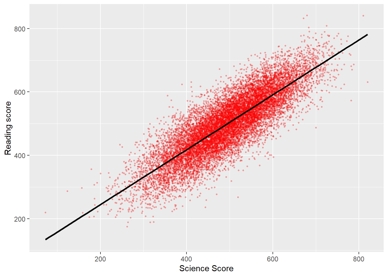
12.2.6 Task 6 Do girls and boys in the UK engage in different levels of environmental activism?
The PISA 2018 data set includes the variable ST222Q09H (I participate in activities in favour of environmental protection). Determine if the data for girls and boys are homogenous (i.e. if the null hypothesis that girls and boys engage in the same levels of activism is true).
Show the code
# Task 6: Is there a relationship between UK boys' and girls' levels of enviromnental activism.
chi_data <- PISA_2018 %>%
select(CNT, ST004D01T, ST222Q09HA) %>%
filter(CNT=="United Kingdom") %>%
na.omit()
# We wish to compare two categorical variables, gender (Male/Female) and engagement in enviromental activism (Yes/No)
# Create a frequency table
Activismtable <- chi_data %>%
group_by(ST004D01T, ST222Q09HA)%>%
count()
# Pivot the table to create a contingency table
Activismtable <- pivot_wider(Activismtable, names_from = ST222Q09HA, values_from = n)
# Drop the first column for passing to chisq.test
Activismtable <- subset(Activismtable, select=c("Yes","No"))
# Perform the chisq.test on the data
chisq.test(Activismtable)
Pearson's Chi-squared test with Yates' continuity correction
data: Activismtable
X-squared = 0.07963, df = 1, p-value = 0.777812.2.7 Task 7 Does participation in environmental activism explain variation in science score for UK students?
Arguments have been made the students who know more science, might engage in more environmental activism. Determine what percentage of variation in UK science scores is explained by a) the variable ST222Q09HA (I participate in activities in favour of environmental protection); b) ST222Q04HA (I sign environmental petitions online); and c) ST222Q03HA (I choose certain products for ethical or environmental reasons).
Show the code
# Task 7: How much varibaility in science score is explained by participation in activism?
# Explanation of variation is performed by carrying out an anova test
UK_data <- PISA_2018 %>%
select(CNT, PV1SCIE, ST222Q09HA, ST222Q04HA, ST222Q03HA) %>%
filter(CNT=="United Kingdom") %>%
na.omit()
# Perform the anova test
resaov<-aov(data=UK_data,
PV1SCIE ~ST222Q09HA + ST222Q04HA+ ST222Q03HA)
summary(resaov) Df Sum Sq Mean Sq F value Pr(>F)
ST222Q09HA 1 58181 58181 6.984 0.00827 **
ST222Q04HA 1 14619 14619 1.755 0.18540
ST222Q03HA 1 4618 4618 0.554 0.45662
Residuals 2606 21710370 8331
---
Signif. codes: 0 '***' 0.001 '**' 0.01 '*' 0.05 '.' 0.1 ' ' 1Show the code
#> Significant differences exist for ST222Q09HA (I participate in activities in favour of environmental protection) (Pr(>F)=0.00827) but not ST222Q04HA (signing petitions) (p=0.18540) or choosing products for ethical/environmental reasons (p=0.45662)
# Determine the % of variation explained
library(lsr)
eta<-etaSquared(resaov)
eta<-100*eta
eta eta.sq eta.sq.part
ST222Q09HA 0.11363973 0.11391504
ST222Q04HA 0.05024603 0.05039979
ST222Q03HA 0.02119558 0.0212666413 Effective international STEM education
13.1 The value of quantitative methods
In this seminar we will reflect on advantages and disadvantages of using quantitative methods in STEM education research.
“These are intemperate terms and, though perhaps rightly arguing against aspects of public policy making which are ill-informed by evidence, undermine alternative, legitimate sources and kinds of evidence (Davies, 1999; Sebba, 1999; Curriculum Evaluation and Management Centre, 2000c: 1), e.g. survey, ethnography, naturalistic and qualitative research. To claim that there is only one path to salvation is dangerous and doctrinaire” (Morrison 2001, 71)
“Cacophonous claims about effective practices abound. But we will later see that their technical warrant is generally weak when evaluated by the most widely accepted causal methods in statistics and across the social sciences as a whole, as opposed to the standards currently operating in large parts of the educational research community” (Gorard and Cook 2007, 309)
13.2 The value of quantitative methods
Download the EEF report: ‘Testing the impact of preparing for, applying for and participating in STEM-related work experience’ (EEF report)
- Read the summary on page 4
- To what extent is the EEF project useful research for teachers?
- Should interventions that receive low ratings, for example the work experience programme of the form evaluated, be rejected?
- Should all practices in schools undergo testing of this form?
- Given the low effect size of many educational interventions are randomised control trials a helpful approach for providing policy recommendations?
13.3 Useful quantification – Visible Learning
Look at the representations of effect sizes developed by Hattie:
- Consider this discussion of how Hattie developed these tables: Effect Size
- Is effect size a useful value for teachers to consider when deciding what approaches to adopt?
- Are meta-analyses of different classroom interventions practically useful? Can they guide practice in a meaningful manner? What questions might be asked about a meta-analysis before adopting its findings?
- What artefacts (findings that don’t reflect the underlying situation) might arise from meta-analyses that combine the results of different studies?
- Can interventions be ranked in a way that is meaningful for schools and teachers?
13.4 The value of quantitative research in STEM education
- From the analyses that we have carried out on the course, report any findings that you think are of value for teaching in your discipline
- What barriers currently exist to the development of quantitative research that is useful to STEM teachers?
- Given the issues with EEF, what might policy makers do to support the meaningful development and use of STEM quantitative education research?
- Is a dichotomy (e.g. a separation in the value and the researchers who conduct the work) between qualitative and quantitative work useful?
14 Practice tasks
14.1 Self study tasks
The pages below set out a series of graded challenges that you can use to test your R and statistical skills. Sample code that solves each problem is included so you can compare your solution with ours. Don’t worry if you solve something in a different way, there will be multiple solutions to the same task. The tasks are all set on the PISA_2018 data set: PISA_2018
To load the data, use the code below:
14.2 Task 1 Practice creating a summary table #1
Create a table that summarises the mean PISA science scores by country. You will need to use the group_by, summarise and mean functions.
Extension: use the signif function to give the responses to three significant figures
14.3 Task 2 Practice creating a summary table (including percentages) #2
Use the table function to create a summary of numbers of types of school ISCEDO recorded in the data frame for the UK. Use the mutate function to turn these into percentages (you will need to calculate a total)
Answer
UKPISA<-PISA_2018%>%
select(CNT,ISCEDO)%>% # Select the country school type
filter(CNT=="United Kingdom")%>% # filter for the UK
select(ISCEDO) # Just select the school type
# I.e. remove the country
UKPISA<-table(UKPISA) # Create a summary of counts
# To manipulate the table it is
UKPISA<-as.data.frame(UKPISA) # easier to convert it to a
# a data.frame
UKPISA<-mutate(UKPISA, per=Freq/sum(Freq)*100)14.4 Task 3 Practice pivoting a table
Convert a table of UK Science, Maths and Reading scores, extracted from the main data set, into the long format R prefers. In the long format, each score becomes a single so each student will have three entries.
Answer
# Create a data frame in wide format, with three columns for each student's scores (math, reading and science)
UKScores<-PISA_2018%>%
select(CNT,PV1MATH, PV1READ, PV1SCIE)%>%
filter(CNT=="United Kingdom")%>%
select(PV1MATH, PV1READ, PV1SCIE)
# Use pivot longer to turn the three columns into one. First, pass pivotlonger the dataframe to be converted, then the three columns
# to convert into one, the name of the new longer column and the
# name of the new scores column
UKScores<-pivot_longer(UKScores, cols=c('PV1MATH', 'PV1READ', 'PV1SCIE'),
names_to = 'Subject', values_to = 'Score' )14.5 Task 4 Graphing Practice #1 A Bar Chart
Draw a bar chart of the mean mathematics scores for Germany, the UK, the US and China
Answer
Plotdata<-PISA_2018%>%
select(CNT, PV1MATH)%>%
filter(CNT=="United Kingdom"|CNT=="United States"|CNT=="Germany"|CNT=="B-S-J-Z (China)")%>%
group_by(CNT)%>%
summarise(mean=mean(PV1MATH))
ggplot(Plotdata, # Pass the data to be plotted to ggplot
aes(x=CNT, y=mean))+ # set the x and y varibale
geom_col(fill="red") # plot a column graph and fill in red14.6 Task 5 Graphing Practice #2 A Bar Chart with two series
Draw a bar chart of the mean mathematics scores for Germany, the UK, the US and China for boys and girls
Answer
Plotdata<-PISA_2018%>%
select(CNT, PV1MATH, ST004D01T)%>%
filter(CNT=="United Kingdom"|CNT=="United States"|CNT=="Germany"|CNT=="B-S-J-Z (China)")%>%
group_by(CNT, ST004D01T)%>%
summarise(mean=mean(PV1MATH))
ggplot(Plotdata,
aes(x=CNT, y=mean, fill=ST004D01T))+ # Setting the fill to the gender
# variable gives two series
geom_col(position = position_dodge()) # position_dodge here means the
# means the bars are plotted # side by side14.7 Task 6 Graphing Practice #3 A scatter plot
Plot a graph of science scores against mathematics scores for students in the UK
Answer
Plotdata<-PISA_2018%>% # Create a new dataframe to be plotted
select(CNT, PV1MATH, PV1SCIE)%>% # Choose the country, and scores vectors
filter(CNT=="United Kingdom") # Filter for only Uk results
ggplot(Plotdata, # Pass the data to be plotted to ggplot
aes(x=PV1MATH, y=PV1SCIE))+ # Define the x and y varibale
geom_point(size=0.1, alpha=0.2, colour="red")+
# Use geom-point to create a scatter # graph and set the size of the point
# alpha (i.e transparency)
labs(x="Math Score", y="Science score") # Add clearer labels14.8 Task 7 Graphing Practice #4 A scatter plot with multiple series
Plot a graph of science scores against mathematics scores for students in the UK, with data split into two series for boys and girls
Answer
Plotdata<-PISA_2018%>% # Create a new dataframe to be plotted
select(CNT, PV1MATH, PV1SCIE, ST004D01T)%>%
filter(CNT=="United Kingdom") # Filter for only Uk results
ggplot(Plotdata,
aes(x=PV1MATH, y=PV1SCIE, colour=ST004D01T))+
geom_point(size=0.1, alpha=0.2)+
# As above, but set colour by the gender varibale
labs(x="Math Score", y="Science score") 14.9 Task 8 Graphing Practice #4 A scatter plot with varying size points
Plot a graph of mean science scores against mean mathematics scores for all the countries in the data set. Vary the point size by the number of students per country.
Answer
Plotdata<-PISA_2018%>%
select(CNT, PV1MATH, PV1SCIE) %>%
group_by(CNT) %>%
summarise(meansci=mean(PV1SCIE), meanmath=mean(PV1MATH), total=n())
# Summarise finds mean scores by countries and n() is used to sum
# the number of students in each country
ggplot(Plotdata,
aes(x=meansci, y=meanmath, size=total, colour="red"))+
# The size aesthetic is set to the total entries value computed
# for the data set
geom_point()+
labs(x="Mean science score", y="Mean math score")14.10 Task 9 Graphing Practice #5 A mosaic plot
Plot a mosaic plot of the number of students in general or vocational schools
14.11 Task 10 T-test practice #1
Using the PISA 2018 data set, determine if there are statistically significant differences between the science, reading and mathematics scores of the UK and the US.
Answer
# Create data frames with the score results for UK and US
UKscores<-PISA_2018%>%
select(CNT,PV1MATH,PV1READ, PV1SCIE)%>%
filter(CNT=="United Kingdom")
USscores<-PISA_2018%>%
select(CNT,PV1MATH,PV1READ, PV1SCIE)%>%
filter(CNT=="United States")
# Perform the t-test with maths results
t.test(UKscores$PV1MATH, USscores$PV1MATH)
# p-value is < 2.2e-16 so signficant differences exist for maths
t.test(UKscores$PV1READ, USscores$PV1READ)
# p-value = 0.8442 so no signficant differences exist for reading
t.test(UKscores$PV1SCIE, USscores$PV1SCIE)
# p-value = 0.2124 so no signficant differences exist for reading14.12 Task 11 T-test practice #2
Divide the UK population into two groups, those that have internet access at home and those who do not. Are there statistically significant differences in the means of their reading, science and mathematics scores?
Answer
# Create data frames with the score results for UK in two
# groups, has internet and no internet, based on ST011Q06TA
UKHasIntscores<-PISA_2018%>%
select(CNT,PV1MATH,PV1READ, PV1SCIE, ST011Q06TA)%>%
filter(CNT=="United Kingdom" & ST011Q06TA=="Yes")
UKNoIntscores<-PISA_2018%>%
select(CNT,PV1MATH,PV1READ, PV1SCIE, ST011Q06TA)%>%
filter(CNT=="United Kingdom" & ST011Q06TA=="No")
# Perform the t-test with maths results
t.test(UKHasIntscores$PV1MATH, UKNoIntscores$PV1MATH)
# p-value is < 2.2e-16 so no signficant differences for maths scores from
# those with and without internet
t.test(UKHasIntscores$PV1READ, UKNoIntscores$PV1READ)
# p-value is < 2.2e-16 so no signficant differences for reading scores from
# those with and without internet
t.test(UKHasIntscores$PV1SCIE, UKNoIntscores$PV1SCIE)
# p-value is < 2.2e-16 so no signficant differences for science scores from
# those with and without internet14.13 Task 12 T-test practice #3
Using the PISA 2018 data set, are the mean mathematics scores of US boys and girls different to a statistically significant degree?
Answer
# Create a dataframe of US boys math scores
USboys<-PISA_2018 %>%
select(CNT, PV1MATH, ST004D01T)%>%
filter(CNT=="United States")
# Create a dataframe of US girls math scores
USgirls<-PISA_2018 %>%
select(CNT, PV1MATH, ST004D01T)%>%
filter(CNT=="United States")
# Perform the t-test, using $PVMATH to indicate which column of the dataframe to use
t.test(USboys$PV1MATH, USgirls$PV1MATH)
# The p-value is 1 which is over 0.05 suggesting we accept the null hypothesis, there are no statistically signficant difference in US girls and boys math scores14.14 Task 13 T-test practice #3
Are the mean science scores of all students in the US and the UK different to a statistically significant degree?
answer
# Create a dataframe of US science scores
USSci<-PISA_2018 %>%
select(CNT, PV1SCIE)%>%
filter(CNT=="United States")
# Create a dataframe of UK science scores
UKSci<-PISA_2018 %>%
select(CNT, PV1SCIE)%>%
filter(CNT=="United Kingdom")
# Perfom the t-test, using $PV1SCIE to indicate which column of the dataframe to use
t.test(USSci$PV1SCIE, UKSci$PV1SCIE)
# The p-value is 0.2124, over 0.05, so we accept the null hypothesis, there is no statistically significant difference between US and UK science scores 14.15 Task 14 Chi-square practice #1
Are statiscally significant differences in the proportion of boys and girls and the number of books in the home for the whole dataset?
Answer
# Create a dataframe of boys and number of books in the home
Malebooksinhome<-PISA_2018 %>%
select(ST004D01T, ST013Q01TA)%>%
filter(ST004D01T=="Male")
# Sum these up and convert to a data frame for chisq.test
Malebooksinhome<-as.data.frame(table(Malebooksinhome$ST013Q01TA))
# Repeat for girls
Femalebooksinhome<-PISA_2018 %>%
select(ST004D01T, ST013Q01TA)%>%
filter(ST004D01T=="Female")
Femalebooksinhome<-as.data.frame(table(Femalebooksinhome$ST013Q01TA))
# Perform the chisq.test
chisq.test(Malebooksinhome$Freq,Femalebooksinhome$Freq)
# The p-value is 0.00727, which is less than 0.05 so the null hypothesis, that are no signifcnat differneces between the number of boys in boys' and girls' homes is rejects. Girls and boys have different distributions of number of books.14.16 Task 15 Chi-square practice #2
Are there statistically significant differences, in the whole data set, between boys and girls use of the internet at school to browse for homework (IC011Q03TA)?
Answer
# Create a data frame of the girls responses to the question on internet use at school
girlsint<-PISA_2018%>%
select(IC011Q03TA, ST004D01T)%>%
filter(ST004D01T=="Female")%>%
select(IC011Q03TA)
# Do the same for boys
boysint<-PISA_2018%>%
select(IC011Q03TA, ST004D01T)%>%
filter(ST004D01T=="Male")%>%
select(IC011Q03TA)
# Create frequency count tables of those data frames
# Note the chisq.test function takes data frames as inputs
# but the output of table is a table, so we convert the tables
# back to data frames
girlsint<-as.data.frame(table(girlsint))
boysint<-as.data.frame(table(boysint))
# Run the chi.sq test using the freq column in the dataframe
chisq.test(girlsint$Freq,boysint$Freq)
# The output p-value is 0.008362 which is less than 0.05. So reject the null hypothesis. There is a difference in usage.14.17 Task 16 Chi-square practice #3
Are there statistically significant differences between the availability of laptops (IC009Q02TA) in school in the US and the UK?
answer
# IC009Q02TA - Available for use in school - a laptop
# Filter the data to get laptop use in the UK, put that into a new dataframe UKchidata
UKchidata<- PISA_2018 %>%
select(CNT, IC009Q02TA)%>%
filter(CNT=="United Kingdom")%>%
select(IC009Q02TA)%>%
na.omit()
# Filter the data to get laptop use in the US, put that into a new dataframe USchidata
USchidata<- PISA_2018 %>%
select(CNT, IC009Q02TA)%>%
filter(CNT=="United States")%>%
select(IC009Q02TA)%>%
na.omit()
# use table to count the entries and convert to a data frame
UKchidata<-as.data.frame(table(UKchidata))
USchidata<-as.data.frame(table(USchidata))
# Do the chi squared test
chisq.test(UKchidata$Freq, USchidata$Freq)
# p-value is less than 0.05, so reject the null hypotheses - there are statistically significant differences in access to laptops in the UK and the US14.18 Task 18 Anova practice #1
Are there statistically significant differences in mathematics scores of France, Germany, Spain, the UK and Italy? Find between which pairs of countries statistically significant differences in mathematics scores exist.
answer
# Create a dataframe of the required countries
EuroPISA <- PISA_2018 %>%
select(CNT, PV1MATH)%>%
filter(CNT=="Spain"|CNT=="France"| CNT=="United Kingdom"| CNT=="Italy"|CNT=="Germany")
# Perform the anova
resaov<-aov(data=EuroPISA, PV1MATH ~ CNT)
summary(resaov)
# Yes, statistically significant differences exist between the countries Pr(>F) <2e-16 ***
# Perform a Tukey HSD test
TukeyHSD(resaov)
# Significant differences p<0.05 exist for all countries except Italy and the UK14.19 Task 19 Anova practice #2
For the UK PISA 2018 data set, which variable out of WEALTH, ST004D01T, OCOD1 (Mother’s occupation), OCOD2 (Father’s occupation), ST011Q06TA (having a link to the internet), and highest level of parental education (HISCED) accounts for the most variation in science score? What percentage of variance is explained by each variable?
! This is a big calculation so will take some time to compute!
answer
UKPISA_2018 <- PISA_2018 %>%
filter(CNT=="United Kingdom")
resaov<-aov(data=UKPISA_2018, PV1SCIE ~ WEALTH + ST004D01T + OCOD1 + OCOD2 + ST011Q06TA + HISCED)
summary(resaov)
eta <- etaSquared(resaov)
eta <- 100*eta
eta <- as.data.frame(eta)
eta
# Most variance explained by OCOD2 (father's occupation), OCOD1 (mother's occupation) HISCED (highest level of parental education), ST011Q06TA (having an internet link), WEALTH, then ST004DO1T (gender)14.20 Task 18 Anova practice #3
15 Datasets
The examples shown in this booklet use a range of freely available datasets. We would like to encourage you to use one of these datasets in your own analysis, but you are welcome to use other datasets if agreed with your supervisor. This section will take you through the process of downloading, understanding and using these datasets.
15.1 PISA
15.1.1 What is PISA
The Programme for International Student Assessment (PISA) is an OECD initiative that looks at the reading, mathematics and science abilities of students aged 15 years old. Data is collected from ~38 OECD countries and other partner countries every three years.
| Dataset | Description | 03 | 06 | 09 | 12 | 15 | 18 |
|---|---|---|---|---|---|---|---|
| Student | demographic data on student participants | x | x | x | x | x | x |
| School | descriptive data about schools | x | x | x | x | x | x |
| Parent | a survey for student’s parents including information about home environments and parental education | x | x | ||||
| Teacher | demographic, teaching, qualification and training data | x | x | x | |||
| Cognitive | x | x | x | x | x | x |
PISA datasets above can be found on the OECD website. The links in the table above will allow you to download .rds versions of these files which we have created, though they might need additional editing, e.g. reducing the number of columns or changing the types of each column. If you want to find out more about what each field stores, take a look at the corresponding codebook, 2018, 2015.
15.1.2 How to use it
The PISA datasets come in SPSS or SAS formats. The data used in this course comes directly from downloading the SPSS .sav files and using the haven package to clean it into a native R format suitable for analysis, in most cases .parquet files (see: Section 2.8.6). There are a few quirks that you need to be aware of:
R uses levels (factors) instead of labelled data
All SPSS fields are labelled, and auto conversion into the native R dataframe format would make numeric fields, factors(!?). To avoid this confusion we have stripped out the no-response data for numeric fields and replaced it with
NAvalues. This means that you won’t be able to tell the reason that a field is missing, and the following labels have all been set toNA:
| value | label |
|---|---|
| 95 | Valid Skip |
| 97 | Not Applicable |
| 98 | Invalid |
| 99 | No Response |
- As the fields are now using R’s native factor format you might find that the data doesn’t quite match the format of the table labels. For example,
CNTis labelled “Country code 3-character”, but the data is now instead the full country name. - the examples shown in the book use cut down PISA datasets, where only a limited number of columns are included. The full datasets are linked in the table above.
15.1.3 Common issues
The PISA datasets can be absolutely huge and might bring your computer to its knees; if you are using a computer with less than 16GB of RAM you might not be able to load some tables at all. Tables such as the Cognitive dataset have hundreds of thousands of rows and thousands of columns, loading them directly might lead to an error similar to this: Error: cannot allocate vector of size 2.1 Gb. This means that R can’t find enough RAM to load the dataset and has given up. You can see a rough estimate of how much RAM R is currently using the top Environment panel:

To get around this issues you can try to clean your current R environment using the brush tool:
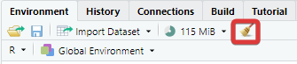
This will drop all the current dataframes, objects, functions and packages that you have loaded meaning you will have to reload packages such as library(tidyverse) and library(haven) before you can attempt to reload the PISA tables.
A lack of RAM might also be the result of lots of other programs running concurrently on your computer. Try to close anything that you don’t need, web browsers can be particularly RAM hungry, so close them or as many tabs as you can.
If none of the above works, then please get in touch with the team, letting them know which table you need from which year, with which fields and for which countries. We will be able to provide you with a cutdown dataset.
15.1.4 Questions
15.1.4.1 What are Plausible Values?
In the PISA dataset, the outcomes of student tests are reported as plausible values, for example, in the variables of the science test (PV1SCIE, PV2SCIE, PV3SCIE, PV3SCIE, and PV5SCIE). It might seem counter intuitive that there are five values for a score on a test.
Plausible values (PVs) are a way of expressing the error in a measurement. The number of questions in the full PISA survey is very large, so students are randomly allocated to take a subset of questions (and even then, the test still takes two hours!). As no student completes the full set of questions, estimating how a student would have performed on the full question set involves some error. Plausible values are a way of expressing the uncertainty in the estimation of student scores.
One way of thinking of the PV scores is that they represent five different estimates of students’ abilities based on the questions they have answered. To decrease measurement error, five different approaches are applied to create five different estimates, the PV scores.
The PISA Data Analysis Manual suggests:
Population statistics should be estimated using each plausible value separately. The reported population statistic is then the average of each plausible value statistic. For instance, if one is interested in the correlation coefficient between the social index and the reading performance in PISA, then five correlation coefficients should be computed and then averaged
Plausible values should never be averaged at the student level, i.e. by computing in the dataset the mean of the five plausible values at the student level and then computing the statistic of interest once using that average PV value. Doing so would be equivalent to an EAP estimate, with a bias as described in the previous section.
(p. 100) Monseur et al. (2009)
15.1.4.2 Why are some countries OECD countries and others aren’t?
The Organisation for Economic Co-operation and Development (OECD) has 38 member states. PISA is run by the OECD and its member states normally take part in each PISA cycle, but other countries are allowed to take part as Partners. You can find more details on participation here.
Results for OECD members are generally higher than for Partner countries:
PISA_2018 %>%
group_by(OECD) %>%
summarise(country_n = length(unique(CNT)),
math_mean = mean(PV1MATH, na.rm=TRUE),
math_sd = sd(PV1MATH, na.rm=TRUE),
students_n = n())# A tibble: 2 × 5
OECD country_n math_mean math_sd students_n
<fct> <int> <dbl> <dbl> <int>
1 No 43 434. 106. 317477
2 Yes 37 490. 93.8 29452715.1.4.3 Why are the PV grades pivoting around the ~500 mark?
The scores for students in mathematics, reading and science are scaled so that the mean of students in OECD countries is roughly 500 points with a standard deviation of 100 points. To see this, run the following code:
PISA_2018 %>%
filter(OECD=="Yes") %>%
summarise(math_mean = mean(PV1MATH, na.rm=TRUE),
math_sd = sd(PV1MATH, na.rm=TRUE),
scie_mean = mean(PV1SCIE, na.rm=TRUE),
scie_sd = sd(PV1SCIE, na.rm=TRUE),
read_mean = mean(PV1READ, na.rm=TRUE),
read_sd = sd(PV1READ, na.rm=TRUE))# A tibble: 1 × 6
math_mean math_sd scie_mean scie_sd read_mean read_sd
<dbl> <dbl> <dbl> <dbl> <dbl> <dbl>
1 490. 93.8 490. 96.0 488. 101.15.1.4.4 Why are the letters TA and NA used in some field names?
15.1.4.5 How do I find fields that are numeric?
15.1.4.6 How are students selected to take part in PISA?
Students are selected by … (ref?)
Add Christian Bokhove papers https://bokhove.net/r-materials/
From the data, you can see that 50% of schools entered fewer than 30 students into PISA.
PISA_2018 %>%
group_by(CNTSCHID) %>%
summarise(size = n()) %>%
mutate(quartile = ntile(size, 4)) %>%
group_by(quartile) %>%
summarise(Qmax = max(size),
Qmedian = median(size),
Qmean = mean(size))# A tibble: 4 × 4
quartile Qmax Qmedian Qmean
<int> <int> <dbl> <dbl>
1 1 19 9 9.53
2 2 29 25 24.6
3 3 35 33 32.8
4 4 491 40 44.9 
15.1.5 Interesting papers and reading on PISA
15.1.6 Copyright
All PISA products are published under the Creative Commons Attribution-NonCommercial-ShareAlike 3.0 IGO (CC BY-NC-SA 3.0 IGO)
This includes the .rds and .parquet formatted datasets linked above.
15.1.7 fields to drop:
CNTRYID, NatCen
15.2 English Department for Education
15.2.1 Students
15.2.2 Schools
15.2.3 School workforce
15.2.4 School recruitment
15.2.5 Restricted datasets
Education provider details https://www.get-information-schools.service.gov.uk/Downloads
Results
15.3 Other datasets
15.3.1 What other datasets are there?
15.3.1.1 Gender equality indices
There are several international datasets for studying gender equality. These have been used by researchers to look at the impact of gender equality on student attitudes and outcomes. For example Stoet and Geary (2018) use the Global Gender Gap Index (GGGI) too look at PISA science self-efficacy and science outcomes for females.
15.3.1.1.1 Global Gender Gap Index (GGGI)
The world economic forum produces the Global Gender Gap Index (GGGI), this index combines female and male outcomes on Economic participation and opportunity, educational attainment, health and survival, and political empowerment.
Reports for: 2022, 2021, 2020,2018,2017,2016, 2015
It has proven difficult to find the 2015 dataset used by Stoet & Geary, 2013 dataset is here
15.3.1.1.2 United Nations
The UN reports on two gender specific indexes:
Gender Inequality Index (GII)
The Gender Inequality Index is a index incorporating data on reproductive health, empowerment and the labour market. Values range from 0 - full equality for men and women, to 0, full inequality.
Gender Development Index (GII)
The Gender Development Index measures inequalities in human development, combining data on female and male life expectancy, years of schooling and earned income. Values of 1 indicate equality, with values of less than 1 showing males performing better, and values over 1 showing females doing better.
Downloads for the GII and GDI are here
15.3.1.2 UNESCO
http://data.uis.unesco.org “Distribution of tertiary graduates” STEM degree entry by country
15.3.1.3 ONS
https://data.oecd.org/api/sdmx-json-documentation/#d.en.330346
https://www.ons.gov.uk/census/2011census/2011censusdata
https://www.ons.gov.uk/peoplepopulationandcommunity/populationandmigration/populationestimates/datasets/populationandhouseholdestimatesenglandandwalescensus2021
15.3.1.4 OECD
https://stats.oecd.org/
15.3.1.5 Ofsted
https://public.tableau.com/app/profile/ofsted/viz/Dataview/DataViewsurvey
16 Questions and answers
16.1 Questions about R
Why doesn’t my select/filter statement work?
When you are loading packages, sometimes different packages have the same function names in them, and the functions themselves will do very different things. For example, there is a select function in the tidyverse, but also another select function in the package MASS that does something very different. If we load the tidyverse before loading MASS, then the MASS version of select is the one that will be used?!
To get around this make sure that you load the tidyverse after MASS, in fact you should always load the tidyverse last.
# A tibble: 53,940 × 3
carat cut color
<dbl> <ord> <ord>
1 0.23 Ideal E
2 0.21 Premium E
3 0.23 Good E
4 0.29 Premium I
5 0.31 Good J
6 0.24 Very Good J
7 0.24 Very Good I
8 0.26 Very Good H
9 0.22 Fair E
10 0.23 Very Good H
# … with 53,930 more rowsyou can also specify the package that select comes from (in this case from a package within the tidyverse called dplyr):
# A tibble: 53,940 × 3
carat cut color
<dbl> <ord> <ord>
1 0.23 Ideal E
2 0.21 Premium E
3 0.23 Good E
4 0.29 Premium I
5 0.31 Good J
6 0.24 Very Good J
7 0.24 Very Good I
8 0.26 Very Good H
9 0.22 Fair E
10 0.23 Very Good H
# … with 53,930 more rowsHow can I unload packages
If you are finding yourself with a conflict as mentioned above and want to unload packages, then you need to run the following code:
# adapted from: @mmfrgmpds https://stackoverflow.com/questions/7505547/detach-all-packages-while-working-in-r
while(!is.null(sessionInfo()$loadedOnly)){
lapply(names(sessionInfo()$loadedOnly), require, character.only = TRUE)
invisible(lapply(paste0('package:', names(sessionInfo()$otherPkgs)), detach, character.only=TRUE, unload=TRUE, force=TRUE))
}Why am I getting the error ‘could not find function “%>%”’
The pipe operator %>% is loaded when you load the tidyverse package - make sure you have installed tidyverse and loaded it
I am getting the error: ‘“Error: Mapping should be created with aes() or aes_().”’ when using ggplot
This may be caused by having a bracket after the geom rather than before it
16.2 About the coursework
?filter
17 References
References
Footnotes
As of November 2022, Tiobe has R as the 12th most popular programming language. Many other, contradictory, ranking systems exist.↩︎
camelCasehas a capital letter in the front or front and middle forming the camel’s hump(s), there are multiple naming conventions, it doesn’t matter which you pick, just stick to one of them.↩︎R was created to allow for vector programming, that is a programming language where you can apply operations to entire sets of values (vectors) at the same time, rather than having to cycle through them individually. Vector languages work in a way that is close to how mathematical notation works, making them well suited for performing mathematical functions.↩︎
You’ll sometimes see the words package and library used interchangeably, technically the library is the place where the packages are stored.↩︎
Even in this cut down format the PISA data might take a few minutes to load. You can find the full dataset here, but be warned, it might crash you machine when trying to load it! Plug your laptop into a power supply, and having 16GB of RAM highly recommended! You might also need to wrangle some of the fields to make them work for your purposes, you might enjoy the challenge!↩︎
https://www.statisticssolutions.com/the-linear-regression-analysis-in-spss/:↩︎
2.4.3 Comments
Code can often look confusing and it’s a good idea to add
# commentsto your code to make it more understandable for you and others. The computer ignores comments when running your code: